Featured image for Designers Pick Their Favorite Packaging From 2022

Designers Pick Their Favorite Packaging From 2022

by Bill McCool on 12/21/2022 | 18 Minute Read

A not-so-dirty secret.

I love year-end lists. Best movies, albums, books, hostile takeovers of social media giants by try-hard-please-like-me billionaires—whatever. I can’t look away. It’s instant click fodder and content I can’t avoid. But my absolute favorites are when artists and designers compile their own lists because it gives you some insight into what they think is pretty inspiring or cool. Sometimes, they hype you to something you’ve never even heard about or a plastic-free dream that could revolutionize the CPG space.

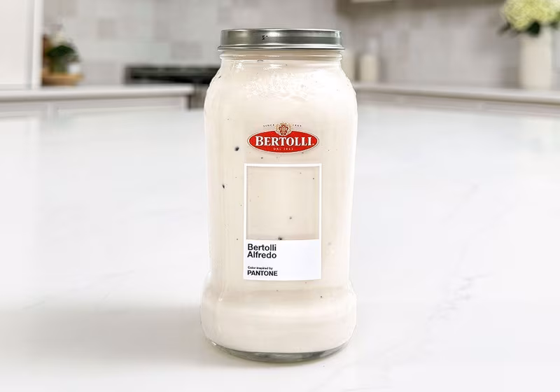
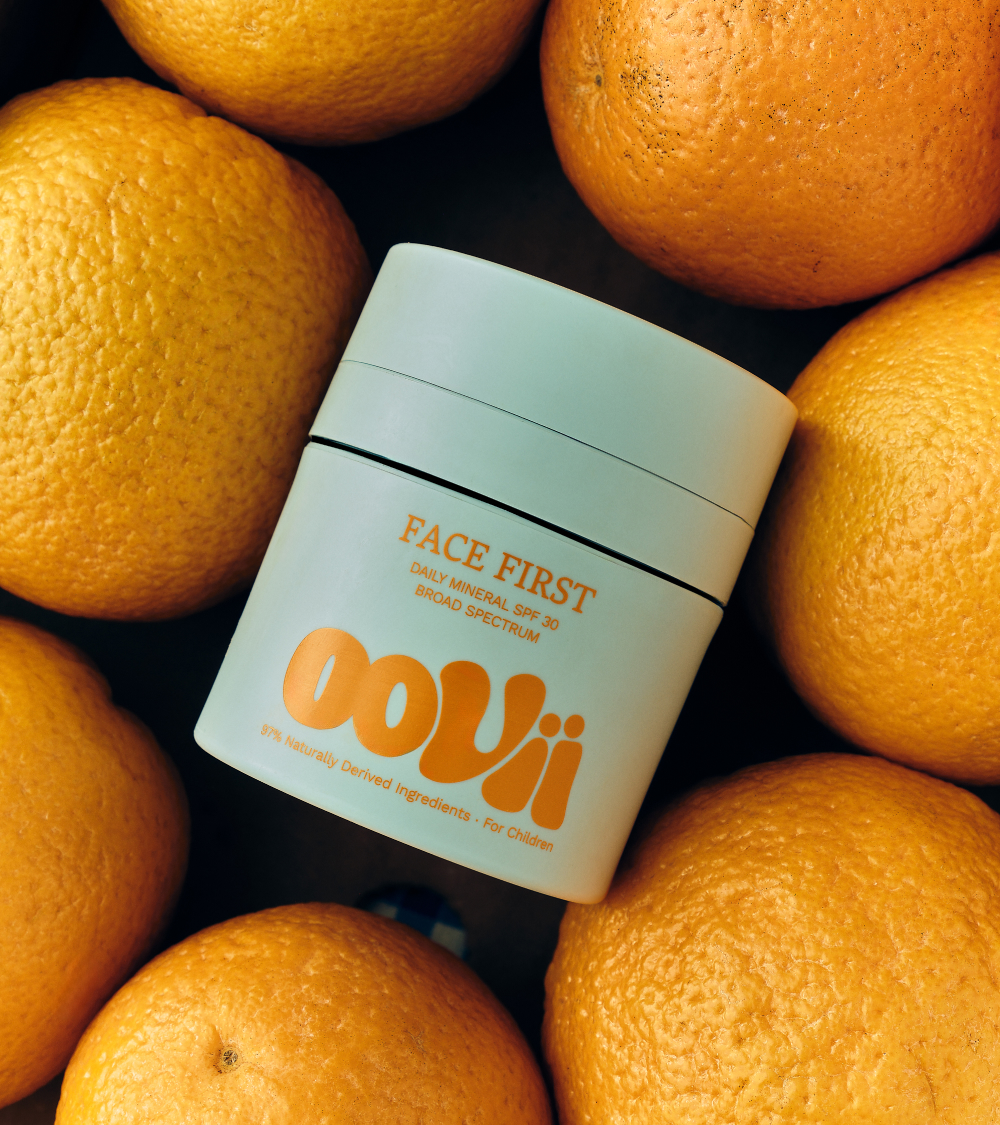
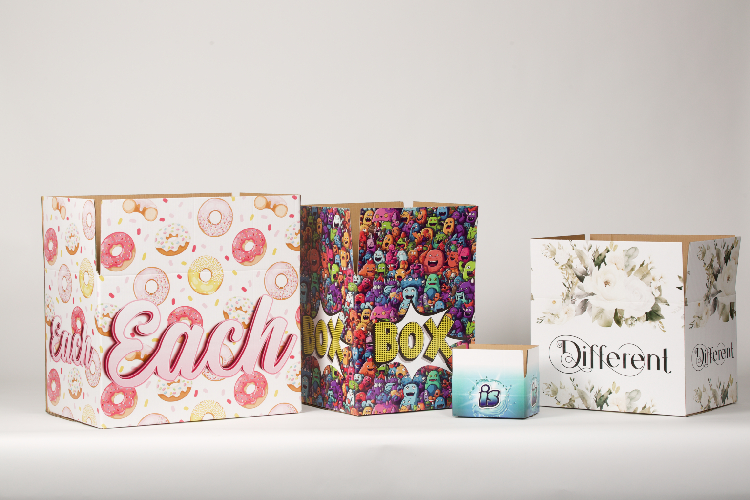
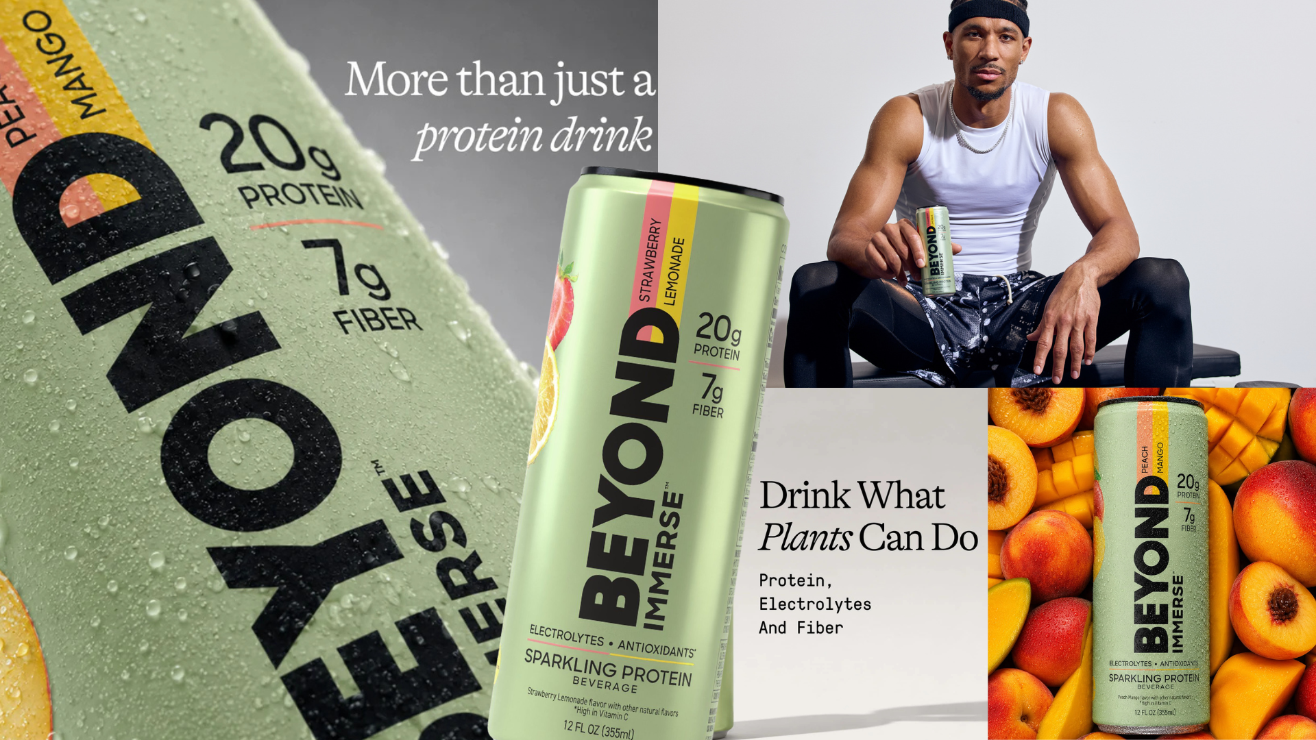
So in that spirit, we asked several of our favorite designers what they thought was the best piece of packaging they saw in 2022. We’ve got everything from flashy redesigns and gorgeous startups to seaweed wonders and olive oils galore—OK, just ONE olive oil, but a LOT of folks loved it.

Anywho, here are some flowers.

upload-04f50ea3-be11-46fa-a74a-2f3eb31a37fb.webp

Jolene Delisle, Co-founder of The Working Assembly

My favorite packaging design project this year came from Matteo Bologna's team at Mucca Design for the Tin Building in NYC. I love the dichotomy of a former fish market paired with the sophistication of Jean-Georges that was captured so beautifully in the visual identity.

upload-28936d49-2f9c-4d7d-afad-5e894bcfeafe.webp

They did an incredible job of tailoring their design system to fit across 24 product lines and 400+ unique SKUs with interesting finishes and seemingly endless expansive ways of flexing the typography.

2.jpg

Alex Center, Founder of CENTER 

There’s only one package design that instantly made me think, “fuck, I wish we had done that,” and “I immediately need to order this.” 

That design is Graza Olive Oil by Gander, easily my favorite packaging project of the year. The squeeze bottle is iconic, the logo is brilliant, and the type is great. The illustration is completely overlooked by how wonderful everything else is. It’s not every day a beloved category like olive oil gets an iconic brand overnight. That happened this year. 

This is also a good reminder that I've finished my first two bottles and need to place an order.

ADC101_PKG039M_0.jpeg

Anjali Mehta, Designer

Although there were so many amazingly creative and inspiring packagings this year, the full Spectrum Bulbs designed by Leo Burnett Toronto was my favorite. Firstly, I think the product design of the lightbulb itself is genius, and something I would buy myself since I wouldn't say I like the early sunsets too. It is such a depressing time of the day, and the concept of packaging the bulbs like a ray of sunshine and happiness is so creative and fun. It translates very well with the usage of the product. The story on the packaging also adds so much character to the design. I myself have felt happier whenever I've switched on a bulb on gloomy days, and I love how that concept comes alive with such a simple yet, bright, happy, and creative packaging design. As an avid lover of colors and textures myself, the shades of chosen yellow and the crumpled paper especially make it complete in my eyes to be my favorite design this year.

01 Sway_Product Film_Seaweed.png

Brian Collins,, Co-founder & CCO of COLLINS

Sway is, for me, the most important packaging work of 2022.

Next year, too. And probably the year after that.

Using biodegradable seaweed as a way to replace single-use plastic? That packaging might also become a regenerative nutrient once it's disposed of?

The company made huge, measurable leaps this year. So, make way for tomorrow, Sway.

And bye-bye, plastic.

Please.

Sprite-Dieline-can-zero.jpg

Zipeng Zhu, Founder & Creative Director of Dazzle Studio

My fav project this year is easily the Sprite Rebrand

Hot type, hot mark, and a hot system that's literally so refreshing to see. What's not to love? Personally, I'm obsessed with the black logo mark on the metallic green background. The “serif-y” sans is so ownable. I love the simple art direction as well! 

3.jpg

Laura Evans, Founder of Our Kind

All the way back in January 2022, Gander shared the design for Graza Olive Oil, and we've been obsessed ever since. It's a perfect example of avoiding classic tropes and cliches of the category while repositioning what it means to use olive oil. A brand and design "meant to challenge the standard" does so not only through the design, but also through the lively-yet-strikingly-simple "sizzle" and "drizzle" ranging and communication.

We love the blend of typography which feels classic, playful, utilitarian, and contemporary in equal measure, alongside a stripped-back color palette that draws focus to the joy and endearing naivety in the illustration. It's fun, vibrant, and doesn't take itself too seriously, yet we can see that Graza Olive Oil is, in fact, seriously good.

Just delicious.

ban1.png

Andrea Hernandez, Founder of Snaxshot

What I love about Delgado's is that they were very on point with the return of the Yuppie aesthetic, but they took a detour via a less beaten path, resulting in an Acapulco 80s vibe. So refreshing and fun! 

171117_054654_FBC6E85D8715E0213D229A93C1.jpg

Norma Coker, Founder & CEO at ALG DIGITAL, Algoritmo Design

We've always taken inspiration from work by LAND, one of our favorite design studios in Austin, Texas. Madre Mezcal was a big reference for our branding work with Mezcal Jurame back in 2019 and Bacanora Kilinga in 2021.

We're fans of using illustrations and modern/traditional elements to create a more complete visual system and engaging packaging. To tell a better story through brand and packaging, you should take inspiration from the land and the people behind the product.

1.jpg

Miro Laflaga, Co-founder of Six Cinquieme 

For 2022, the package design that most stands out to me is Papi Cannabis’ Sweet Sluggers by David Ortiz, aka Big Papi. Although I'm a sucker for minimalism, in the Cannabis space, you typically see super-minimal or super-funky, candy-like designs. 

Sweet Sluggers' packaging is cool because it gives a refined, nostalgic feel. There’s a certain authenticity that you don’t really see much of in the cannabis space. You can feel the Dominican culture referenced boldly and unapologetically, which I appreciated. The packaging also helps destigmatize cannabis consumption and creates a more sophisticated perception of the hobby.

ZLKlVmF5.jpg

Jena Garlinghouse, Co-founder & Client Director for Herefor

Why choose one "best packaging design" when you can choose two?! After chatting with my best buds and co-founders, we landed on our favorite pack designs from 2022 as Couplet Coffee—branding and packaging design by the one and only Javier Garcia—and Graza, by the super talented team at Gander. Packaging design is successful when it goes all-in on its story and visually brings to life why the brand exists and how it's different from the competition. The goal is to elicit a very clear feeling that resonates with your design target, and these two do that well.

Couplet Coffee exists to make specialty coffee fun, approachable, and "for f*ckin’ everyone." Just look at the pack; what’s not to love about the whimsical filled-to-the-brim bits of brand elements showcased on the front? And the entire pouch is holographic. So good, Javier! 

Graza has turned the olive oil category on its head by building a brand that’s fancy because of its high-quality product, yet un-fancy because of its squeezable bottle format and playful visual identity system. It has an unconventional—but totally successful—pack hierarchy, joyful illustration style, and an ownable brand color that sets Graza apart from the rest.

04 Toblerone_Bulletproof_2022_NewPack.jpg

Kim Gaskins, Senior VP of Marketing & Design at Designalytics

Once you start looking at Toblerone’s new design by Bulletproof, it’s hard to stop—it’s eye candy but, like, really smart eye candy. It has everything I love: vibrant colors, cleverly-utilized distinctive assets, and a big honkin’ image of chocolate. The fact that Bulletproof managed to meld the last two items on that list by replacing the Matterhorn mountain icon with a visual of the product itself is pure elegance (when it comes to design effectiveness, the role of compelling taste imagery can’t be overstated).

This redesign strikes me as just the right amount of bold. It’s new and exciting but still recognizable as the Toblerone brand. Remaining “stubbornly triangle in a world of squares,” the brand’s got some swagger—for example, in its willingness to occlude a portion of its wordmark.

One theme of this redesign might be “doing more with less”—from the way in which the wordmark extends slightly beyond each panel, inviting the consumer to rotate the small package and explore more, to the way the chocolate triangle serves double duty as both taste imagery and distinctive asset. It’s beautiful and just so deliciously efficient.

L7wlnnuA.jpg

Kevin Batory, Copywriter & Producer at CENTER and Co-host of Front & Center Podcast

Kate Moss, creative director of Diet Coke, had the hardest package design of the year. Oh yeah, I’m talking about the JODA [editor's note: jeans + soda = JODA]. The denim-swatched can was also accompanied by a camo can, a lace can, and a cheetah print can in a limited-edition pack celebrating Diet Coke’s 40th Anniversary. The rugged yet elegant denim depiction on the JODA is a visual delight that has me yearning for more. More denim, more texture, more coverage! My thirst can only be quenched by the JODA, and I'm excited to see what Kate Moss has cooking for the coming year.

EVE LOM HOLIDAY GIFTING 2023.jpeg

Evelio Mattos, Host of the Package Design Unboxd podcast and Creative Director of IDPDirect.com

I thought 2022 couldn't surprise me with its unexpected twists and turns, but then EVE LOM Skincare came along with its skincare gift box in a truly uniquely innovative box and insert design! 

It was the most inspired design I'd seen all year, making it a top three favorite pack of 2022. Beyond the beautiful exterior design and tactile processes, they ditched plastic inserts for a folded structure complete with jar-wrapping curves and angled tube cavities. The fact this brand is basically my name didn’t hurt, either. Seeing the right application of paper over plastic is an exciting shift in the design conversation and the speed of innovation. 

2023 will see innovation at warp speed as brands begin deploying AI into their process and eliminating materials that require engineering. Can’t wait! Other notables include Colourform’s Lancome La Vie est Belle molded fiber pack, Here Design’s work on the Glenfiddich Time Reimagined data-generated packs, and, of course, Oikos from Beardwood. 

3.jpg

Rudy Sanchez, Dieline

Gay Blood, by studio Mother and Stuart Semple, is a superb example of a packaging project that is beautiful visually and in its purpose. Gay Blood is a unique pigment made with blood from gay Mother team members. The goal is to highlight the discriminatory US FDA rules surrounding blood donations from gay and bisexual men. Current regulations are more rooted in fear from the early days of HIV/AIDS rather than modern science. The FDA’s rules are outdated scientifically, as virus detection methods have significantly improved.

The packaging is terrific and plays on a medical theme. Packaging includes inks in lab vials, pens similar to syringes, and labels reminiscent of pharmaceutical packaging. Gay Blood is striking, bold, and subversive.

Mother and Semple hope everyone buying Gay Blood will use it to protest the FDA’s current rules. The FDA reduced the time gay/bisexual men have to abstain from sex from a year to three months in response to COVID-related blood shortages.

As of this writing, theFDA is drafting new rules lifting the 90-day abstention requirement in favor of individual donor risk assessment. How much of an effect Gay Blood has on the FDA’s move is impossible to measure. Still, I love projects that aim to do good at their core, and that’s why Gay Blood is my favorite from 2022.

gander-graza-closeup.jpg

Katrina Romulo, Brand Designer

My favorite design to come out of 2022 is Graza. I've been in love with Gander's work for years, but I think they outdid themselves with Graza. The colors and type systems and illustrations (THE ILLUSTRATIONS!!! So playful and dynamic) work so well together. I love the monochromatic color schemes in the packaging. I normally want as many colors on a package as possible, but they made two colors work together so well.

TP_Packshot_01.webp

Phoebe Glasfurd, Creative Director for Glasfurd & Walker

I always gravitate towards packaging that is long-lasting. When the packaging itself is the product, it's less disposable and something that can bring joy over a long period of time.

The new Ormaie Tableau Parisien perfume packaging is a new design that has an enchanting quality. It is a unique combination of elegance and quirkiness. As an avid admirer of creativity and craft, I am in awe of the brand’s approach to design—it is pure art.

The typography of the label draws the eye with its playful ligature between the "S" and "I." The juxtaposition of the faceted glass and organic, hand-carved cap is an interesting design choice that is unusual yet warm and inviting. This combination of modern and traditional elements is a homage to Paris and the Art Deco era, and the choice of the elm burr wood cap, which is hand-polished and varnished, creates its own unique elegance.

The beauty of Ormaie's designs is that they are distinct but still sophisticated. The Tableau Parisien packaging is a great example of this, with its playful typography and combination of traditional and modern elements. The attention to detail and simplicity of the execution is beautiful.  

4.jpg

Chloe Gordon, Dieline

2022 brought a lot of creative packaging designs, but Vacation's Classic Whip sunscreen sits at the top of my list. Reimagining the delivery of a product almost everyone knows and is accustomed to is difficult, but Vacation executed flawlessly and with their cherished nostalgic take. From the cherry-red splashes to the dreamy typography, this packaging design system is playful and innovative in all the right ways.

1haXGIRU (3).jpg

Becca Rembold, Lead Designer for Wonderkind

My favorite packaging from 2022 is the Mercado Famous meats pack from Gander! First off, how can you not love a cream and cobalt blue color palette? I adore this packaging because it masters that classic, trusted deli look and feel while bringing to life fresh typography combinations. Everything fits effortlessly, from the playful font choices to the brand mark and illustration system. It feels authentic and timeless and is something I would kill to reach for when planning my next charcuterie board—a total win. 

Macklowe_700ml_200ml_LayingDown_Group.jpg

Michael Hester, Principal & Creative Director of Pavement

I love the bold simplicity of the ultra-luxury spirits brand and bottle design from The Macklowe. It's confident, memorable, and oozes originality, something that's increasingly more difficult to achieve in the spirits space. At a price point of $1,500, this bottle is intended (and destined) to be instantly collectible and desirable. The form feels inherently masculine but is reminiscent of iconic feminine perfume bottles from the 1980s, like Opium by Yves Saint Laurent. It's one of those bottle designs that stopped me in my tracks when I first saw it. Bravo!

Sprite-Dieline-can-slender.jpg

Adey Efrem, Founder of Swoon Studios and Principal Designer at Impossible Foods

In 2022, Sprite teamed up with world-famous design agency Turner Duckworth to refresh its brand and create one of the most iconic packaging designs of the year. Sprite’s new look falls in line with a reductionist aesthetic gaining popularity in the design world, where an identity is reduced to its simplest form through uncomplicated type and minimal supporting design elements. One reason Sprite might be leaning into this level of simplicity is to make their brand more easily identifiable and memorable in a digital world where even the most iconic brands are at risk of getting lost in all the noise.

In its new logo, Sprite removed its "burst," allowing the wordmark to sit at maximum scale on the packaging and making the brand impossible to miss. Also, the logo is no longer fixed at a slant but sits straight and relies on a subtle swoop created by the "rit" to infuse a sense of motion and energy. Overall, Sprite did an exceptional job at refreshing its brand and packaging in a way that honors its iconic identity while optimizing it for maximum attention both on the shelf and on screen.

Houseplant-Shot05-C-Pink.jpeg

Max Ottignon, Co-founder of Ragged Edge

The Houseplant packaging system is a triple whammy of distinctive brand design, beautiful pack, and innovative structural packaging. An apparently seamless collaboration between Pràctica and Ma-Ma, it’s one of those projects that just exudes happiness (and that’s without sampling the product, which isn’t available here in the UK).

First, the brand—aspirational but playful and vibrant. It stands out by a mile from the rest of the category, built around block colors and a pleasingly condensed bespoke typeface, whose rectangular counters inform a crisp, modernist aesthetic throughout. 

Applied to the packaging alongside a range of semi-abstract line illustrations, the effect is immediately recognizable, confident, and super playful. Just as you’d want from a Seth Rogen product. 

While that would probably be enough on its own, this brand goes all in with some hugely innovative structural design, which aims to make the packaging both collectible and more sustainable. The stackable Lego-style tin jars are a highlight. But so is the attention to detail throughout, with Apple-grade secondary packaging. 

It’s all just so pleasing. And so much fun. 

lUVg1tMl.jpg

Madeleine Voge, Creative Director of Aura Bora

This year, Vacation Sunscreen Co. introduced its newest innovation to the world of sun protection—Vacation® Classic Whip SPF 30. Every part of this whipped cream daydream is delightful, from the Baywatch-red cap and classic tilt-valve nozzle to the nostalgic typefaces and creamy backdrop. And that airbrushed hand with a twinkling dollop? A perfect visual for the sublime sensory experience you're about to have. Like with all great design, I'm transported. I'm on a faraway beach. Jimmy Buffet is there, and I think some of the 1980s Playboy Bunnies are too.

Most sunscreen takes itself too seriously, with white and beige colorways and clinical aesthetics. But Vacation's "dessert for your skin" concept is reminiscent of the "Coppertone Burstin' Berry Wacky Foam Sunscreen" that turned my skin purple in 2001 (in a good way). 

Vacation is making sunscreen fun again—and beautiful too.

latas-individuales-killsed.jpeg

Rion Harmon, Co-founder & Creative Director for Day Job

Liquid Death created the most compelling brand we've seen in years by throwing away every observable rule in the branding and marketing of water.

But what KillSed has done by copying Liquid Death's approach and positioning is set things back to their natural order. Everything is in its right place and what's new and innovative is bland again.

Screen Shot 2022-12-14 at 11.26.45 AM.png

Bill McCool, Dieline

As a rule, I try not to read the comments on anything I've ever written. I fail miserably almost all the time, although I hold fast to one rule—never, ever respond.

But I am compelled to highlight Plink, a beverage that comes in tablet form. Just add water, and you've got tasty goodness. Essentially, it's flavored Alka Seltzer without all of the antacid nonsense. Plus, Made Thought created a pretty sweet bubble letter logo with some catchy gradients and fruit illustrations. What's more, because it comes in a tiny sachet, you have 98% less carbon impact and 99% less packaging waste than canned or bottled beverages. 

But some of you saw nothing but waste.

The hardcore sustainable packaging folks can be a lot. And I don't blame them. Every day, there's a new greenwashed "sustainable" doodad released into the world that's chockful of good intentions and questionable PR copy but ultimately does more harm than anything else. But if the past few years have taught us anything in the plastic-free realm, progress is slow and hard-won. And if you can show me a beverage that comes powdered or as a tablet with that kind of waste and packaging reduction, IDGAF. That's a win, and it's worth celebrating.

Also, they're working on a compostable sachet. So just relax, guys.

joggy_welcome_kit_01_cropped_web_v2_copy.jpg

Madison Utendahl, Founder of Utendahl Creative

2022 was the year of maximalism. From beverages to skincare, I was surprised and happily amazed by how many brands adopted a very bold and eccentric trend. 

One of my favorite interpretations was from the brand Joggy. From their animation-forward website, chunky logo, and scripted typography, I became engaged and invested in how they would visually evolve the brand and build their world; they're onto something unique and differentiated in a very crowded CBD market.

3IzFy37R.jpg

Susanne Brose, Co-Founder of Fenomenal

Our favorite packaging of 2022 is Moonshot Snacks because we can feel the femme power and climate change purpose. The branding and packaging are heroic—climate change is humanity’s most urgent issue today, and Moonshot prioritizes this message in an approachable and fun way.

We loved learning that Sasha Dusky created the design for this packaging (while working at Hatch). Sasha is a designer who helps bring brands to life with a focus on positive environmental impact. We can feel the collaborative energy of the female BIPOC founder and designer, together changing the world one brand at a time.

The Moonshot brand personality exudes bold, playful energy with its expressive illustration that tells an optimistic environmental story. The message is disruptive for the category. Gone are the days of needing to communicate better for you (and the earth) by using earthy palettes and realistic imagery alluding to naturality.

This brand’s packaging boldly communicates its climate purpose. Yet the whimsical graphic illustration keeps the message fun and friendly to make the message relatable and approachable for all consumers.

The cherry on top—and what makes Moonshot a success—is how this design communicates taste appeal, so often missed and overlooked. The snacking experience is clearly going to be delicious!

The mixed media approach ties together the brand personality. And product and flavor are communicated through a perfect blend of brand illustrations and photography.

XLvFTbhk.jpg
Designed by Pearlfisher

Fred Hart, Partner & Creative Director for Interact

Commodities like fresh fruit, bulk grains, meat, dairy, and eggs are often designed with indifference or underinvested when it comes to creative. That's what makes Consider Pastures all the more rare. And for a good reason, too—these are not your run-of-the-mill eggs. Certified humane, pasture-raised, small farms make these eggs better in every way: taste, nutrition, look and feel. 

It also means they're more expensive eggs, which is where design comes into play. Its unique gable-like structure to the gold foil wordmark, rich navy blue, and beautiful egg patterning validate and support the overall premium positioning of the brand. Best of all, it bucks all typical conventions for a fresh take, making the rest of the category look like, dare we say, rotten eggs. 

3.jpg

Jo Tulej, Creative Lead & Senior Art Director, Mother Design

When sustainable packaging is becoming more important for the world, my favorite packaging has to be the all-natural solutions offered by Notpla. Using the likes of seaweed and plants, they’re naturally biodegradable and home-compostable, just like a piece of fruit, making it very easy for anybody to dispose of. These innovations recently won them the Earth Shot Prize in the Build A Waste-Free World category.

It couldn’t have come at a better time, as Greenpeace published a report in October that said US recycling rates are going down. While companies encourage their consumers to recycle, different regions have different recycling programs and capabilities, so it’s become more work than necessary for people to know what they can put in which bins. Worse still is that virgin plastics are cheap to produce, so the cycle continues.

It would be great to see more corporations investing in innovative start-ups such as Notpla, as well as practical refillable options, so the responsibility doesn’t have to fall solely on the consumer to ‘do the right thing’ at the end of the product life cycle. These sorts of adaptations will win favor with increasingly conscious consumers.