THIS IS IT! DIELINE Awards 2026 Late Entry Deadline Ends Feb 28
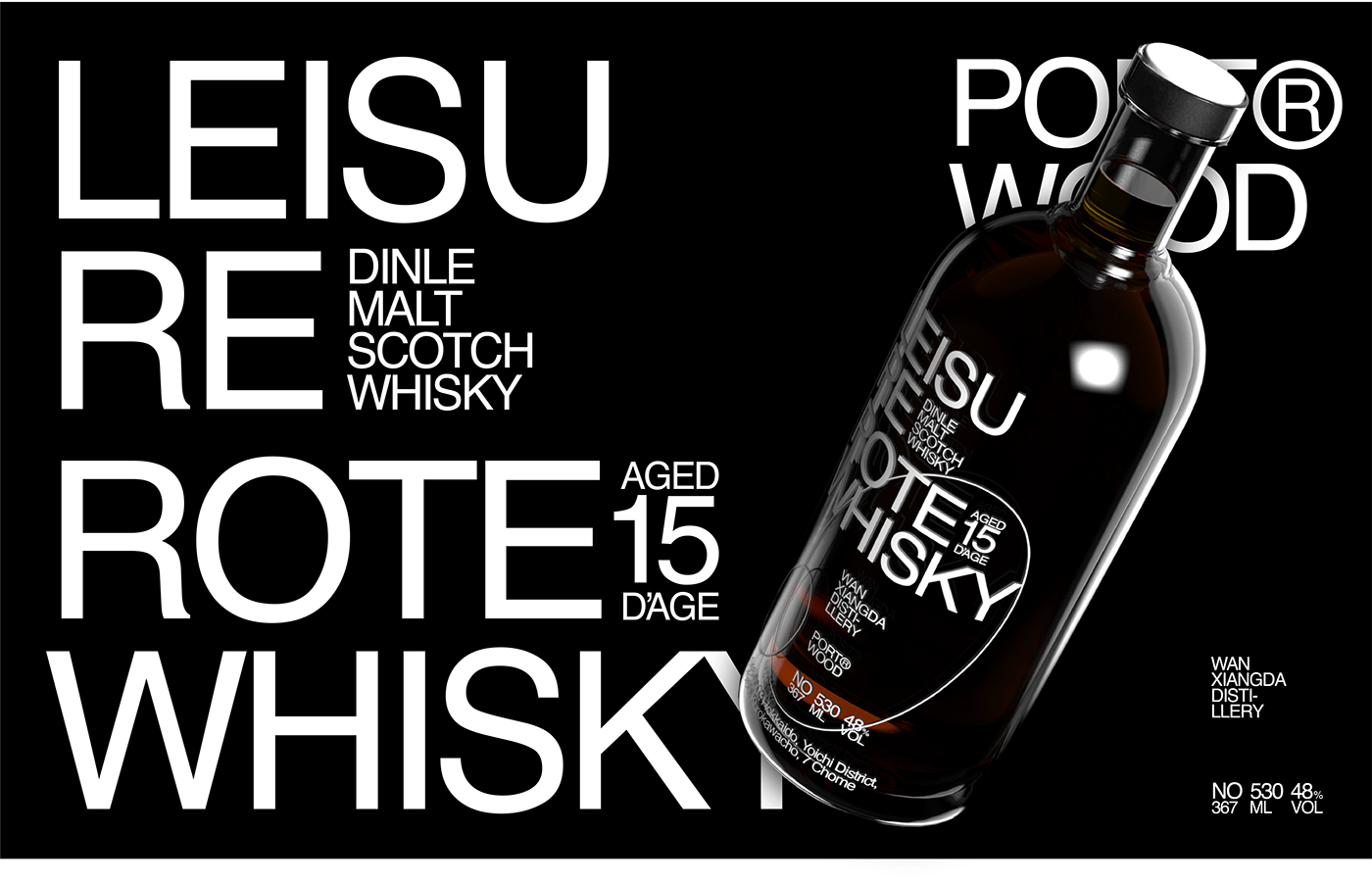
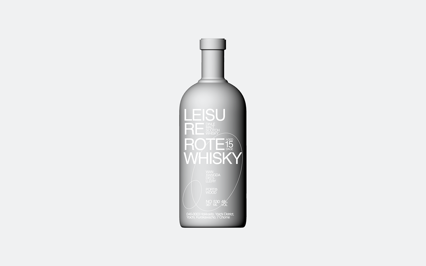
Whisky is a spirit with a stereotypically dark association. Wooden barrels, masculine design euphemisms, traditional serif fonts, you get the gist. Well, in a beautiful turn of events, designer Chen Wei Ming has created a whisky bottle that’s the antithesis of all the whisky design cliches. We’re talking bright colors, modern sans serif fonts, and a sleek bottle that will stand out in a sea of other whiskies. We’re into this refusal of the norm, and, if anything, we need more of it. Cheers!

Get unlimited access to latest industry news, 27,000+ articles and case studies.
Have an account? Sign in


