THIS IS IT! DIELINE Awards 2026 Late Entry Deadline Ends Feb 28
Happenstance Is Serving An Unexpected Modern Edge
By
Published
Filed under

By
Published
Filed under

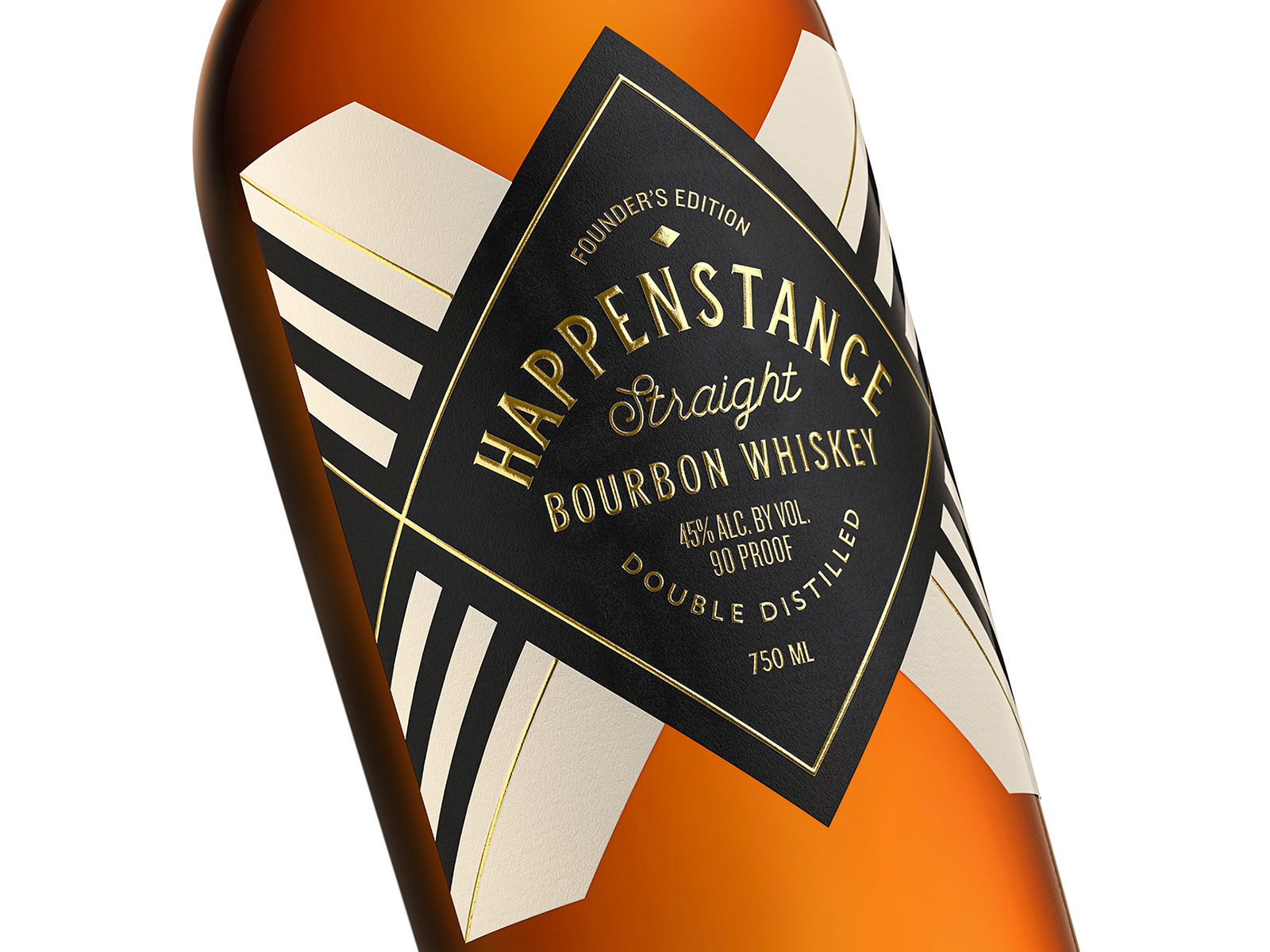
Happenstance is a whiskey brand that values tradition but isn’t close to the stereotypical old-fashioned brand that you might be used to. The brand’s founder wanted to respect traditional American bourbons with an unforeseen twist on today’s most sought-after flavors, which can easily be seen through the packaging designed by Pavement Design. Because Happenstance is a female-founded company, it was essential to the brand to ensure that the packaging was less focused on gendered tropes and more focused on a more sleek and modern design. The vintage lettering paired with the gold foiling did just that in an unexpected yet completely fresh way.

Happenstance is a premium bourbon whiskey that celebrates life’s moments that happen by chance. Carefully crafted in Nashville, Happenstance pays homage to the tradition of American bourbons, but with an unexpected modern edge. As a female founded company, it was imperative to create a design that didn’t focus on the typical masculine tropes often found in American whiskey branding. An edgy, sleek look was crafted that focused on a bold label shape, foil adornments and a modern “cowboy noir” aesthetic. This paired with vintage-style lettering helped communicate a product rooted in tradition, but positioned as a more modern and fresh take on high-end whiskey.
Get unlimited access to latest industry news, 27,000+ articles and case studies.
Have an account? Sign in