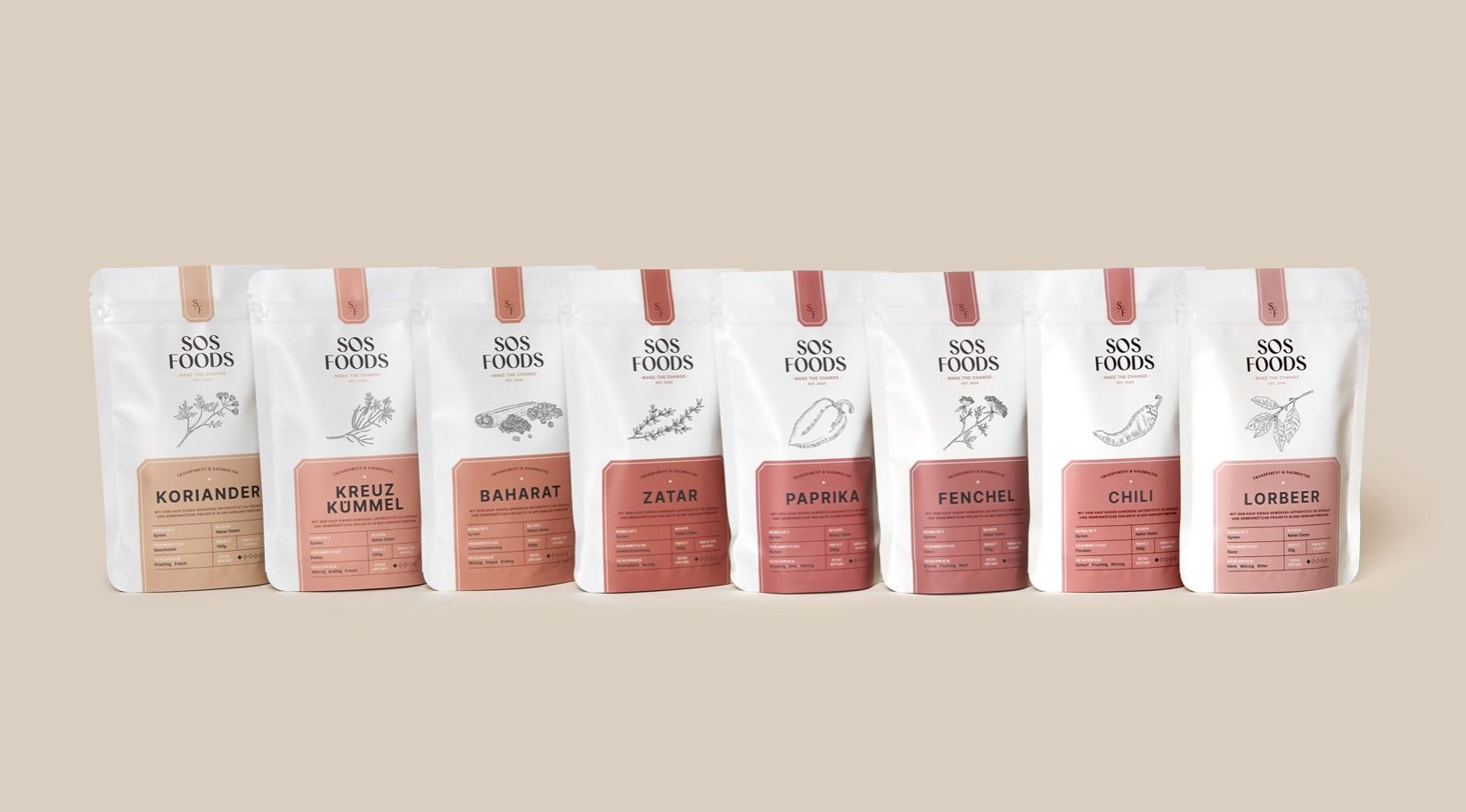
DIELINE SHOP - ALL HATS 10% OFF THIS WEEK ONLY
Featured image for Add A Little Spice To Your Life With SOS Foods

Add A Little Spice To Your Life With SOS Foods

by Chloe Gordon on 06/22/2021 | 2 Minute Read

SOS is a spice brand that's all about transparency. While you might not be able to see through their bags filled with flavorful spices, the outside of the bag details everything you need to know about how much the brand donates to the social projects of the region of the spice's origin. The color gradient of the products is a nice touch and makes me feel like I need to purchase all of the spices to create a complete set, even though I might never have used Lorbeer once in my life. The illustrations on the front of the label add a wholesome addition, especially in conjunction with the sans-serif typeface that radiates a more industrial feeling.


Editorial photograph

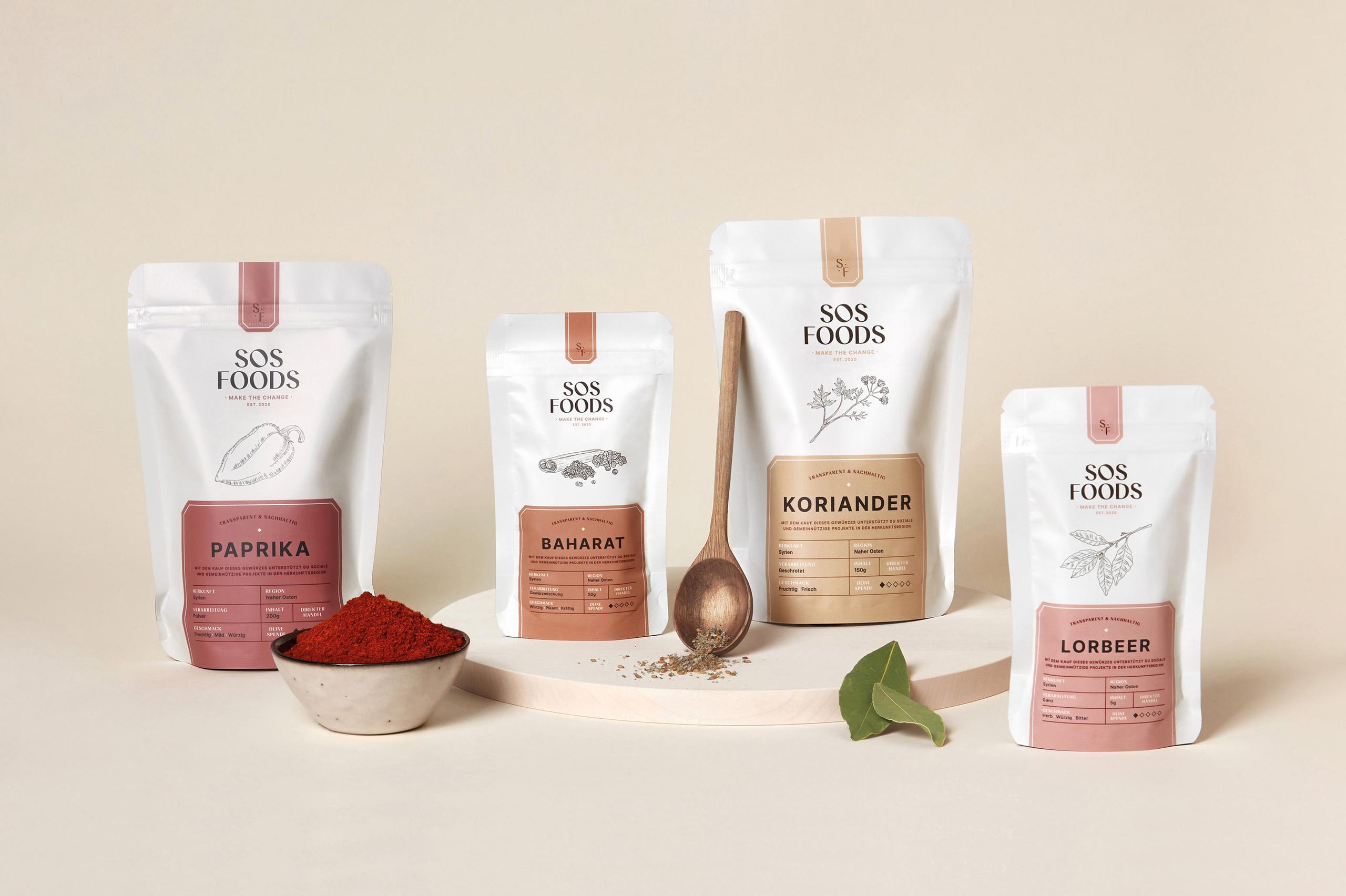
SOS Foods is more than just an online store for spices. Their concept: fair prices to producers and the generation of donations that flow directly into social projects in the regions of origin.

Natural products, personal contact with fair conditions, sustainable packaging solutions and a transparent publication of donations – with this mission, the two founders, Felix and Rami, want to raise awareness about the grievances in the food industry and re-establish fair trade. In addition, with each product sale 20% of the turnover flows into social projects of the region of origin, in order to help directly on site and support the people. The project starts with 8 spices from syria: Cumin, Fennel, Paprika, Chili, Coriander, Baharat, Zatar and Bay Leaf.

Editorial photograph

We have incorporated many small details into the packaging. The idea of transparency is one of the most important points for the two founders. And because there's nothing to hide, everything is communicated transparently on the products. The small diamond also shows the percentage of the donation. To visually support the idea of transparency, all important information such as origin, processing and taste of the spice is communicated in tabular form. As a central design element of the packaging we have chosen fine, hand-drawn illustrations. Each product gets its own individual line drawing that comes to life on the website. The gentle color gradient of the product range, the design of the diamond pattern, the hidden message in the bottom of the bag – all this rounds off the appearance for SOS Foods.

Editorial photograph