Terrapi’s Packaging Encompasses Diverse Unisex Beauty Ideals.
By
Published
Filed under

By
Published
Filed under
Unwind Studio has created the packaging for Terrapi that showcases the brand’s philosophy and purpose through an earthy color scheme and unparalleled typography. The reflection of the brand’s clean values is found through the minimalistic packaging that addresses many people, showcasing that the brand’s embracing unisex beauty paragons. It’s challenging to find a brand that practices what they preach, but Terrapi’s values elegantly shine through both in their messaging, branding, and packaging – a triple threat in the skincare industry.
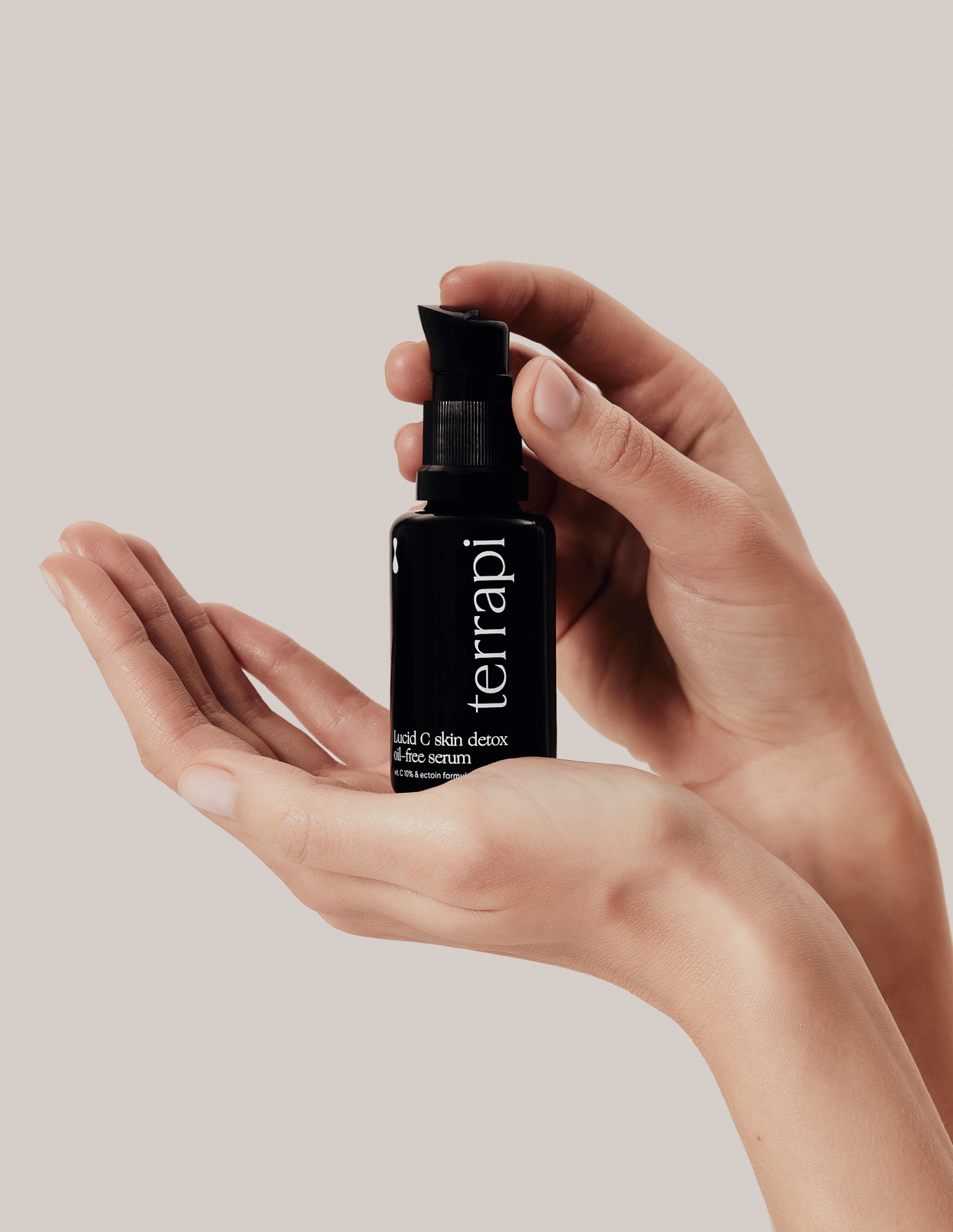
The packaging for @terrapicosmetics is an essence of brand’s philosophy where nude shades, unique typography and brand’s claim meet.
Get unlimited access to latest industry news, 27,000+ articles and case studies.
Have an account? Sign in


