Everyday Canned Food Packaging Design By Barceló Estudio Makes You Wonder If The Glass Is Half Full or Half Empty

Published

Filed under

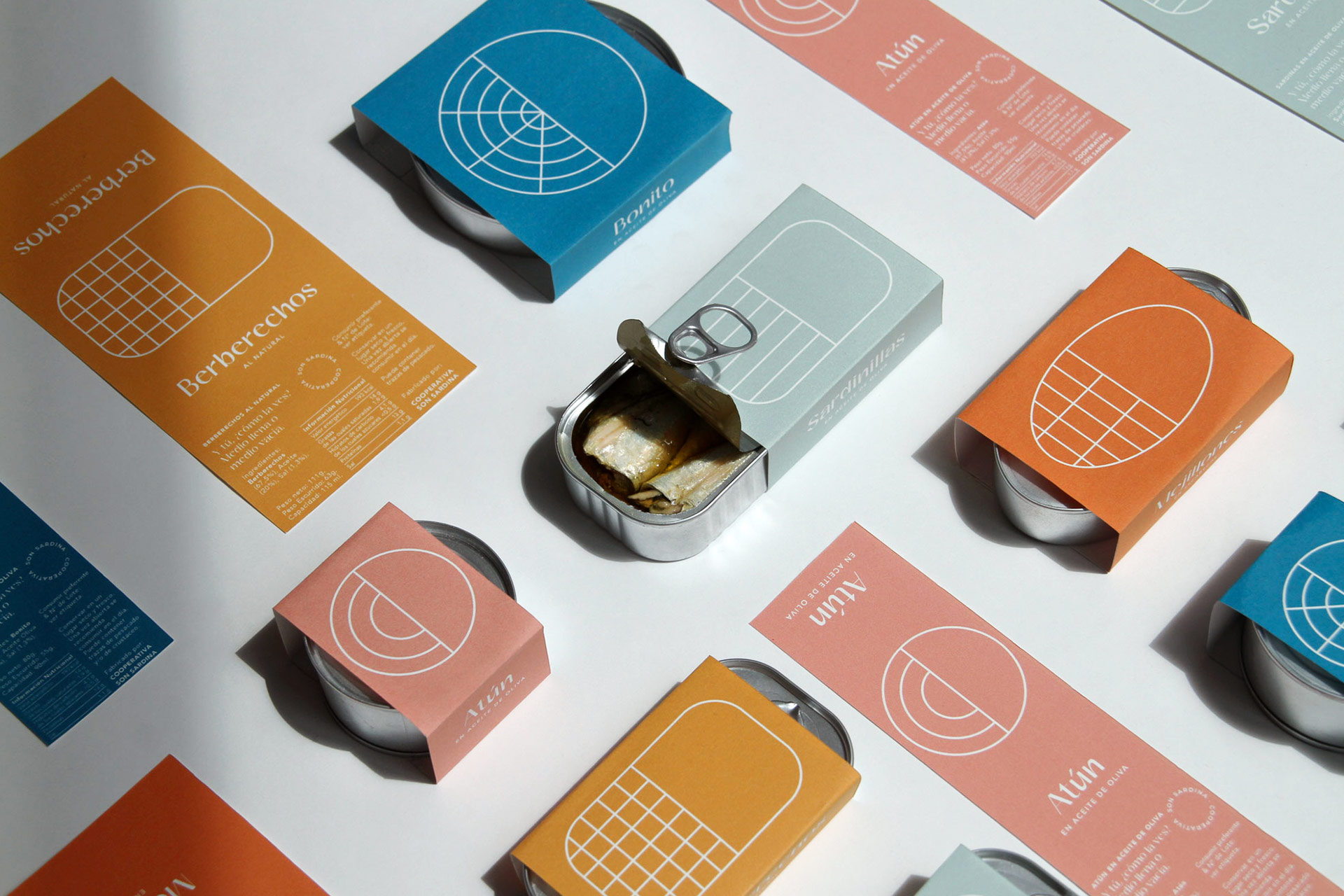
Sometimes the glass is half full, and sometimes the glass is half empty. The only thing that changes between the two, though, is our perspective. Barceló Estudio is challenging our outlook by creating the packaging of canned seafood products that insights a sense of the unknown. The half-done pattern is a nod to the glass-half-full conundrum, and we cherish it when packaging makes you wonder. The colors and typography are fresh and modern, and when paired together, create an almost tranquil aura. Now I’m curious, is the pattern design half-incomplete or half complete?


Editorial photograph

Company specialized in the distribution and marketing of canned seafood products.

The concept of the packaging is based on the metaphor that refers to the optimistic or pessimistic reflection of a glass half full or half empty of water. This experiment aims to bring us closer to the particular vision of the events that occur in our daily lives, and to place us in front of our own vision of all the things that happen to us. But, in the end, it doesn’t matter how you see the glass as long as you reflect on how it is, because in the end every vision is equally correct. The glass seems to be half full as well as half empty and it only depends on the moment in which this reflection is valued.

Calm, tranquility. Color, explosiveness. A new way of approaching preserves to our daily life, a pause, a moment. Also close to a new modern and young generation, with a fresh and reflexive communication. A way to go beyond a simple product, or a snack, or a Sunday ritual.

Editorial photograph

It’s about getting out of the routine and breaking with what we do every day. Maybe that surprise factor. Maybe new ways of seeing, understanding and reflecting on the everyday and turning it into something more special.

And how do you see the can?

Simple and minimalist lines to visually represent the contours of the cans and give each element a special prominence that together with the color creates flexibility in the variety of products.

Typography with a high contrast between the antlers with a slight modern handwriting, accompanied by a humanist typography with a geometric base.

Fedrigoni Freelife Vellum 215gr paper has been used and 1-ink offset printing.

Editorial photograph

This placeholder is removed when the ad slot is configured.

This placeholder is removed when the ad slot is configured.

This placeholder is removed when the ad slot is configured.

This placeholder is removed when the ad slot is configured.

This placeholder is removed when the ad slot is configured.

This placeholder is removed when the ad slot is configured.