Bom Dia’s Packaging Redesign Features A Bright And Juicy Pattern
By
Published
Filed under
By
Published
Filed under
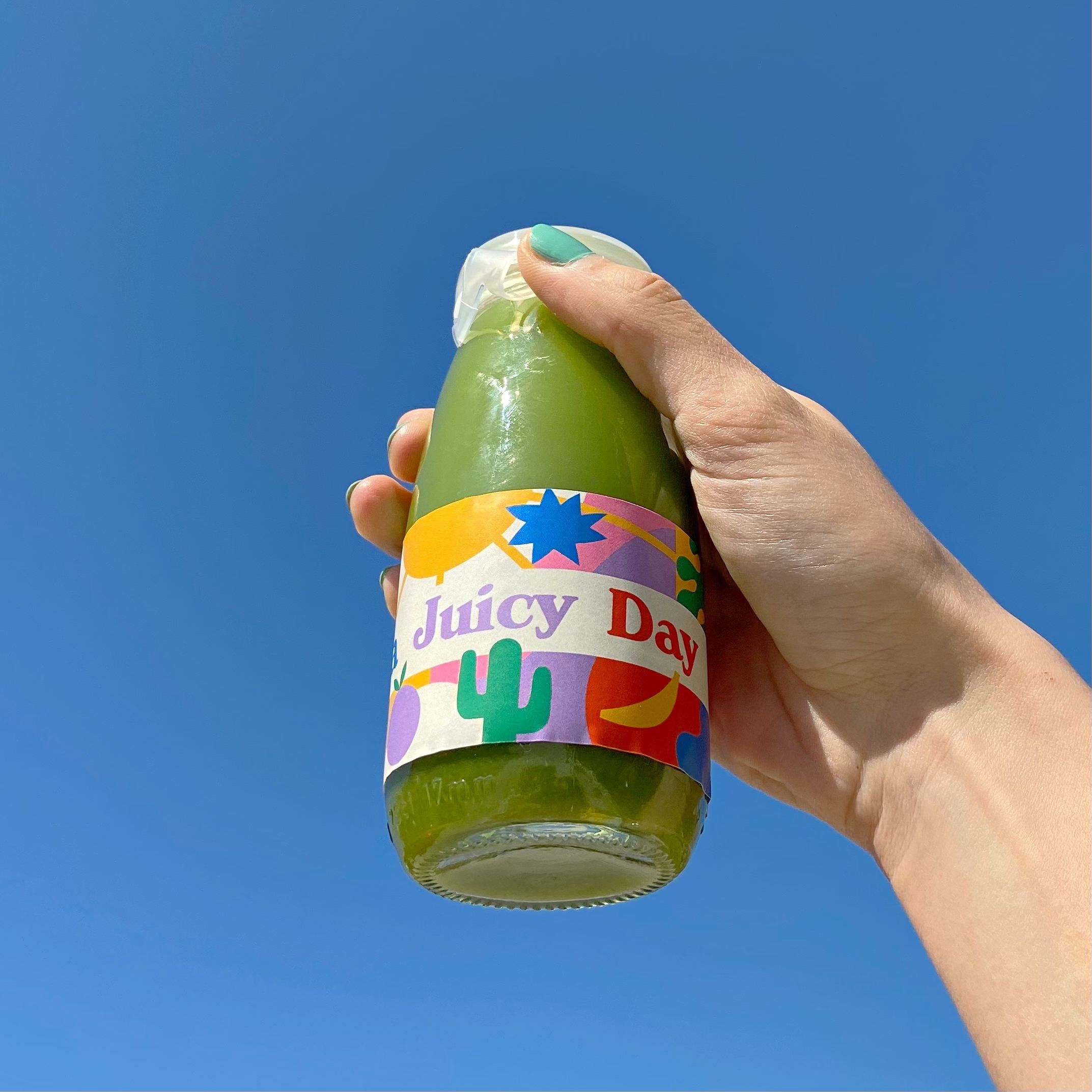
Bom Dia is an eatery located in Turkey that’s loved by locals and tourists alike. Yeraz Gökbas was tasked with redesigning their to-go food and drink packaging. From boxes to bowls to drink packaging, the goal for all was to keep summer fun, nature’s beauty, and bright energy in mind. Using colorful abstract shapes to make a pattern keeps these to-go orders looking like they’re ready to be taken on a summer road trip. Everything about this redesign is light and happy, perfect for a healthy and delightful restaurant.
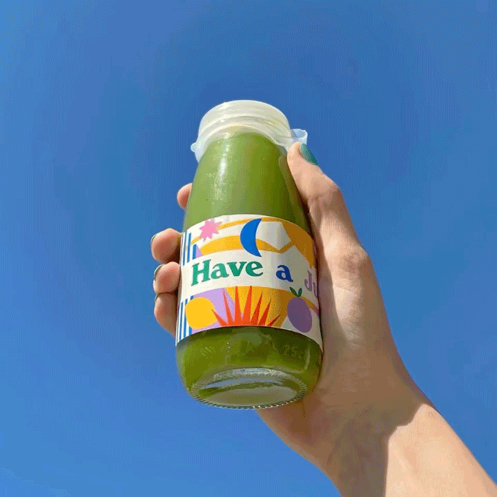
Bom Dia is a breakfast, brunch and cocktail bar in Turkey, a favorite spot of both locals and vacationers for brunch, smoothies and healthy, delicious food in sunny Alacati. The task was to re-design their to-go food & drink packaging (which includes: rectangle boxes, bowls with plastic lids, coffee cups, and glass bottles for juices, smoothies & iced coffee), as well as the packaging for their homemade granola (material: kraft paper) and their peanut/hazelnut butter (in glass jars). The keywords during the design process were summer, fruits, nature, sun, and energy. The abstract illustrations and the summery color palette therefore emphasize these elements.
Get unlimited access to latest industry news, 27,000+ articles and case studies.
Have an account? Sign in


