Minna is a brand that’s different from the other sparkling beverage options in so many ways. Not only does its packaging differentiate them, but the company donates a portion of its profits to charitable foundations. Brooklyn-based design studio Gander created a visual identity that splendidly captures the brand’s essence and the brand’s mission. The word “Minna” means “everyone.” The playful colors, geometric designs, and a sparkling logo all create inclusive and friendly packaging. Cheers, Minna!
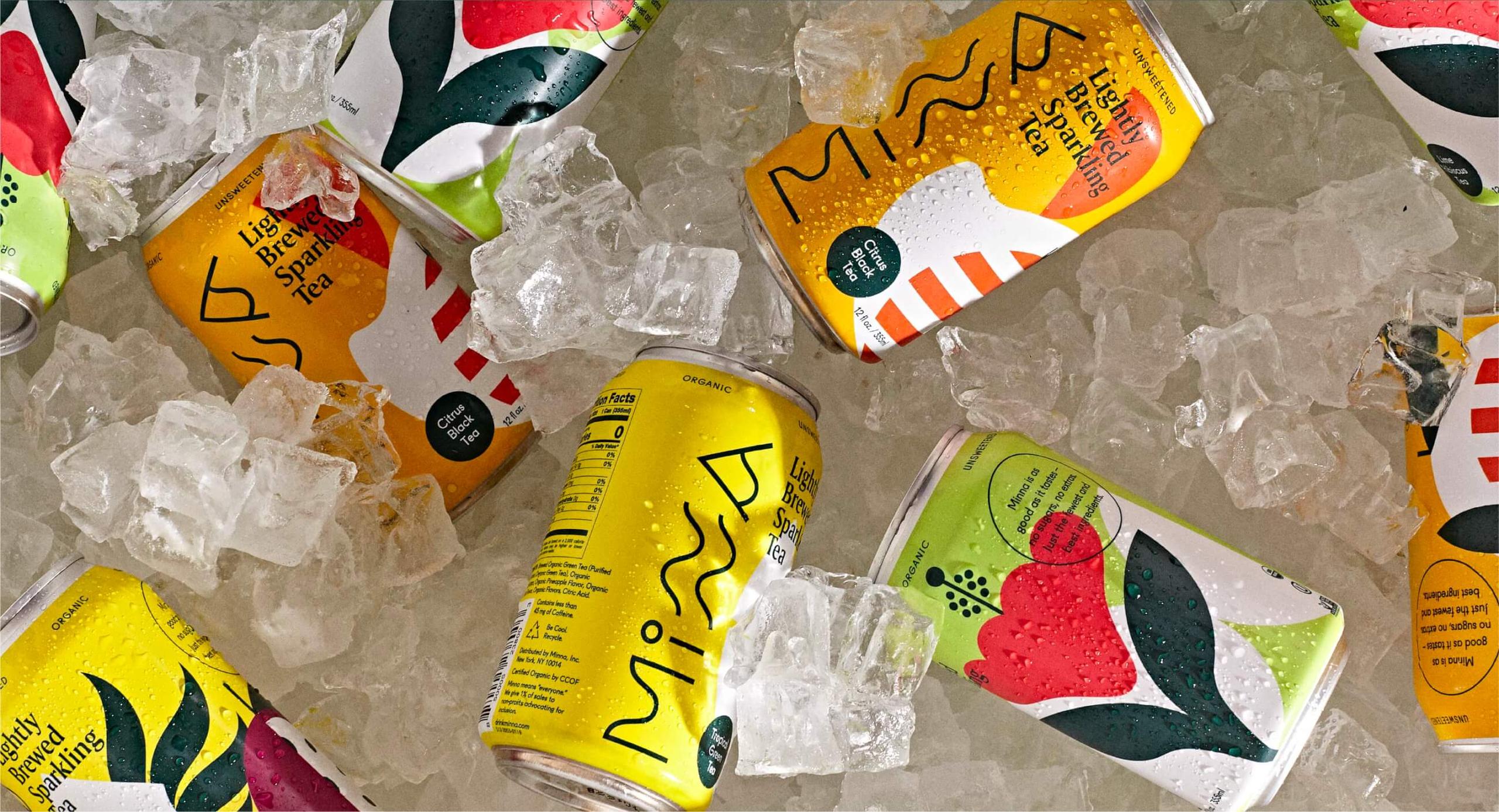
When Minna told us they were in the process of making a lightly brewed sparkling tea, we were hooked before we even tried it. When they went on to say they would be donating a portion of their profits to charitable foundations supporting inclusion, we were all in. From there, we set out to create a brand that would float above the rest in an ever-deepening sea of sparkling beverage options. One that would be as unique and refined as the flavors Minna was brewing up.