Featured image for The 11 Best Brands We Saw At Expo East 2021

The 11 Best Brands We Saw At Expo East 2021

by Fred Hart on 10/04/2021 | 4 Minute Read

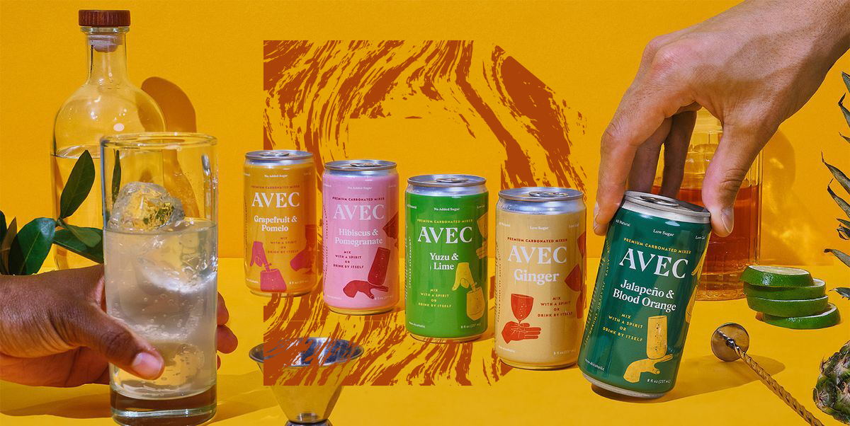
Expo East 2021, held in the city of brotherly love, a.k.a. Philadelphia, was back in action for the first time since 2019. Spirits were high, masks were on, and great design was aplenty. Entrepreneurial upstarts filled the aisles, showing off their new wares while challenger brands debuted overhauled looks. Plant-based foods, adaptogenic beverages, and better-for-you products reigned supreme.  

It was hard to pick from the star-studded crew, but here are 11 highlights from the tradeshow floor. 

Editorial photograph

Avec

Your cocktails just got the mixers they always deserved. Avec—meaning “with” in French—sports a playful series of hands making and mixing drinks with unique glasses on each piece of packaging. Beautiful type and fun color combinations, all from a minority-owned brand—now we’ll drink to that!

Editorial photograph

GoodPop

GoodPop, makers of cleaned-up-classics like push-pop, rocket pops, and creamsicles, recently cleaned up its own look to resemble something, well, more classic. The brand now sports an energetic and optimistic new look anchored by a teal brandmark and mouth-watering photography flanked by a star-studded cast of celebrity ingredients.

Editorial photograph

Orro

Sleek black packaging, gold identity, and sophisticated color palette—this brand hopes to become the gold standard of plant-based beverages. It’s got a touch of personality with elements like "FOR THE HUNGRY" on the front panel while remaining elegant and elevated in every other way.  

Editorial photograph

Hooray

PLANT-BASED BACON. I REPEAT, PLANT-BASED BACON. 

This company is working to defy expectations while delivering all of the joy that should come with the most revered of foods. Friendly typography, bright colors, and illustrative elements work harmoniously to create a jovial brand interested in plants, not pigs.

Editorial photograph

Happy Being

Welcome to happy health in a bottle. Happy Being is a polyphenol-promoting beverage (immediately heads to Google) and opts for a minimalistic design. The clean look reinforces the efficacy of the products, while the name and subsequent copy and tone of voice help give it a human touch.

Editorial photograph

Aura Bora

“Drink Weird Water.” That about sums up the awesome quirk and character of the Aura Bora brand, bringing an immersive world to life via illustration with unique and distinctive flavors inspired by herbs, fruits, and flowers. 

Editorial photograph

Odyssey Elixir

Mushrooms have always conjured up heady imagery. Odyssey Elixir, a line of mushroom and adaptogen beverages, is no exception. They managed to pull off elements from sacred geometry within its overall design system—creating something both consistent and flexible, with an ethereal gradient in the back for good measure. You’ll be happy to know it tastes as good as it looks, which isn't easy when dealing with fungi.

Editorial photograph

The Farmer's Hen

This chicken has flown the coop—freed from its old look, basking in the warm glow of a rebrand. Clean and modern with a heritage twist, the new Farmer’s Hen instills trust and quality and shares its efforts in taking better care of its chickens (certified humane) and people (family reach). 

Editorial photograph

Plant Perks

Plant Perks is a line of plant-based “cheeze” spreads and dips with a colorful mainstream look. The branding is approachable, lighthearted, and welcoming with a set of friendly colors and charming illustrations. 

Editorial photograph

Shire City

Shire City is bringing the fire now that they've undergone a rebrand to create a platform of drinking vinegars after seeing great success with its hero product Fire Cider. The new logo is a fun homage to that beloved product, and the packaging cleans things visually while simultaneously introducing ingredients cues to each pack.

Editorial photograph

FX Chocolate

FX is a brilliant phonetic name that perfectly suits its goods—a functional dose of high-quality supplements in handcrafted chocolate. The brand strikes the perfect balance between clean, clinical, and gridded typography with loose, paper-cut-like illustrations that soften the overall presentation. Chocolate has never been so permissible.