Featured image for Refreshing Innovations in the RTD Category

Refreshing Innovations in the RTD Category

by Richard Shear on 08/07/2020 | 4 Minute Read

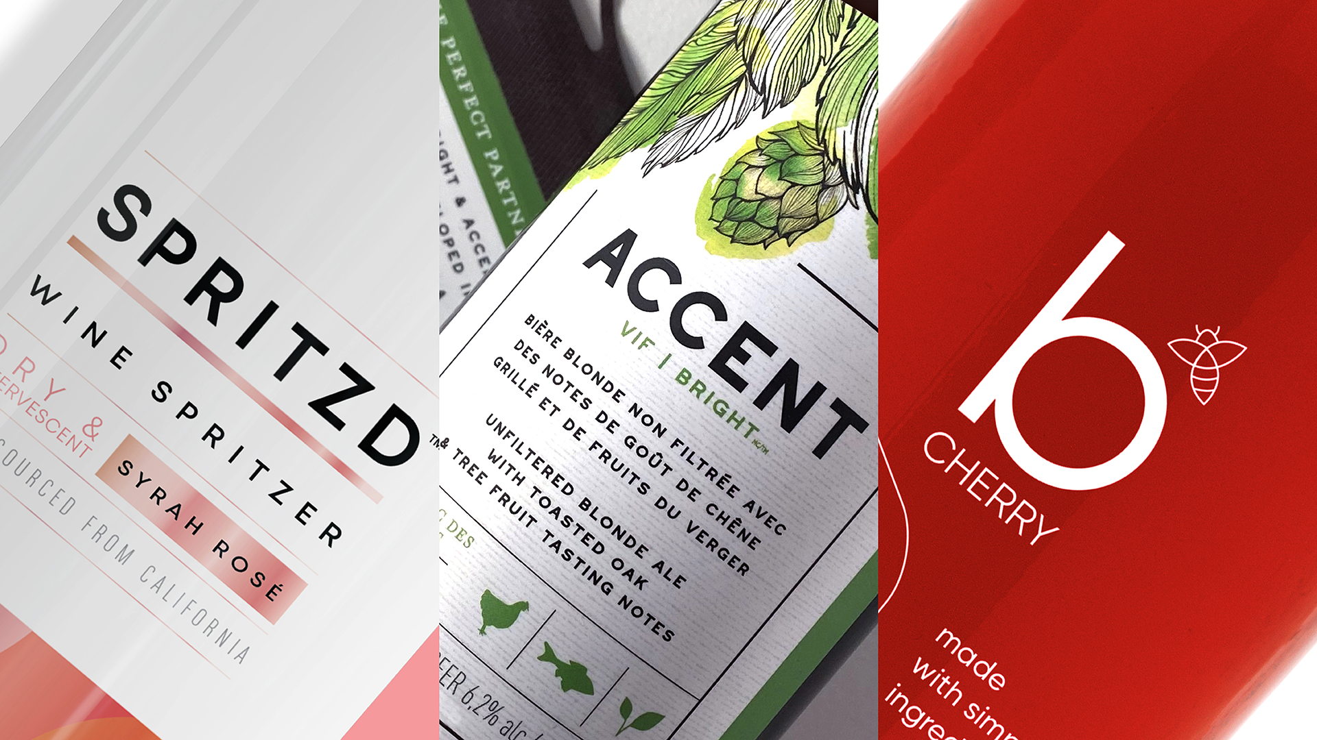
The ready-to-drink, single-serve cocktail category has demonstrated incredible growth in the U.S. and Canadian marketplace. As consumer lifestyle choices evolve, so too has the desire for new and inspiring drinks that enable a balance between social, health, and wellness. This influx of alternative beer, wine, and cocktail choices all feed the need for innovation.

Over the past year, the collaborative relationship with the Anheuser-Busch InBev, Labatt Brewery, and Mike’s Beverage Company innovation team has enabled Invok brands to bring three new-to-world beverages to market. Each drink uniquely addresses the needs of a younger demographic, championing health, and wellness consumer trends amidst a shifting culture, while cultivating a standout experience.

The design solutions tapped into specific elements of an evolving beverage culture with the creation of brands that responded to these shifts in consumer interest with unique visual characteristics:

  • Understated simplicity, to deliver a message of transparency and directness
  • Blurring of the lines between traditional beverage categories by mixing the heritage of beer and wine vernaculars
  • A reflection of pairing a new food culture with beverages selections that go beyond the simplistic and outdated wine choices of white, red, or rosé. 

Here’s how those three pillars guided some of our most recent work.

Editorial photograph

b is a naturally fermented beverage with the juice from pure fruit, honey, and yeast. Better still, the drink only has a 2.4% ABV and was purposefully designed to meet today’s wellness trends. A new name, brand identity, structural design, and graphics, culminated in a visual brand story that reinforces the purity and simplicity of this drink.

Simplicity guided creative exploration. The intentional reduction of color brand design elements and clear bottle allowed the product to take center stage in the overall presentation. The honest and understated delivery of the beverage's qualities combined with a whimsical sense of discovery in the brand identity is designed to intrigue and instill lasting value. 

Editorial photograph

Catering to the adventurous food lover seeking something other than just wine or beer, Invok crafted Accent, a beverage alternative that pairs well with a casual dining experience. 

Invok teamed up with brewmasters, insights, brand development, and commercialization groups to ensure the new name, identity, and visual expression delivered a premium feel, reinforcing the idea of mealtime pairing in a large bottle format perfect for sharing. The elevated yet approachable beers come in two flavors, one to pair with lighter fare and one for something on the darker side.

Our team focused on creating a design vocabulary that landed at the point where the beer and wine converge. The oversized multi-serve bottle borrows the glass form and color from iconic “longneck” beer brands, while the label set is rooted in the fine winemaking craft. Beautifully illustrated source brewing ingredients combined with a classic and controlled typographic expression elevate this unexpected yet familiar visual brand story. 

Editorial photograph

Spritzd delivers a refreshing, effervescent beverage targeting a female demographic that fosters a balance between health and fun in a social setting. AB InBev and Mike’s Beverage Company identified a gap in the ready-to-drink market and partnered with Invok to bring this first-to-market wine spritzer brand to the Canadian alcohol space. It is a genuine wine spritzer made with popular wine varietals and sparkling water with a low, 6% ABV with only two ingredients.

A mantra of “the lighter side of sophistication” fueled the brand development and packaging design. This was another example of two juxtaposed themes converging into one idea, and the Spritzd visual brand story beautifully merges these elements. The more sophisticated treatment of the brand identity and understated product attributes within an abundance of controlled white space sets up the adjacent expression of our new colorful and playful look of effervescence. The result is a fusion of simplicity and celebration.

Editorial photograph

We are all increasingly looking to explore new experiences and be part of new communities in all aspects of their lives. In the beverage category, this is leading to a new sense of convergence—the interest in combining elements that are unexpected, refreshing, and real. This sense of convergence is reflected, admittedly in different ways, in each of these three brands. 

Breaking convention isn't easy, nor is piquing consumer curiosity. But if you can offer them something new and unexpected through packaging design alone, you can create a genuine buzz, and maybe even attract a few fans.