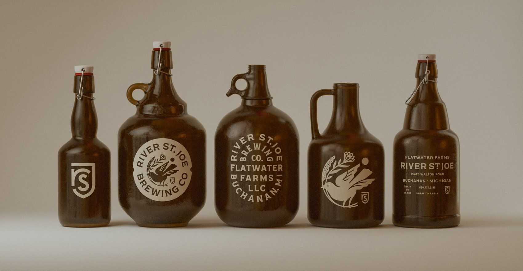
We’re digging the sophisticated and grass-roots design of River St. Joe brewery that utilizes growlers as a nice reminder to the past.
The earth-tone color pallate helps build a brand system that incorporates a bird carrying a flower. The mature illustration highlights that this is a brewery steeped in tradition, while the sticker system with playful copy such as “your new favorite” and “plant to pint” plays with a variety of modern shapes that prove that River St. Joe isn’t afraid to step into the future. The authoritative serif font utilized throughout the branding design proves that this is a brand who knows how to brew a craft beer, and plans on sticking around.
Grain-to-glass. Farm-to-table. The brewery doing it all deserves branding that does the same.