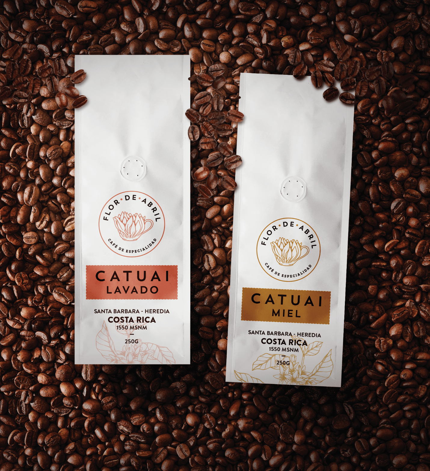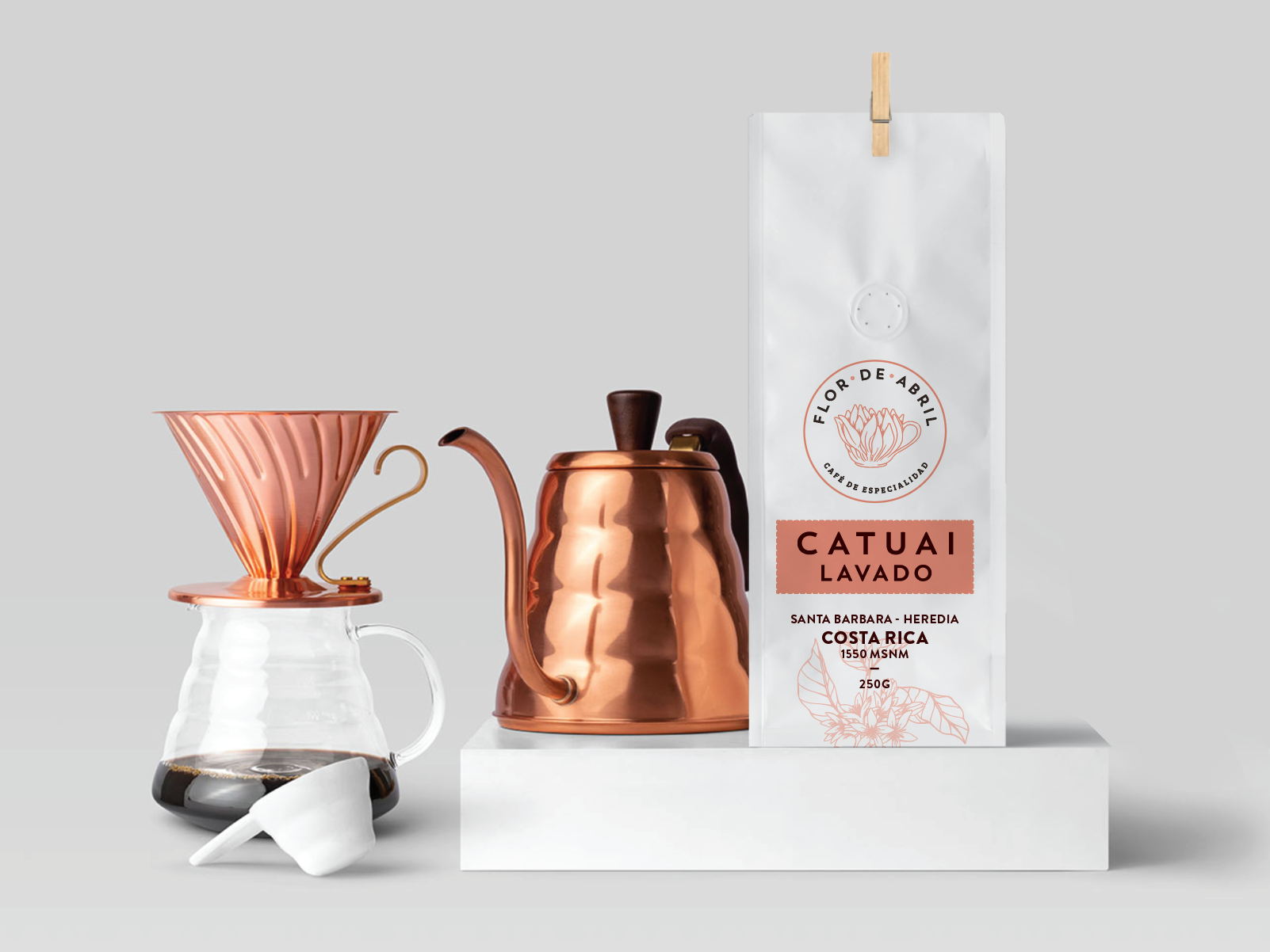
The brand design for Flor de Abril coffee is minimalist and clean, utilizing a striking white, that perfectly pairs with the packages illustrations and earthy color pallate. The circular logo is the hero of the brand design, featuring a flower blooming from a coffee cup, speaking to the living nature of the beans. The packaging pays homage to wear the beans are sourced, added a historical element to the brand’s story.
Gitanos is a brand management agency. Through creativity we create projects that help achieve the purpose of your business. We export our services to countries like Spain, the United States, Mexico, Guatemala, El Salvador, Nicaragua and Honduras among others.