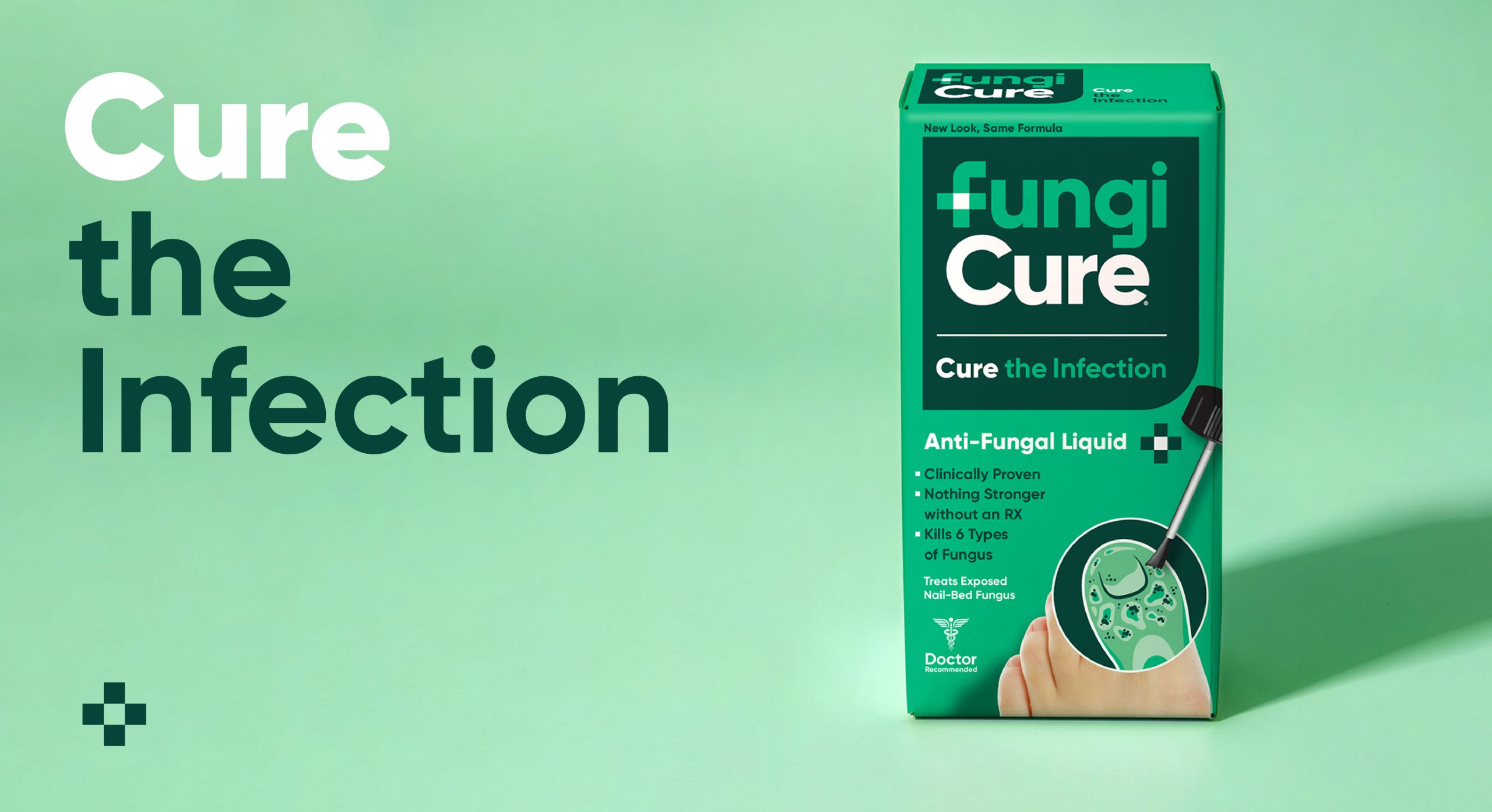
The typography-forward design for Tropik Cosmetic speaks to the no-frills method that the company produces their products. The box and color system creates a brand identify that is easy to understand, the medicinal in feel. By using type to deliver information about ingredients, Tropik Cosmetic inspires confidence in their consumers.
The desire was to convey a minimalist and modern, natural and responsible aesthetic. We brought a botanical illustration, in order to include the concept of Brazilian National Identity, which was an important point for the brand. The bottle of essential and vegetable oil is a small and delicate glass. The small area available to work on, the attributes and the ingredients of the product brought several layout restrictions making the project very challenging. Thus, we developed the entire graphic design of packaging, divided into 09 primary packages, 01 cartridge and 02 gift kits of different sizes


