THIS IS IT! DIELINE Awards 2026 Late Entry Deadline Ends Feb 28
We All Need A Little Satori Time Right About Now
By
Published
Filed under
By
Published
Filed under
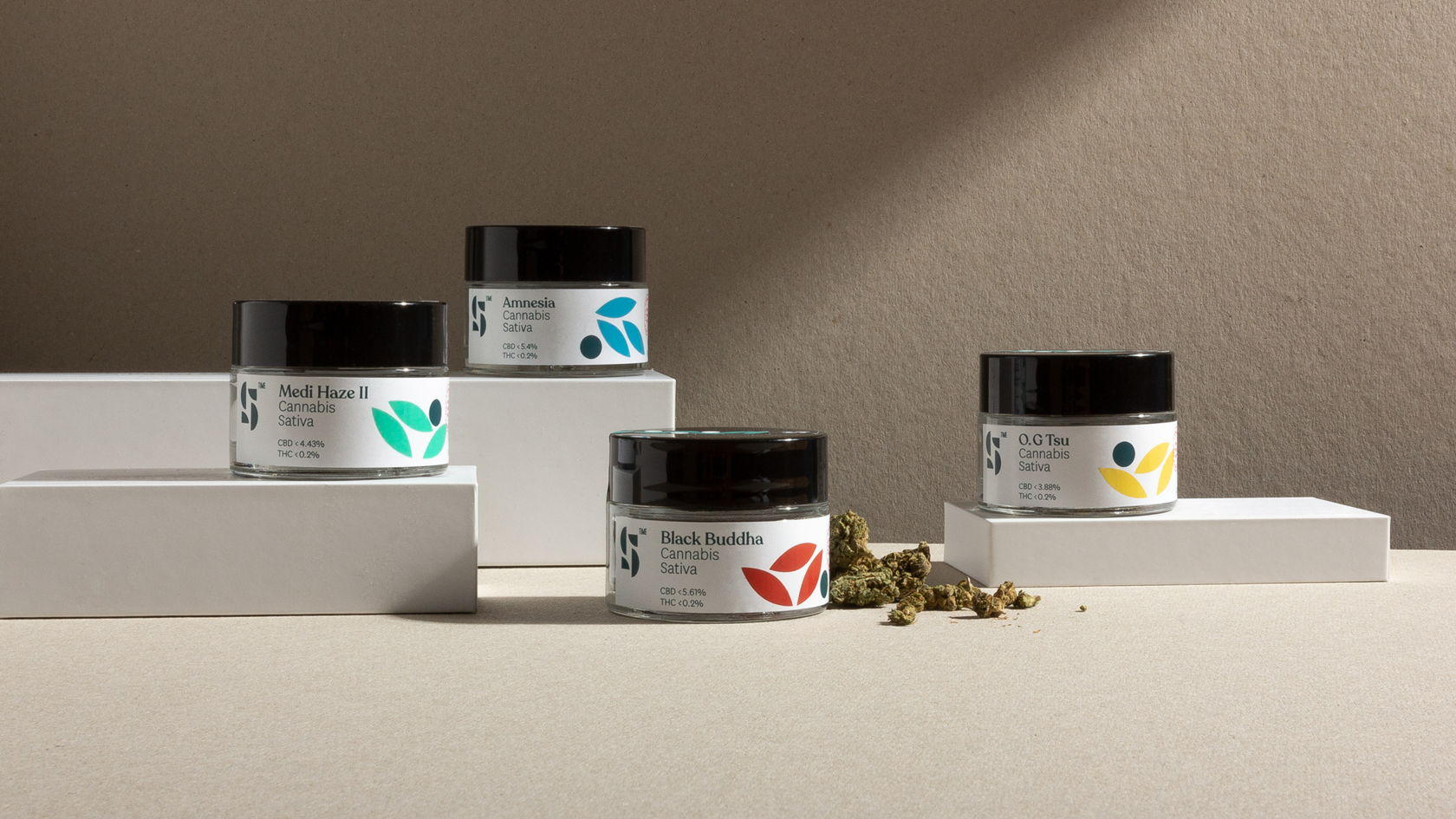
The packaging for Satori Time is balanced and playful. Utilizing various colored leaves to indicate strain, this cannabis company combines medicinal knowledge and playfulness in a way that gives it a lifestyle brand feel
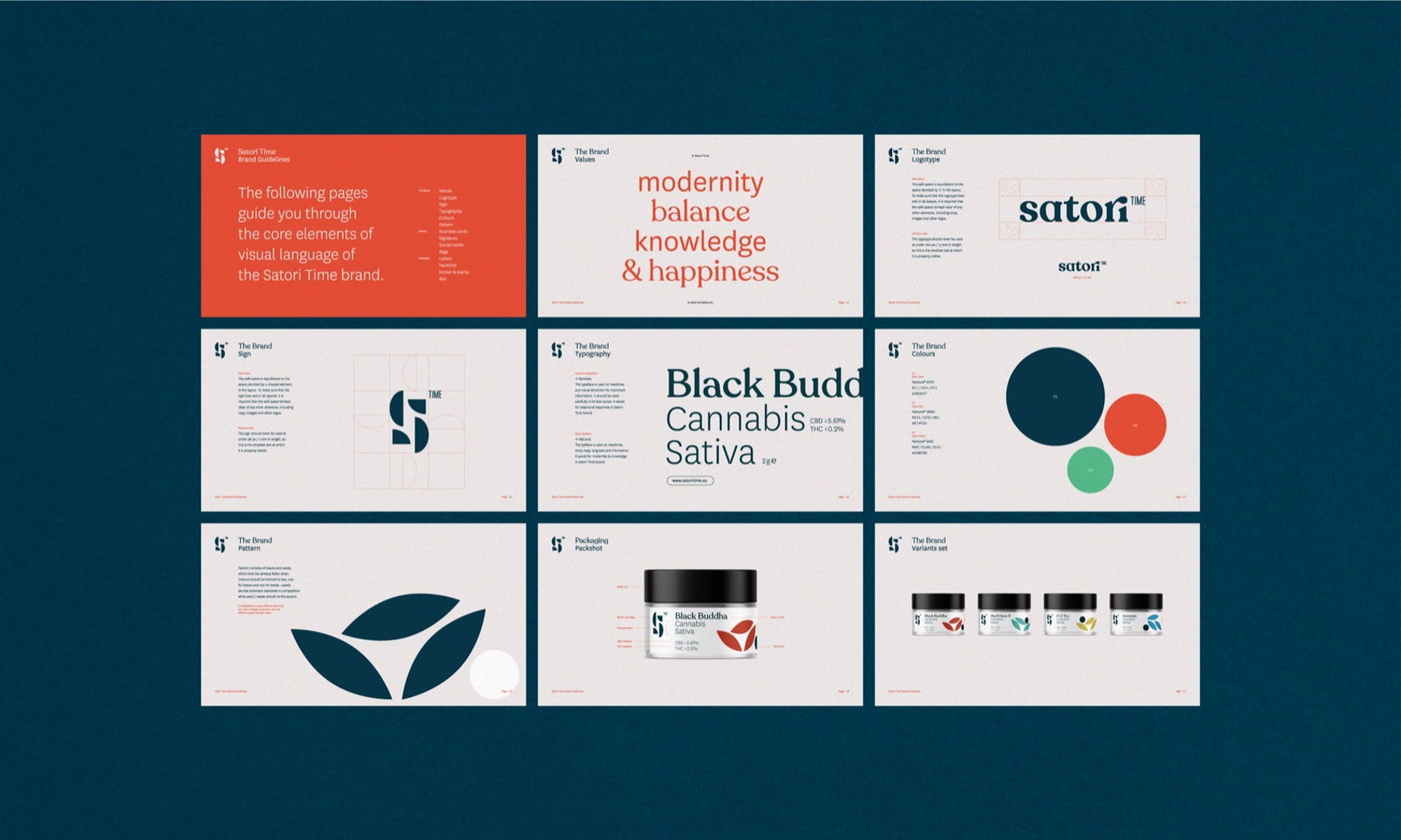
Living in a very fast reality we need to slow down and take care of ourselves. This is where Satori Time comes in — an ecommerce offering high quality cannabis products with CBD. The name of the company refers to buddhist tradition of self-realization, enlightenment and self-actualization. Our task was to create brand identity for the shop as well as a dedicated line of products. The brief was to keep it lifestyle with a medical side to it. We wanted to communicate high quality of the product and its supportive and harmonizing effect. We decided to use the main sign and the signet — a part of the visual language is a geometrical pattern used on the quality seal and as a colour differentiator between the types of cannabis. For quality communication we additionally use a japanese stamp — the user can be sure that he is getting the best product possible.
Get unlimited access to latest industry news, 27,000+ articles and case studies.
Have an account? Sign in


