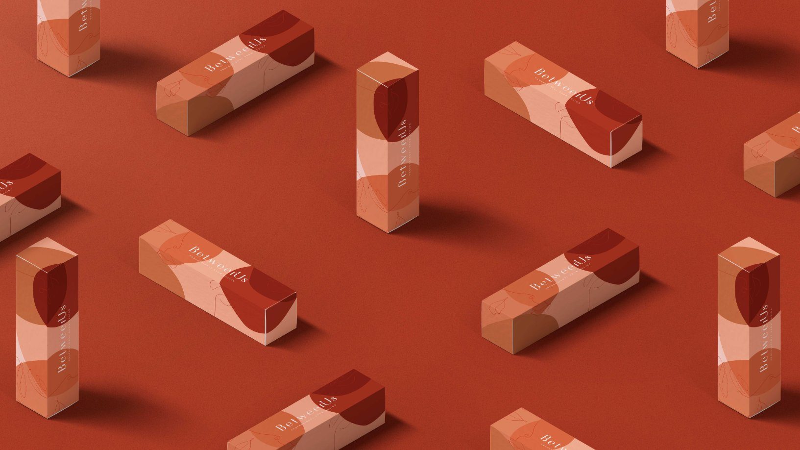
The brand design for BetweenUs eyebrows proves that the two lines on your face are the most expressive of all. Utilizing a rich earth-tone color palette meant to recall various skin-tones, the shapes work in harmony with the line drawings to create a sophisticated brand experience. Looking at BetweenUs’ decidedly feminine packaging, a consumer is invited to imagine all the possibilities their face could accomplish.

As the name implies, BetweenUs promotes the intimate relationship between the brand and the consumer, in the personalized design of eyebrows. The brand intends to value what really exists “between us”, (brand and customer), be it a story, a gesture or an action and, mainly, the excellence of the service.


