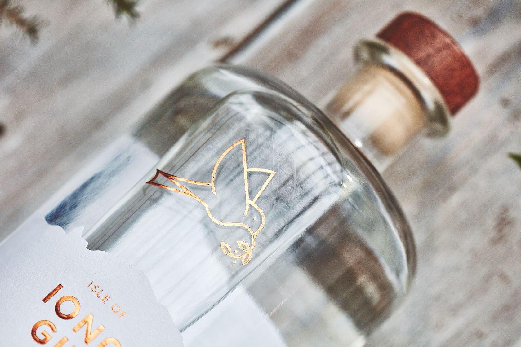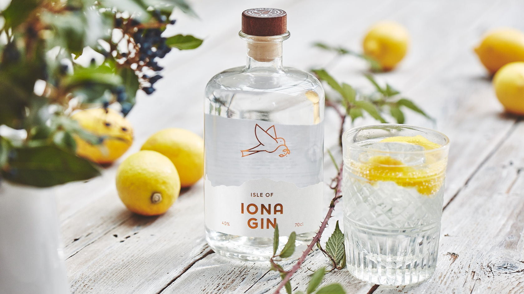
The bottle design for Isle of Iona Gin is clear, clean, and gorgeous. The foil flourishes reveal the luxurious nature of the product without overpowering the bottle design. The illustration of the dove, utilizes simple and clean lines that add a beautiful flourish to a minimal design.
Isle of Iona Gin is a premium spirit distilled from foraged botanicals from around the Island. The Gin has a pure, clean and zesty taste (perfect straight on the rocks with a twisted lemon.) With this in mind we wanted to create a brand that would capture the fresh and unspoiled beauty of the island. With a clear design, pure white nu-coated paper with a flash of bronze foil to show off its quality. Throughout the design we used our dove motif that represents peace, a well established icon of the Isle of Iona and the world famous Abby. The dove was also used to depict the foraging of ingredients gathered to produce the gin.