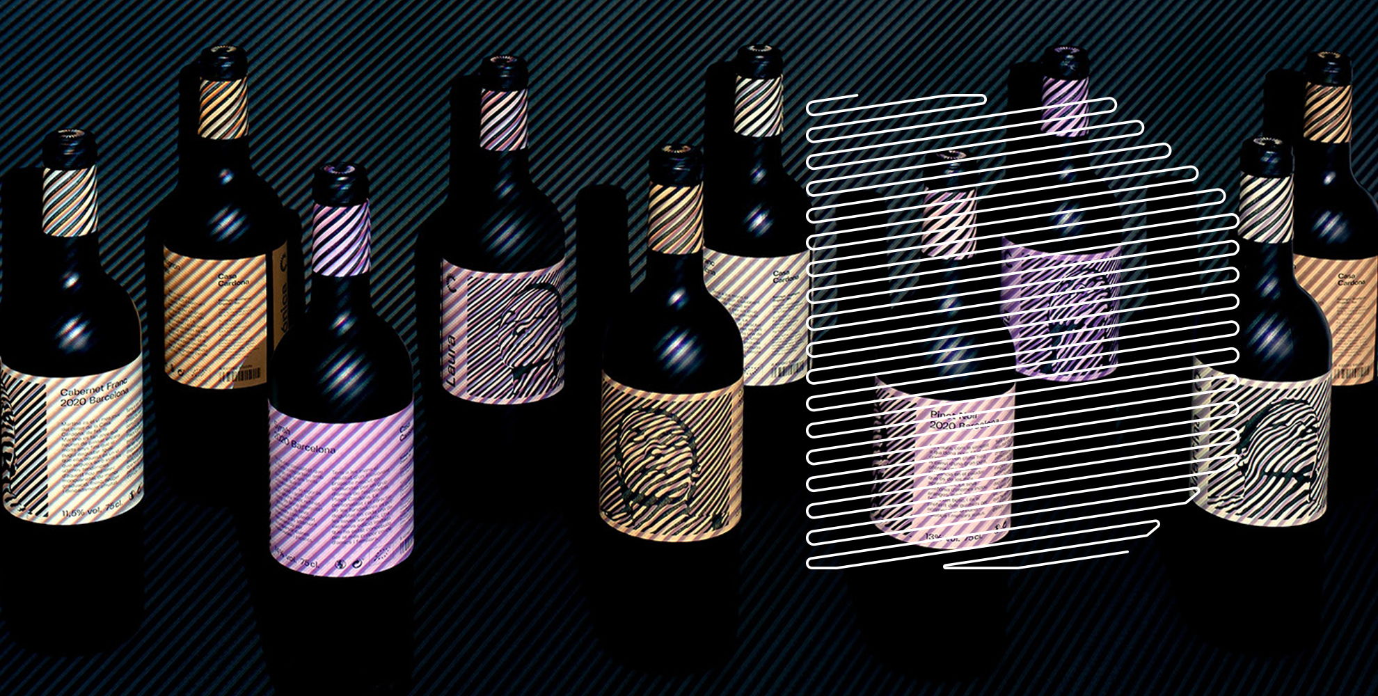
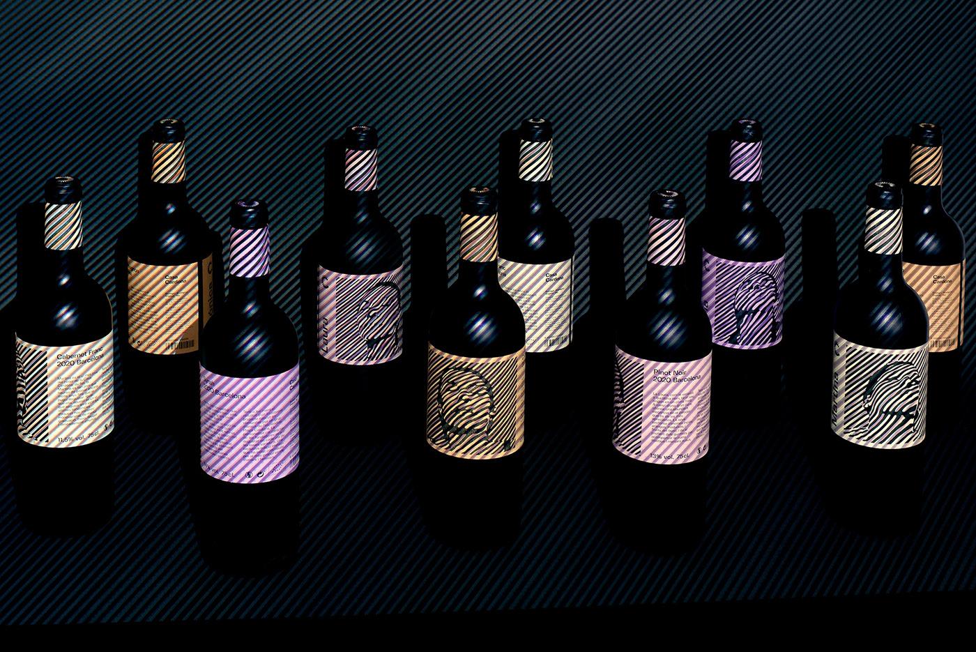
Pack of the Month: Marçal Prats Creates Dizzying Patterns For Casa Cardona Wines
by Bill McCool on 02/27/2020 | 4 Minute Read
OP art, or optical art, came to prominence in the early 60s and functions like an optical illusion. Typically, the form embraces geometric patterns, and when viewed, you can find hidden images, or it can give the impression of movement. Even when you come across it on your phone while you’re scrolling through Instagram, it can have a bewildering effect.
In other words, that shit could make you dizzy and fall down on the train if you stare at it a little too long. Or maybe that’s just us.
Still, we love the latest project from Marçal Prats. Tasked with designing the packaging for his friends at Casa Cardona wines, he wanted to imbue the bottle with the personality of the founders. Finding inspiration in the Op art pieces of Bridget Riley and Victor Vasarely, the labels were the result of a series of lighting experiments centered around illusion and perception.
We spoke with Marçal about the inspiration behind the project, and how he achieved this dizzying, visual effect.
In the project brief, you mentioned that this started as a series of lighting experiments inspired by folks like Bridget Riley. What came first, the experiment, or Casa Cardona as a client?
During the conceptual research phase, I realized that in the wine-making process, there is an outdoor period where bright sunlight is essential for growing grapes. Then comes the second part in the cellar, which in contrast, develops in the absolute darkness where the total absence of light is critical.
This duality, almost ambivalence between light and dark and black and white, evoked the Op-art process. I have always been deeply fascinated by this artistic movement, and it reached a new climax when I visited the recent Bridget Riley exhibition at the Hayward Gallery.
So, Casa Cardona first came as a client, although Op-art was always there.
Why did they choose to move in this direction for the branding and the packaging?
I knew in advance that each variety of wine would get named after the female founders. The wines would also be determined by their personality as well. Then I made the next crucial decision; the labels would show a portrait of them.
Walk us through the design process that you went through for this project.
I first created a series of black and white linework backgrounds—vertical, horizontal, circular—and turned them into light using a projector. After several tests, I decided on portraits with diagonal lines as they offer the best balance of definition, depth, and aesthetics when projected on them.
Because I shot videos instead of photos, I was able to choose the best snippets from where I extracted the final frames. I then vectorized the artworks to remove any raster effect and get the sharpest black and white contrast.
What was one of the biggest goals you set out to achieve with the Casa Cardona bottles, and how did you accomplish it?
I am satisfied with the modern take of the 60-70s graphic design aesthetics. In those decades, Eurostile was in wide use, and this is why I chose Fivo Sans Modern because of its resemblance, and it's so contemporary.
What does the packaging say about Casa Cardona as a brand?
From first sight, it communicates that it is a wine with an unusual origin; it arouses curiosity and invites you to read the description that goes with the label. The packaging works as a statement, instantly telling you that this is an exceptional off-brand wine-few wineries could make such a similar approach.
Patterns and linework like this tend to create a disorienting and dizzying experience for anyone encountering work like this—even on their mobile phone (Overtone Brewing is another one that comes to mind). Why do you think more brands experiment with this aesthetic?
In contrast to traditional brands where taste, look and feel are mandatory to be predictably recognizable, most of the new vineyards and craft breweries are pure anti-establishment cultural attitudes. Seasonal and limited-editions encourage experimentation in formats, fermentation processes, ingredients, and flavors; these values are carved into their identity, thus pushing the boundaries of what a packaging artwork can be.
It's hard for me to imagine any forward-thinking graphic designer who is not fascinated by the optical effects that you can achieve by overlapping patterns, shapes, colors, and materials.
What was the most challenging part of this project?
Today, when I walk into a specialty wine or beer shop, I experience the same feelings as when I visit a design exhibition; all new brands exude tremendous creativity! Therefore, developing a design that is recognizable, unique, and memorable is undoubtedly the biggest challenge.