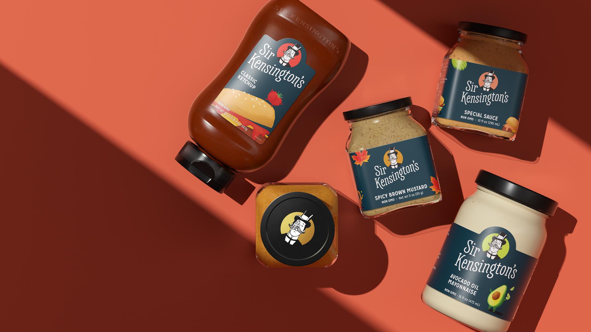
Featured image for Sir Kensington's Redesign Elevates The Brand To The Next Level

Sir Kensington's Redesign Elevates The Brand To The Next Level

by Casha Doemland on 04/01/2019 | 3 Minute Read

Sir Kensington's ethos revolves around the fact that food creates a powerful connection that can reduce the divide among people around the globe, despite geographical, cultural or ideological differences.

They are a company built on cleaner, sustainable condiments such as ketchup with real whole tomatoes and less sugar and chipotle mayonnaise that uses certified humane free range eggs to help enhance those moments at the table surrounded by friends and strangers alike.

Editorial photograph

When you put that much love into your products, you've got to deliver the same amount to the branding and packaging that sells and houses it. Starting with the development of Sir Kensington himself, the character featured front and center on their labels and the living spirit of the brand that is knighted for nothing but the finest ingredients, purest experiences and delicious taste. He's all about creating a balance in integrity and charm; hence the dapper get up.

After five years of rocking the same design—a white backdrop with Sir Kensington front and center underneath colorful, yet clean typography—the in-house marketing and creative team realized it was time for a redesign.

Editorial photograph

"A new visual strategy was needed to as our reach grew and our categories and channels expanded to continue delivering on the brand's promise," states Matthew Loyd, CMO at Sir Kensington's. " We developed a new, more prominent logo, as well as the midnight blue trade dress – consolidating our palettes and messages to their effective minimums."

Editorial photograph

The new typography utilizes Mission Gothic and Silva as well as custom typography for the brand's logo that sits directly below Sir Kensington himself. From there, they added fun little illustrations of a hot dog with arms for the yellow mustard, a raspberry running across a lemon for the raspberry vinaigrette and an egg with a monocle for the classic mayonnaise.

"The one immutable truth in our process to stay true to the brand was that Sir Kensington, as he was drawn, was our single strongest and most recognizable brand asset," shares Loyd.

Editorial photograph

"We knew our brand recall was low and that we had a multisyllabic name that was originally quite small on the package,” he adds. “So, there was a lot of work to do. By keeping our namesake at the center, we stayed grounded in the most loved embodiment of the brand and the richness of our history." 


Editorial photograph

Considering the notion that millennials hate mayonnaise, which has apparently been proven time and time again by Buzzfeed, Sir Kensington had to do everything in their power to stand out. Introducing exotic flavors, some of which are vegan-friendly, to hit the market are legitimately delicious and well worth placing your trust in glorious, wonderous mayonnaise once more before throwing in the towel.

Plus, it doesn't hurt that the Chipotle Mayo is an excellent condiment for your homemade breakfast sandwiches.

Which, I mean, come on guys.

Editorial photograph

Photo Renderings by The Studio of Nathan Dreimiller