THIS IS IT! DIELINE Awards 2026 Late Entry Deadline Ends Feb 28
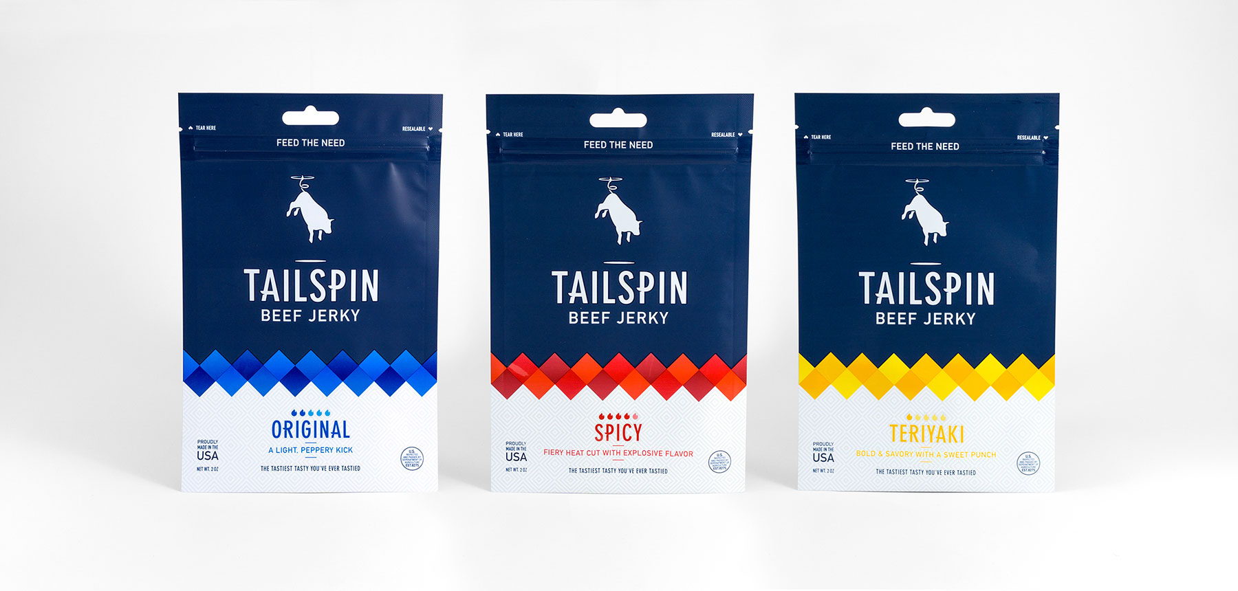
By taking a clean approach to design, Brett Lair made sure that Tailspin Jerky had a look that would be more approachable than the existing products on the market. With carefully crafted typography and a more subtle approach to color, this jerky packaging definitely stands out from the rest.
“Tailspin Jerky is a company defined by quality and an abject refusal to take itself too seriously. In the crowded snack space, Tailspin’s refreshing sense of humour helps to cultivate a strong identity. An identity defined by fun, flavour, and questionable business decisions. Even the name, ‘tailspin’, with its traditionally negative implications has been ironically embraced. In a world filled with cookie cutter brands, Tailspin lets their actions and product define their name, rather than letting the name define their brand. Tailspin is a jerky that everyone can enjoy, from the family that is out camping to the group of friends kayaking up Everest, and the design had to reflect this.”
“When it came to packaging, we knew that there were a few things dominating the jerky shelves—black and craft bags, overly macho themes, and loads of hand crafted, artisanal buzzwords. Straying from the status quo, we landed on a design system and visual language that’s scaleable and much more approachable.”
Get unlimited access to latest industry news, 27,000+ articles and case studies.
Have an account? Sign in