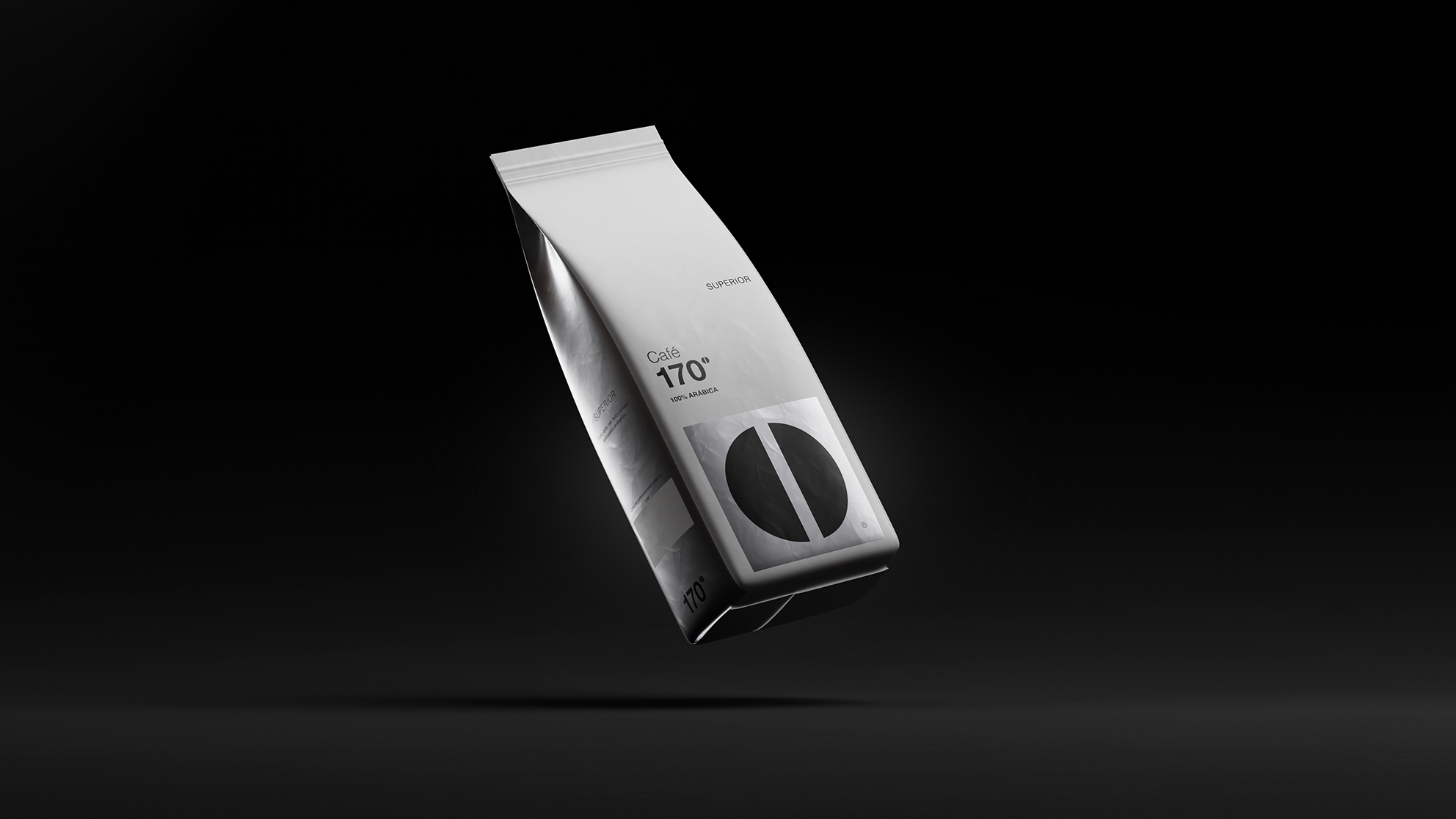
Student Spotlight: ArtCenter Packaging Students Design for the Cannabis Industry
by Theresa Christine Johnson on 08/16/2017 | 6 Minute Read
Marijuana isn’t just for smoking anymore—it’s become a hot industry that has now extended into categories like Beauty & Health, Beverages, Spirits & Liquor and more. Medical marijuana sales are projected to grow from $4.7 billion in 2016 to $13.3 billion in 2020, so for the Spring 2017 Packaging Design class at ArtCenter, The Dieline’s Founder Andrew Gibbs and Partner Jessica Deseo wanted their students to take on this booming industry. We spoke with them to learn a little more about what their students designed and what it might mean for the future of cannabis.
Why did you choose this semester's project to be for cannabis packaging?
Jessica: After the passing of Proposition 64 in California we thought the project would be truly relevant to today’s market. We’ve also seen a surge of new cannabis products launching with some amazing product and packaging. It is a booming new industry that is ripe for innovation. The packaging now is nothing like it use to be with brands like KIVA, AYA, and Bloom Farms that have elevated the category. We wanted the students to design their own brand and products with the new California regulations in mind.
Andrew: We also thought it would be fascinating to see what our students would come up with in a category that is essentially brand new, with no defined standards as far as packaging and branding. The project was not only to design the packaging but to conceptualize an entire brand, the products, packaging and branding, as well as an art/photography direction.
What did you hope for students to achieve through working on their design?
Jessica: We wanted them to really understand what it would be like to design for an actual start-up cannabis client, with all of the new CA regulatory restrictions in mind. The results required a lot of research, but each student presented a realistic concept that carefully considered has every new legal requirement on the packaging.
Andrew: Rather than everyone working on the same brand, it was important that each student have a unique brand and portfolio piece. We wanted the project to be as realistic as possible—something that could enter production tomorrow. We wanted them to consider their target customer, the consumer’s needs and desires, the state of the cannabis industry and create a product line that looks to the future.
How did Art Center students disrupt this category with their finished designs?
Jessica: The product selection was what truly shocked me. The students were able to do extensive research on what products can be sold with cannabis. We have everything from beauty products to teas, beverages and personal care items.
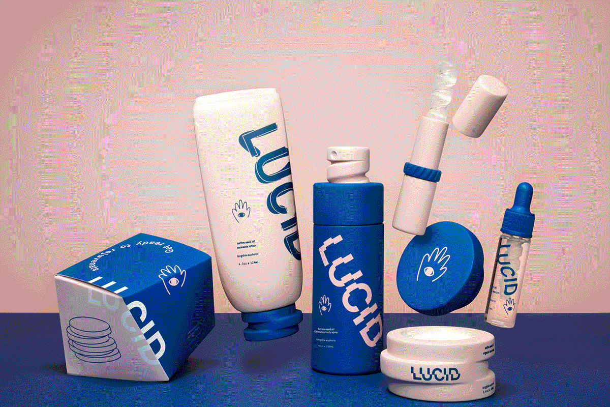
Andrew: Lucid for instance, is a Cannabis infused skincare and cosmetics line that truly looks like nothing else in the category. MLAB is all about constrained and limited dosage, which is not the typical category norm. Atma is a Cannabis line that looks more holistic and natural than what currently exists.
What were some of the standout elements from some of the projects, and why?
Jessica: The branding on many of the concepts were really stellar, and realistic. Some of the students naming and reasoning behind the name followed by the design required a lot of concepting and branding with truly real-life results. I can see some of the projects, if funded today, would be easily sold and quite successful in the market.
Andrew: The structural design of Lucid is Salvador Dali meets Sephora. With a flexible branding system, it is a refreshing take on Skincare & Cosmetics products, and it really takes what Cannabis products can be to another level.
What were some of the biggest challenges you saw students encounter with designing cannabis packaging? What solutions did they create for these problems?
Jessica: The biggest challenge was creating a brand collection that made sense. I also think this project was particularly challenging because of the many different steps the students had to take, which any start-up client would face like the naming of the product and the product selection. Once that was complete the final graphic application with legal regulation which at times can disrupt the design.
Andrew: Typically in this class, students are given an existing brand and product range to redesign. This term was completely different—they had to create an original brand name, brand concept and product selection that fit with that. Typically, students thrive on constraints. This project did not provide many constraints, so it was a challenge for them to have to balance so many different ideas and concepts that they could do, and create something that made sense for the market.
Based off of what your students submitted, what do you think we can anticipate and/or will need from cannabis packaging in the future?
Jessica: This really opened my eyes to realize that this assignment was relevant to what is to come in the future with cannabis. I also think the possibility of creating a really high end product line is truly possible.
Andrew: We are seeing a category that is on the verge of going mainstream. In the past, Cannabis has been seen a certain way, for hippie types and “stoners.” Our students showed us a glimpse into the future of this category. A future where Cannabis is more socially accepted, with products that truly change the perception and the face of the category as a whole.
Designed by: Xiaoyi Xie, Angela Pak, & Ziqi Wang
ArtCenter College of Design