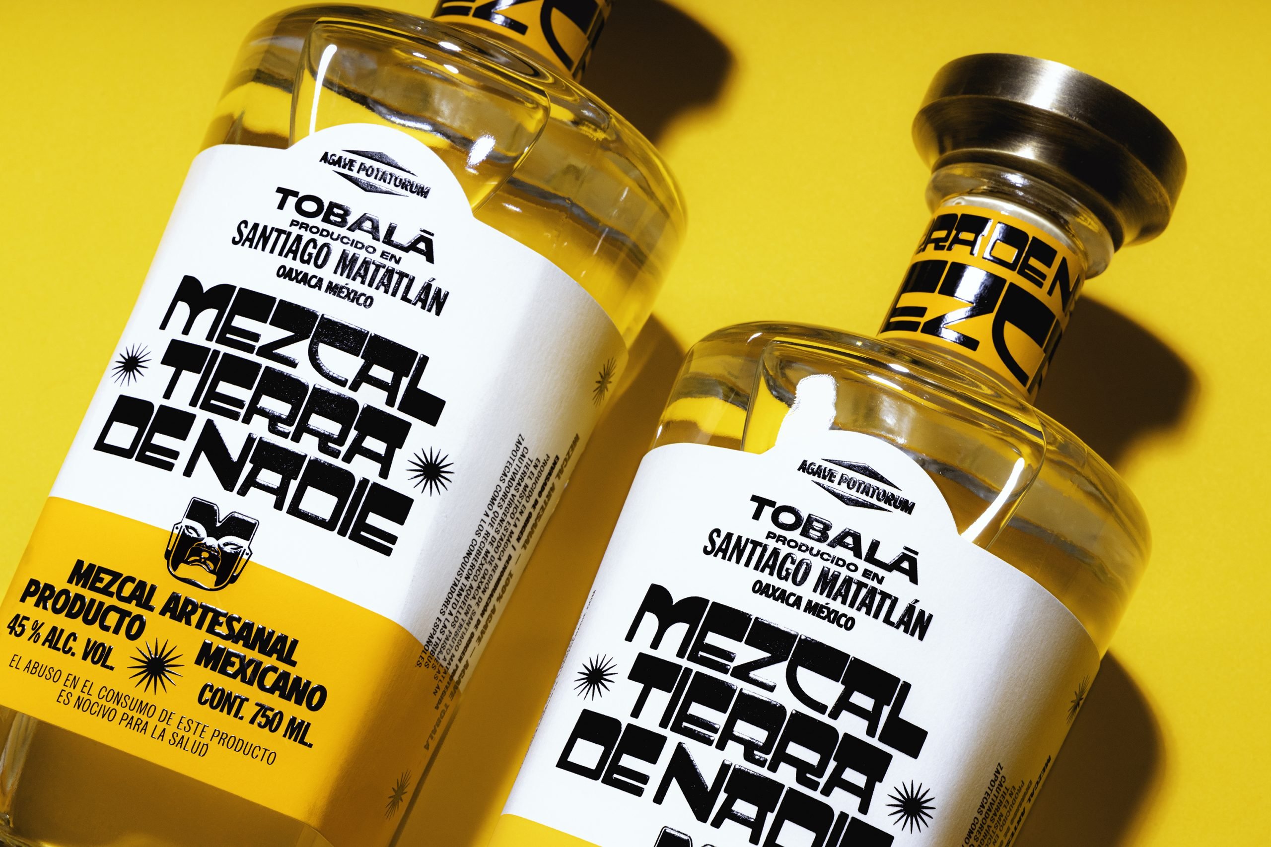
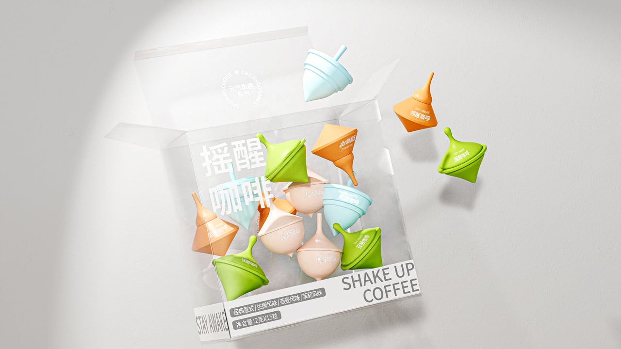
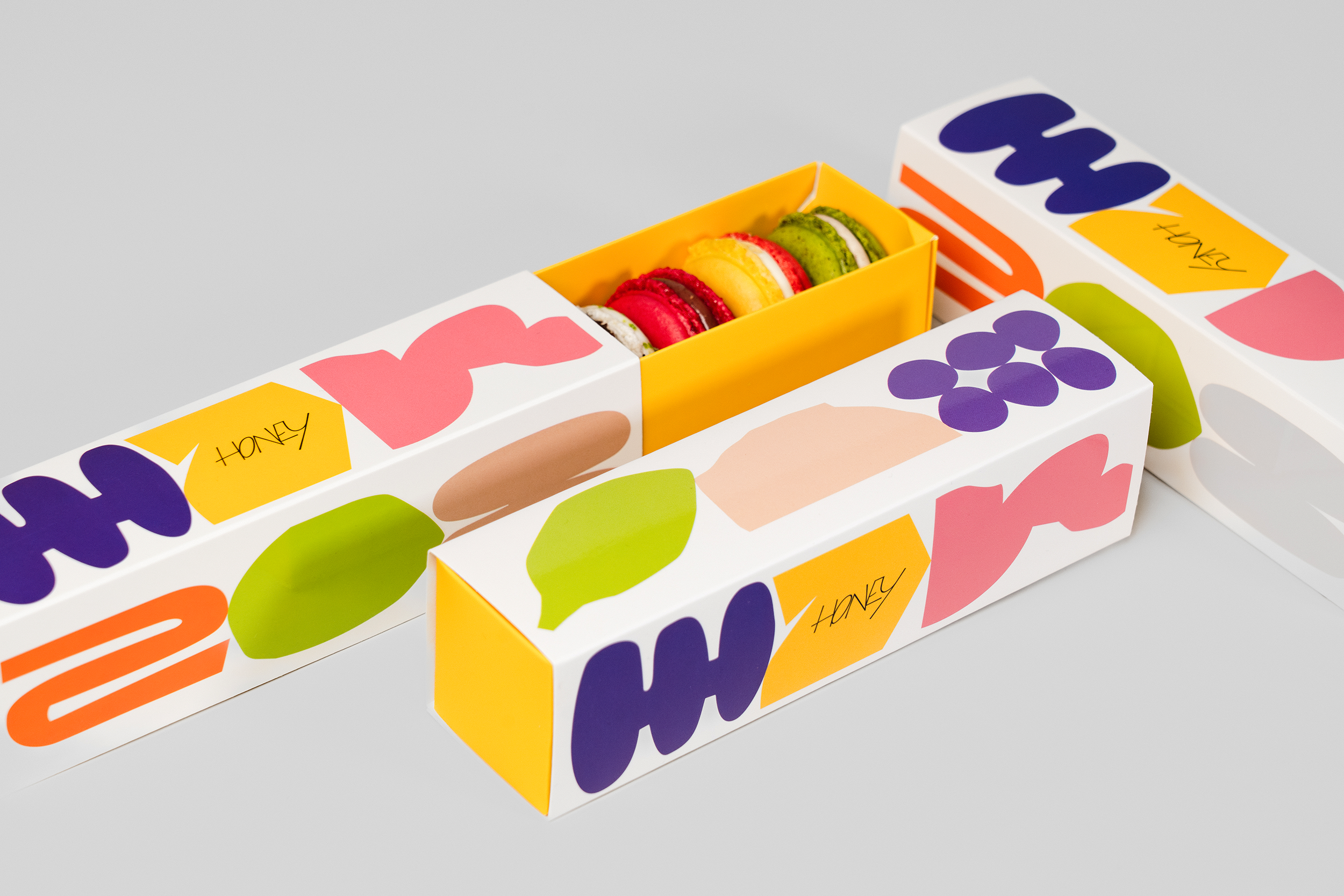
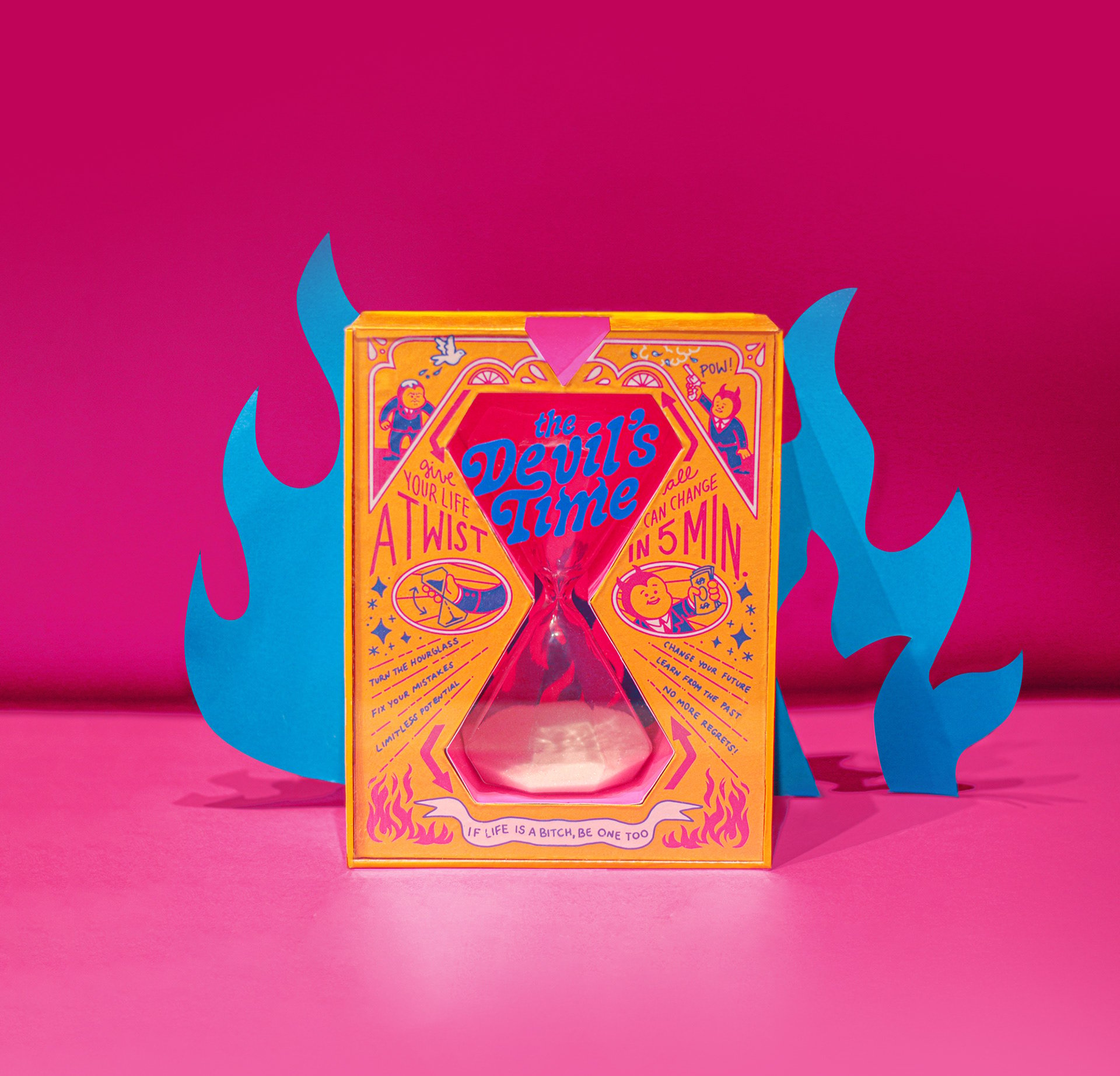
Check out the Top 10 Posts Of The Week! Featuring a great selection of colorful and bold packaging and an opinion series about Zero Waste Packaging.
By
Published
Filed under
Check out the Top 10 Posts Of The Week! Featuring a great selection of colorful and bold packaging and an opinion series about Zero Waste Packaging.
Create a Free or Pro account to continue reading.
Free members enjoy 3 posts per month,
or access more features and content with Dieline Pro.
Have an account? Sign in