THIS IS IT! DIELINE Awards 2026 Late Entry Deadline Ends Feb 28

ANA is a prêt-à-porter tool-kit that transforms the way parents and toddlers respond to tantrums. Together with Human, ANA’s brand development and packaging was reimagined in order to appeal to both. Drawing connections from classic board games and their respective primary color-saturated palettes, the brand identity is both crisp, modern, and bold.
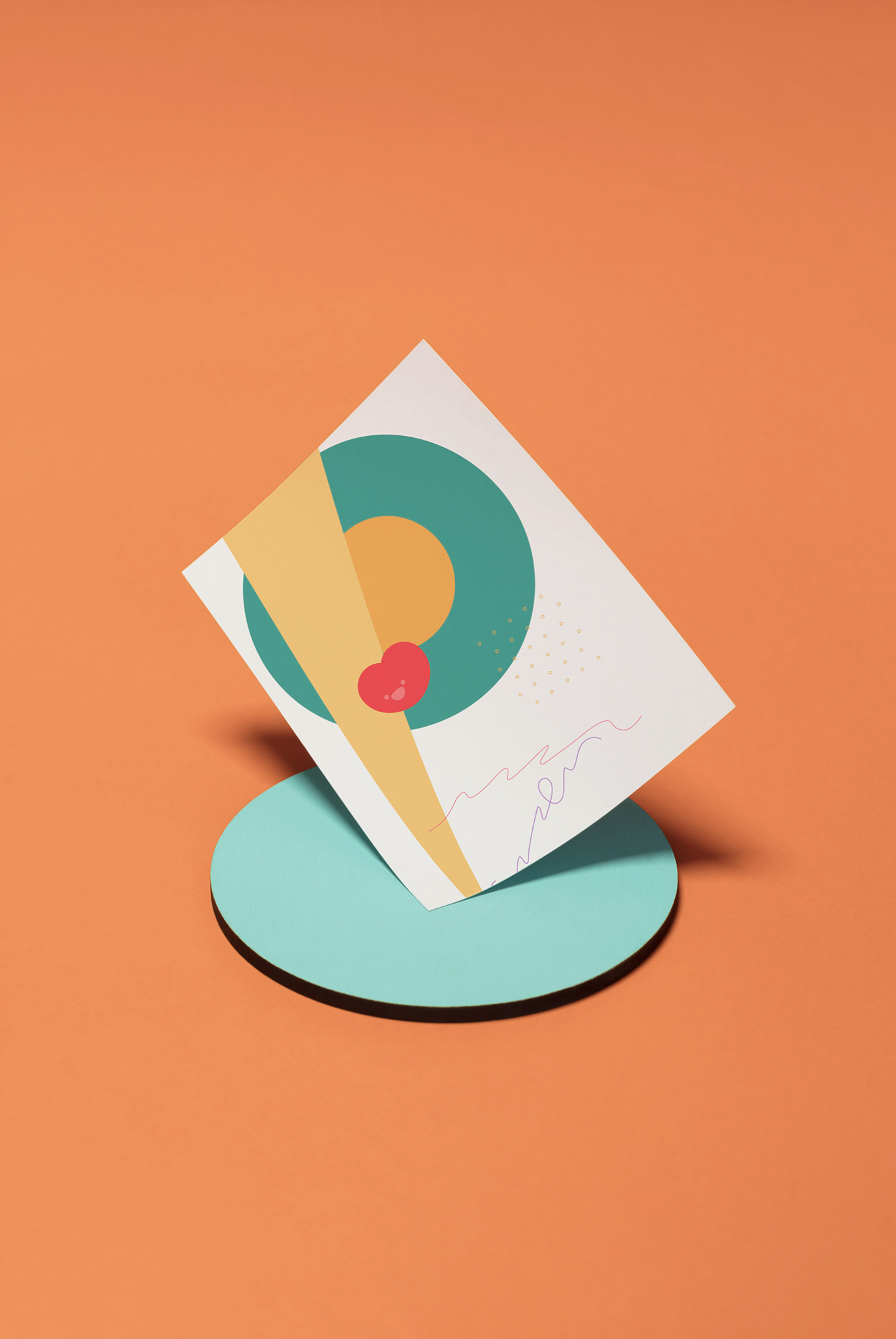
We found inspiration in traditional children’s games, such as tic-tac-toe, Scrabble, and a Mexican game called “avión”, to create a modular logo that can adapt on any peripheral. The graphic system is friendly, full of characters, icons, and patterns contrasted by a vibrant color palette in order to resemble a board game, which will be more appealing to children and parents.
Get unlimited access to latest industry news, 27,000+ articles and case studies.
Have an account? Sign in


