Sparrow & Barrow Turns Agricultural Symbols Into Design Whimsy
By
Published
Filed under
By
Published
Filed under
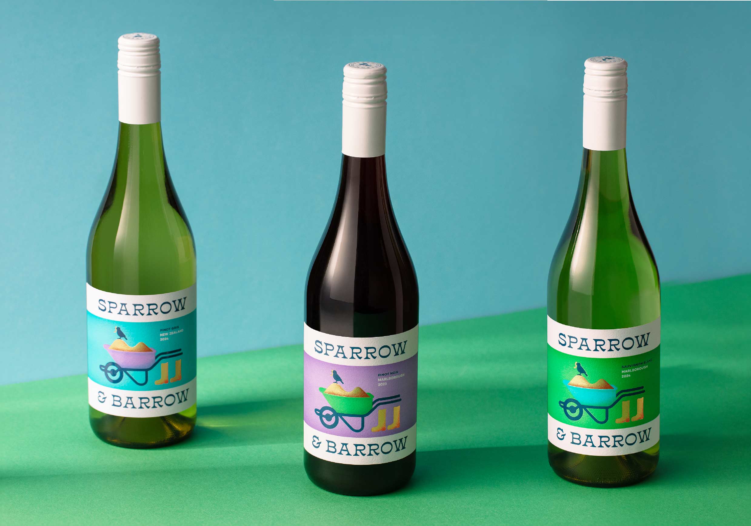
Sometimes wine packaging leans pretentious, so when I spot a label that feels more storybook than snobby, I get excited. Sparrow and Barrow’s packaging by Creative Platform turns agricultural symbols into design whimsy.
A wheelbarrow crowned by a bird nods to farm labor and pastoral folklore, rendered in flat illustration and softened gradients, paired with serif lettering with uneven weight, feels literary rather than rustic. Teal, violet, and green signal varietal distinction while sidestepping somber wine codes. The result rejects vineyard clichés in favor of wit and charm.
Get unlimited access to latest industry news, 27,000+ articles and case studies.
Have an account? Sign in