
Cape York Lager’s packaging, designed by Matt Vergotis, leans into location. The can literally wraps its message around the Cape itself—with a playful geographic outline and the words “the froth from the top” nodding to its tip-of-Australia origin.
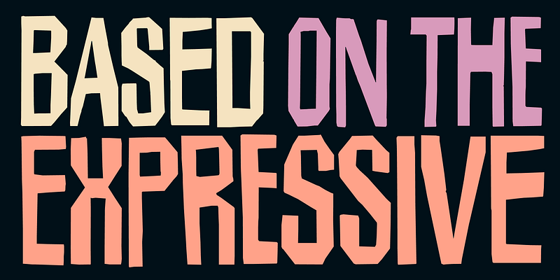
Custom script meets condensed sans in a typography mix that feels both deliberate and full of movement. Paired with seafoam blue, pine green, and bursts of orange, the whole thing reads like a lager that wants to be immediately cracked open outdoors.
