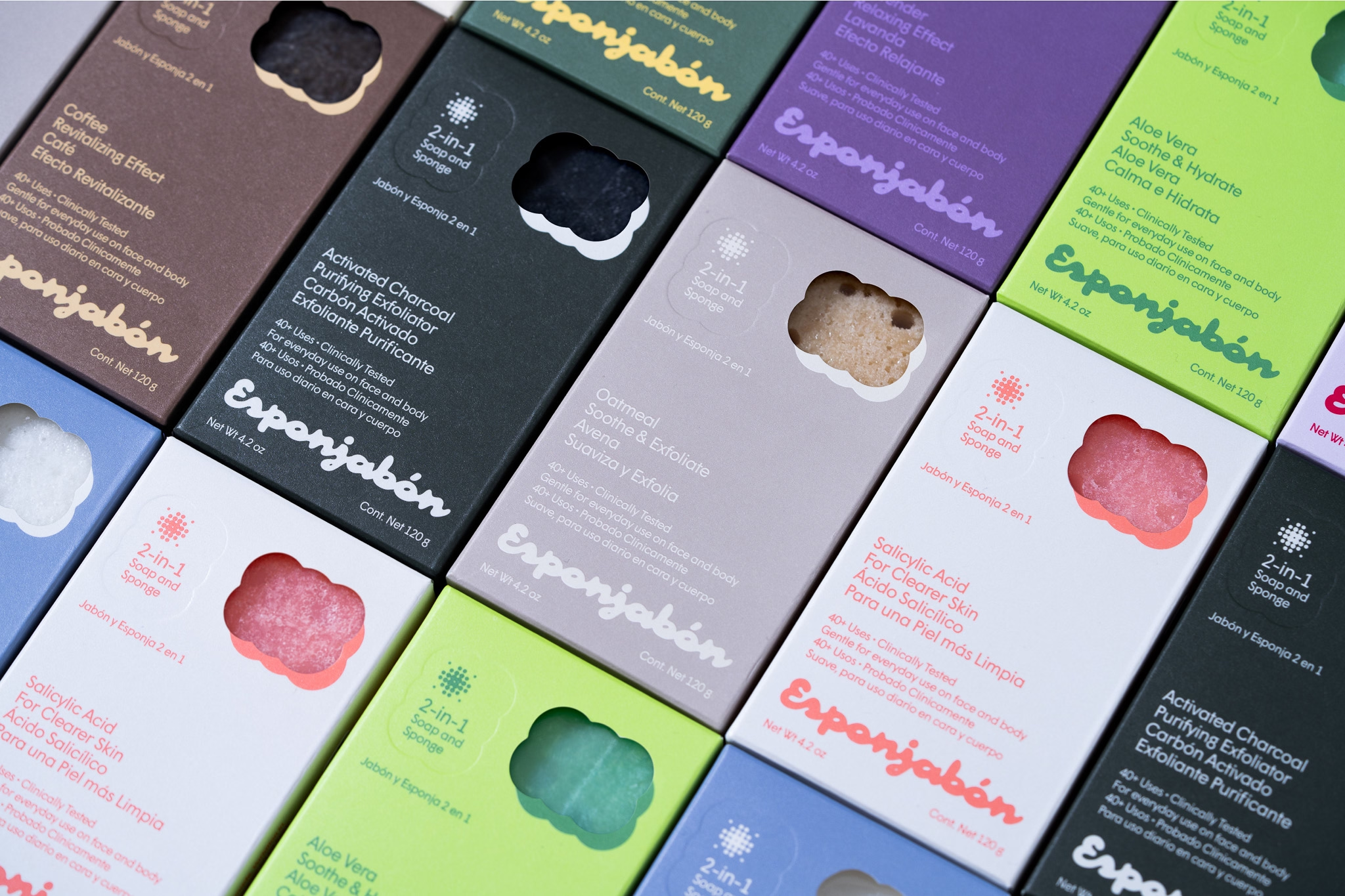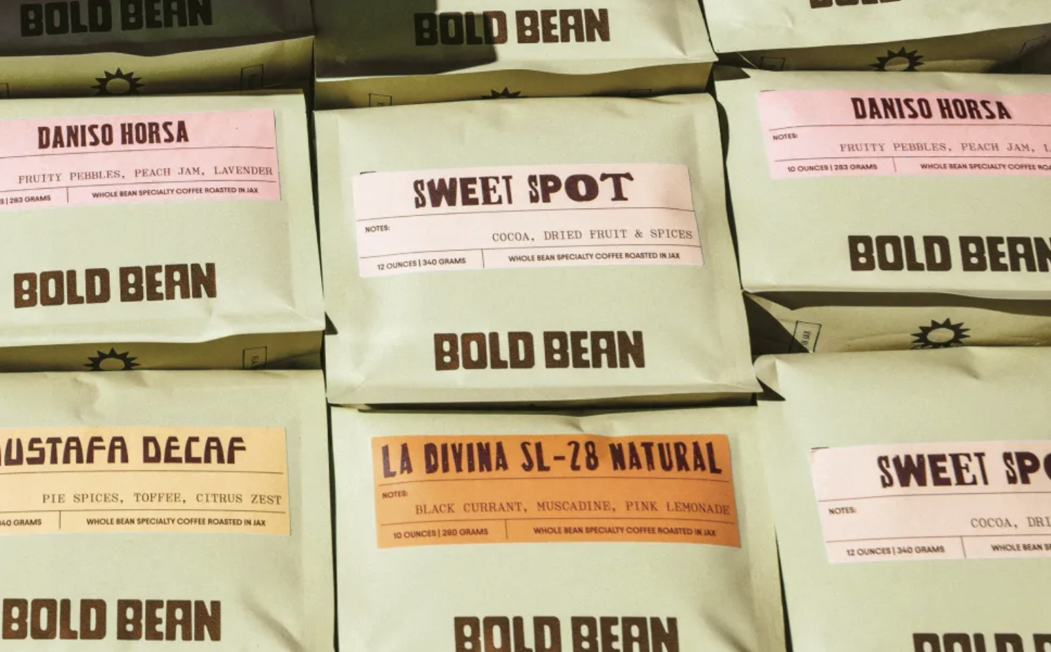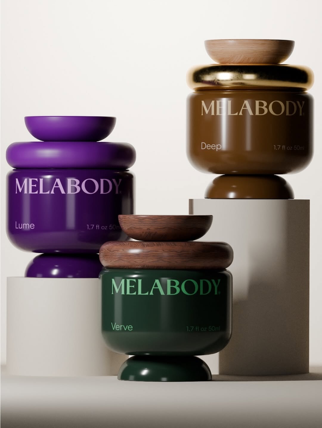

Scandy Skincare’s packaging leans hard into iridescent minimalism, using holographic figures as its signature visual anchor. The logotype is set in a bold, rounded serif with a lowercase “s” that plays nicely across every color treatment, whether soft pastel tubes or punchy neon bottles.
The abstract shapes double as a texture cue and mood signal, giving each product a slightly different personality while staying cohesive. Classmate Studio nails the balance between clinical and playful, keeping it fresh without feeling sterile.
