THIS IS IT! DIELINE Awards 2026 Late Entry Deadline Ends Feb 28
MatchaLand’s Packaging Embodies Tranquility And Energy Together
By
Published
Filed under
By
Published
Filed under
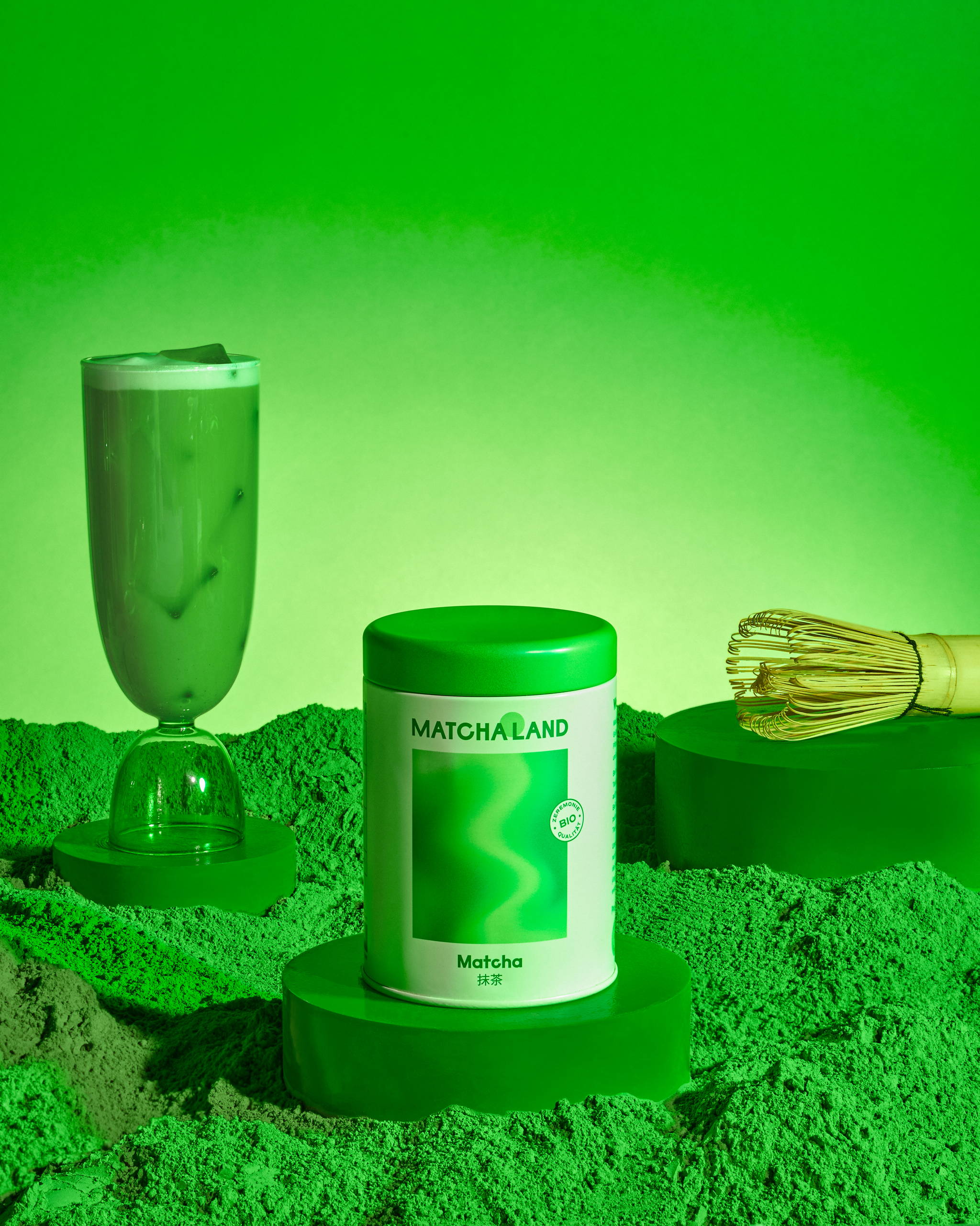
Wonderkind Co’s packaging design for MatchaLand gorgeously encapsulates the essence of the Japanese green tea-inspired brand. Inspired by Japanese art prints and letterforms, the packaging’s calming colors evoke a stillness. The blend of fresh matcha green and neutral tones in the brand’s color palette highlights the harmonious fusion of flavors.
The gradient artwork, mirroring the depths of the swirling motion of matcha, injects a dynamic and lively aspect into the packaging. At the same time, the vivid green pattern against the white backdrop creates a striking visual contrast. The psychedelic-inspired graphic design immerses consumers in a peaceful and zen-like experience, making MatchaLand’s packaging a true embodiment of tranquility and energy in one.

Get unlimited access to latest industry news, 27,000+ articles and case studies.
Have an account? Sign in


