Pistakio Packaging Acts As A Nod To The Visual Cues Of The Nut
By
Published
Filed under

By
Published
Filed under
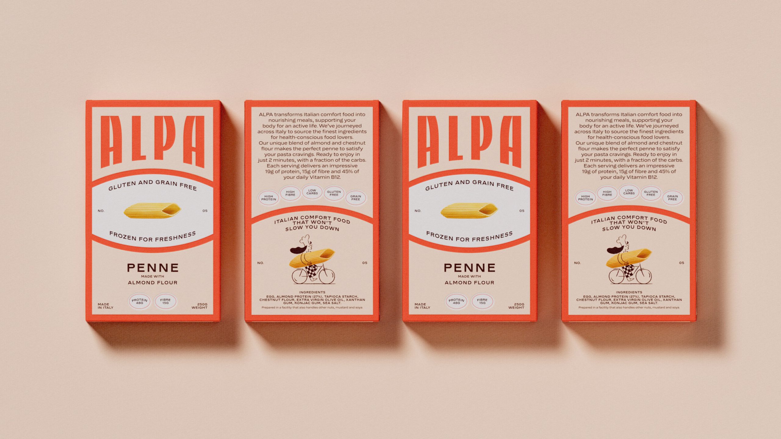
Francine Voit’s conceptual packaging design for Pistakio pays homage to Italian grandmothers and their carefree living and celebration culture. The bold, legible typography on the packaging conveys tradition and nostalgia, echoing the foundation of the brand. The Pistachio-inspired color palette, featuring earthy greens and warm browns, not only celebrates the deliciousness of pistachios but also signifies growth and Pistakio’s commitment to quality. The packaging is a statement of Pistakio’s dedication to a simple, honest, and sustainable approach to food, reflecting their desire to make pistachios a household staple in the U.S.
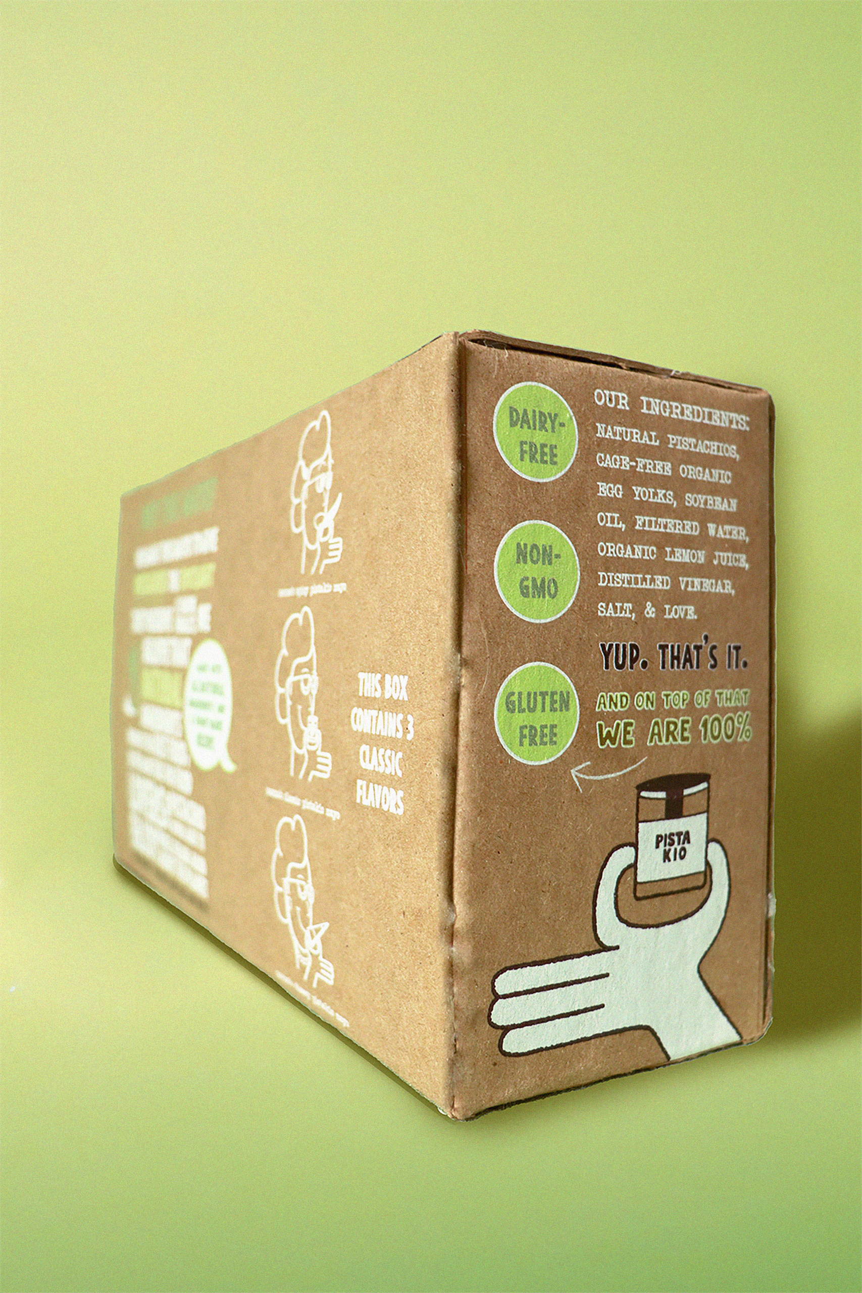
Pistakio is a food brand created to give pistachios the spotlight they deserve. we believe that pistachios are underrated in the world of nuts so we created a goes-on-anything spread to unleash pistachio’s nutty and wholesome flavor and their infinite health benefits. we’re here to reimagine the way pistachios are seen and bring back the enjoyment of the little things in life. our packaging is a representation and a symbol of the “nonni” way of life and the spirit of italian culture.
Get unlimited access to latest industry news, 27,000+ articles and case studies.
Have an account? Sign in