Studio Cliche’s Packaging Design for Hub Cosmetics Nods to the De Stijl Movement
By
Published
Filed under

By
Published
Filed under
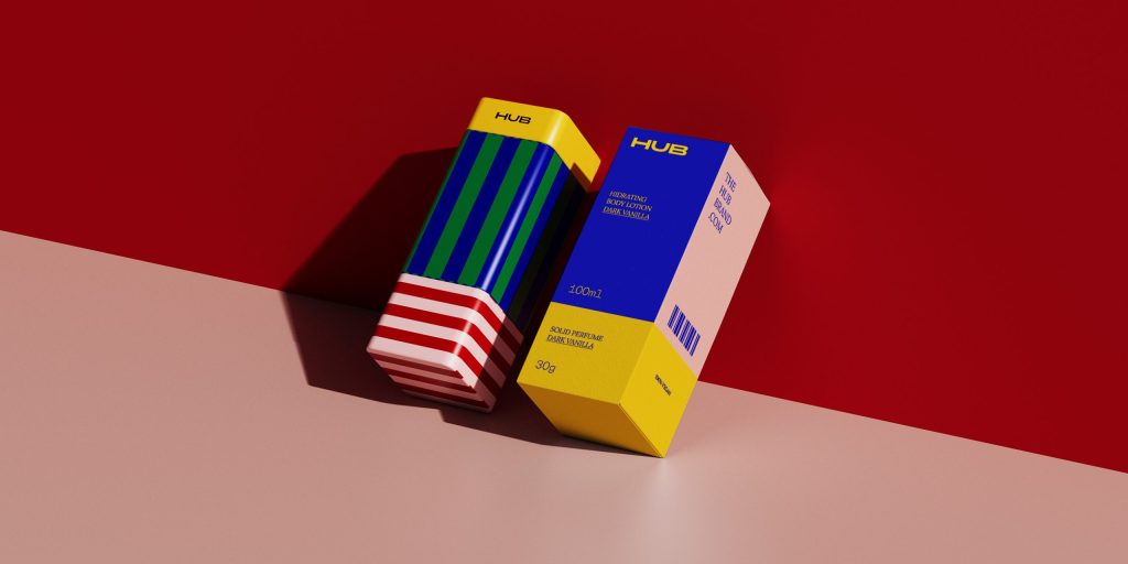
If beauty packaging was more like a LEGO set, there’d probably be an awful lot more play before getting ready to go out.
At least, that’s what feels like the central theme behind Studio Cliche’s clever packaging design for Hub Cosmetics. The beauty brand’s aesthetic leans into color and personality, bringing a joyful sense of pride to consumers’ naturally mundane daily routines. Specifically, Hub’s customizable cosmetics line lets users curate their beauty regimen easily while welcoming a vibrant, geometric-inspired look and feel.
Get unlimited access to latest industry news, 27,000+ articles and case studies.
Have an account? Sign in


