THIS IS IT! DIELINE Awards 2026 Late Entry Deadline Ends Feb 28
We’re Nuts About Nutting Peanut Butter’s Energetic Packaging System
By
Published
Filed under
By
Published
Filed under
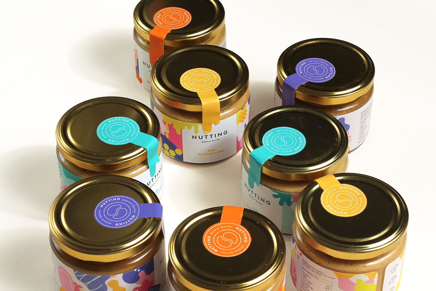
To build a brand that’s tempting to both the eye and the stomach, peanut butter brand Nutting turned to designers Gül?ah Cansever and Pelin Maravent. Together, the team created an illuminated and sunny packaging system through stunning colorful patterns and drip-inspired tape detailing. Moving away from what the rest of the peanut butter industry is doing and tapping into uncharted packaging territories, Nutting has immediately cut through the dullness and marked itself as a brand that’s doing things differently, and colorfully at that.
Nutting is a peanut butter brand established by two successful nutritionist women based in Istanbul. They were very enthusiastic about creating healthy products which appeals to both eye and the stomach. We were asked to design this colorful brand that represents their joyful personalities.
The main goal was to create a fun and energetic brand identity with an eye catching packagings.Inspired from organic shapes and illustrations, we designed 4 different jar labels. We included illustrations of ingredients and a vibrant color palette specific to each product. We also made character illustrations representing our clients and incorporated it into the designs. Since the overall packaging designs are quite bold, we used the typography in a minimal way. We preferred a san serif clean font for the logo and combined it with a modern serif font on the products.
Get unlimited access to latest industry news, 27,000+ articles and case studies.
Have an account? Sign in


