Cure’s Packaging Designed By Gander Highlights The Bursting Fruit Flavors
By
Published
Filed under

By
Published
Filed under
With gorgeous typography and stunning photography, the packaging design for the hydration mix cure is simply stunning. Designed by Gander, the packaging highlights the brand’s bursting fruit flavor through effective color usage and oversized photography. It’s simple, it’s effective, and the design is totally in line with the gorgeous work Gander always produces.
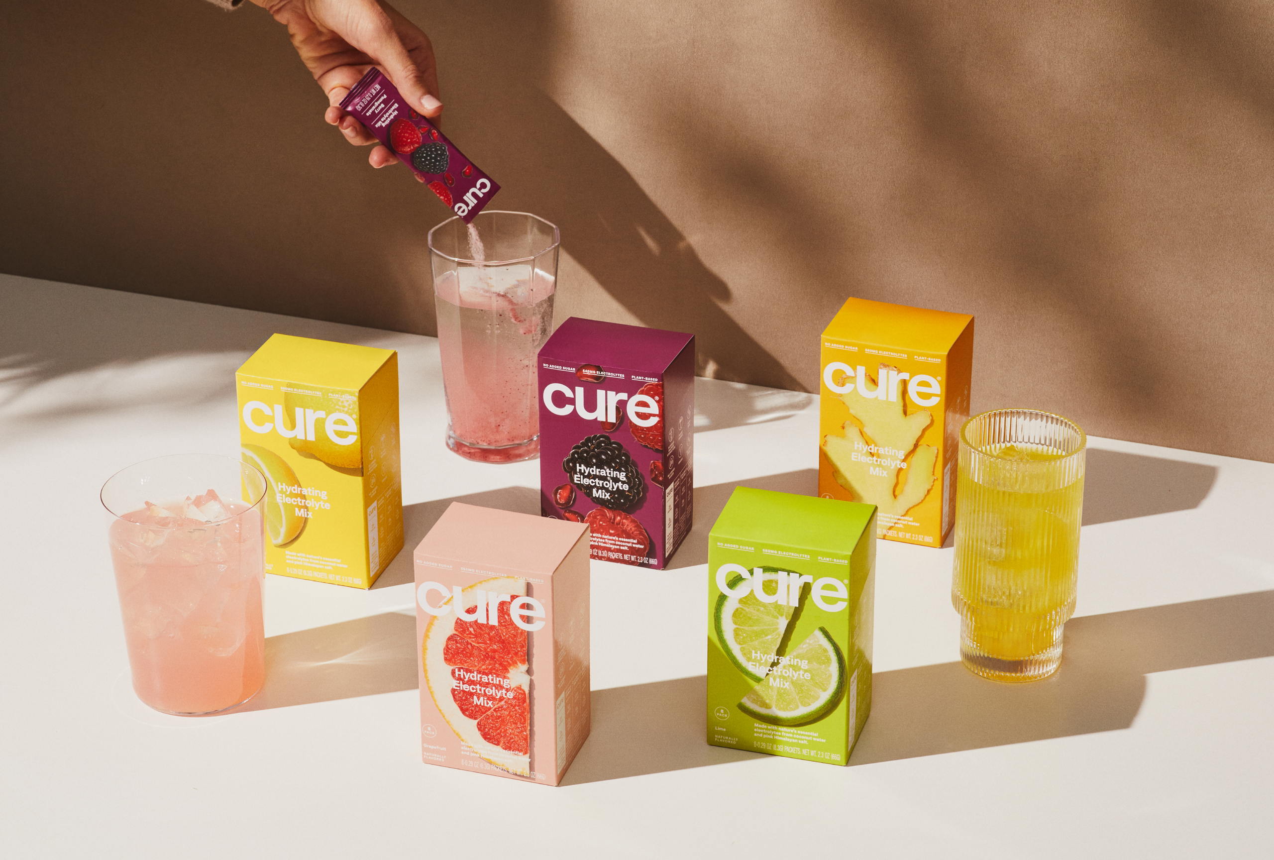
Cure came to us with a fundamental problem that needed solving: they had an exceptional product that was getting lost amongst some similar looking (but not similar quality) brands. We wanted to help Cure clarify their singular point of view and ensure that consumers and retailers could understand what makes them so unique upon first glance.
Get unlimited access to latest industry news, 27,000+ articles and case studies.
Have an account? Sign in