Utilizing warm colors and shapes, coffee concept Sol finds inspiration in tropical Brazil’s abundantly vibrant flora. The patterned leaves are a significant departure from some of the more minimalist and modular coffee brands, making Sol a cup of hypothetical joe you’d instantly warm up to when it comes to starting your day. Additionally, the off-kilter, wavy typeface used throughout the design is another nod to the fact that Sol plays by its own beautiful branding rules.
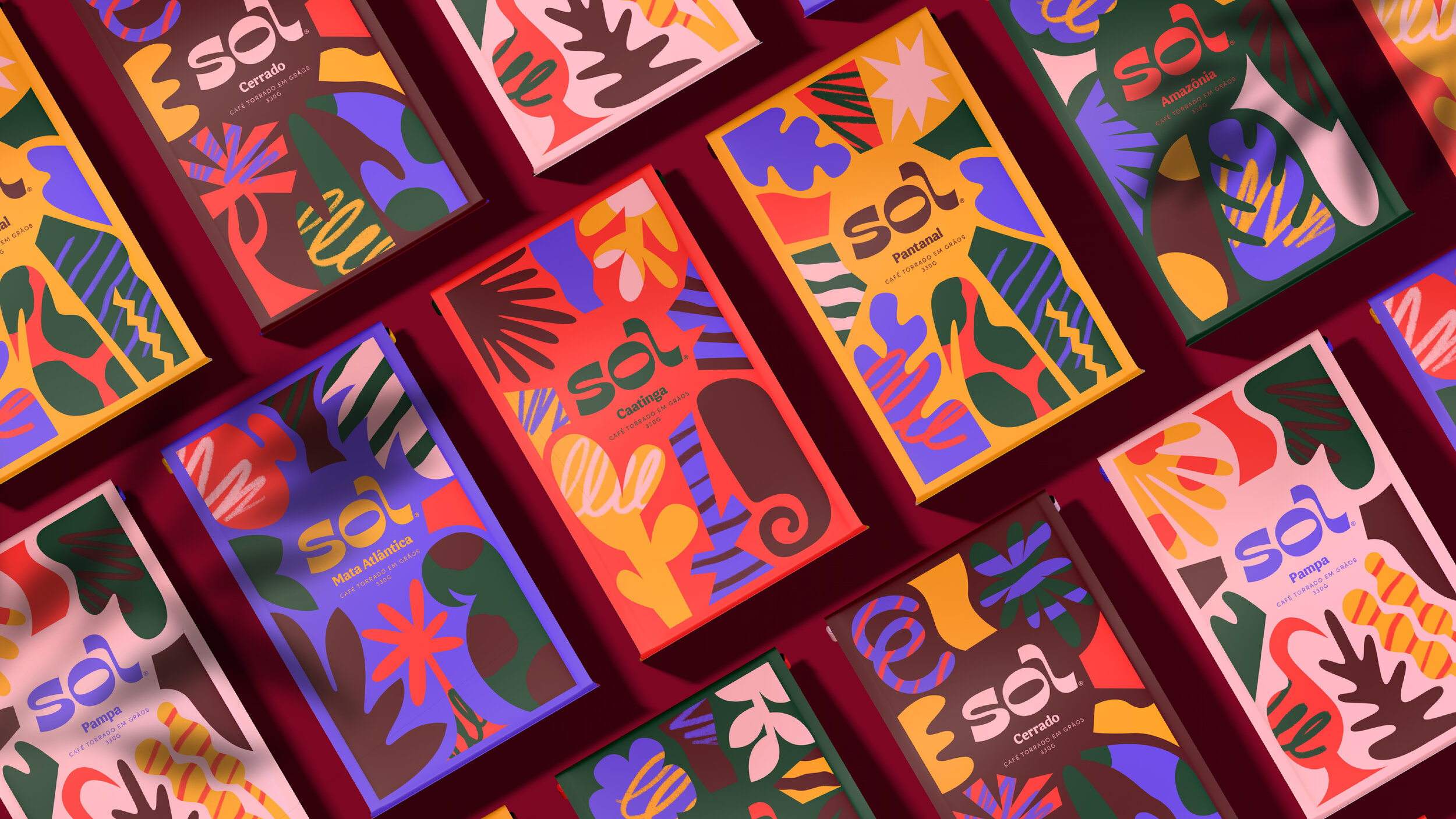
Sol, which translates to “sun”, is a concept coffee brand inspired by the diverse colors and flavors of Brazil. The wordmark takes inspiration from the sinuous shapes of its natural and urban landscapes, followed by a custom bold display typeface.
Sol’s flavors are inspired by the 6 regions of Brazil – Amazônia, Pantanal, Cerrado, Mata Atlântica, Caatinga & Pampa – and their native fauna, flora and ingredients. With an expanded colour palette that is a modern interpretation of the flag’s green, yellow and blue, all elements come together on the packaging, keeping the wordmark centered as a source of life and growth.


