THIS IS IT! DIELINE Awards 2026 Late Entry Deadline Ends Feb 28
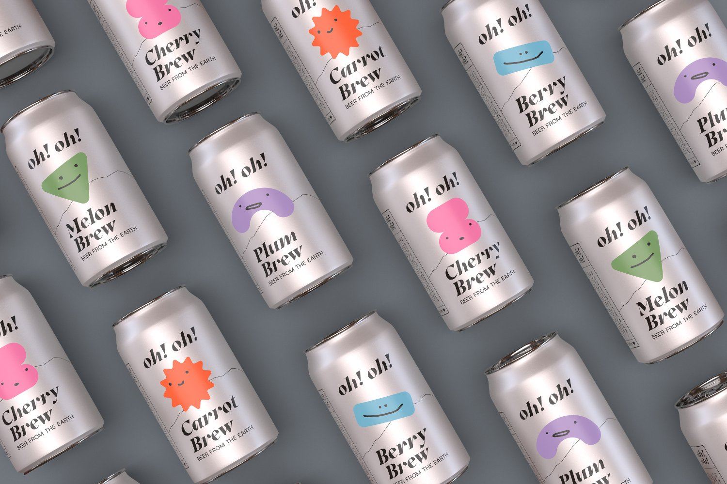
Beer too strong? Oh! Oh! has got you. The italicized font speaks to the fun, good-natured approach of the brand as a fun and subtle alternative to harsher beers. The colors on each flavor are indicative of the vegetable flavor inside the can, but the unique and fun shapes and faces that each shape contains connects with the consumer. Oh! oh! is a brand concept that is fun, innovative, and allows the character of each can to be the star of the design. For strong souls with a soft hearts, grab an Oh! oh! for your next cookout or happy hour with friends.
Oh! Oh! is a Berlin-based brand that offers five new non-common vegetable-based brews for people who find the classic beer on the market too strong. The idea behind the project was to create a brand identity that is fun and enjoyable.
The goal was to create a visually independent brand. By giving each brew a very specific characteristic through really simple shapes and using very simple key colors, a family of funny and gentle personalities was created. The idea behind this is that consumers can relate to one of those characters and flavors (carrot, cherry, Melon, blackberry, or Plum).
Get unlimited access to latest industry news, 27,000+ articles and case studies.
Have an account? Sign in


