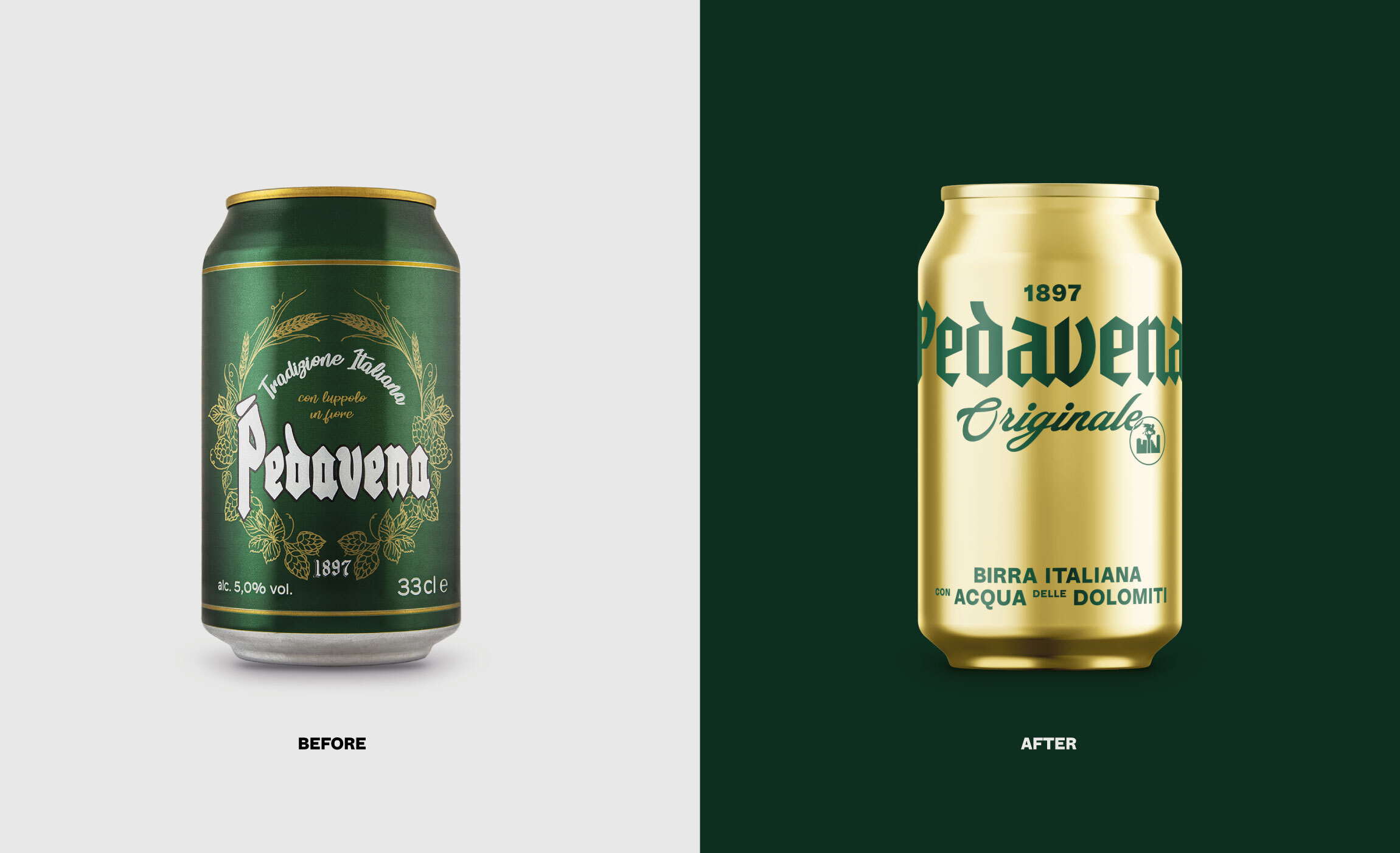
Little Big Brands Gives Wink Condoms A Contemporary Look
By
Published
Filed under

By
Published
Filed under
For some folks, their first time buying condoms was nearly as awkward as the first time they did the deed. Doing that walk of shame down the pharmacy aisle, all the way to the back of the store and sometimes in plain view of the pharmacist. That most condom packaging and branding are so similar doesn’t help either.
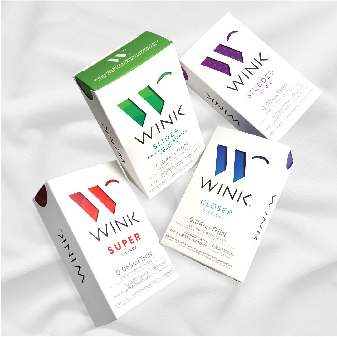
Wink takes a different approach with branding that focuses on the condoms and not the sex with a stylish, contemporary aesthetic that stands out among its prophylactic progenitors. Turning to Little Big Brands for the packaging and visual identity, the letter mark is a “W” made up of both straight edges and round arches, the latter of which evokes the eponymous eye gesture. White is put against gradients and patterns by condom type, composed of saturated colors. The inner packs are also unconventional, this time using a white background and doing without the gradient for a solid color.
Get unlimited access to latest industry news, 27,000+ articles and case studies.
Have an account? Sign in