5 Lessons from IMAG!NE Snacks on Designing a New Brand Identity & Experience
By
Published
Filed under
By
Published
Filed under
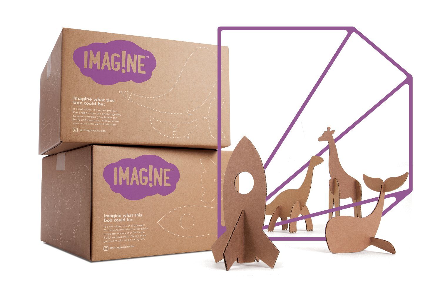
There are plenty of kids’ snacks that have playful packaging, but we don’t often see designs that tangibly reflect a child’s own boundless imagination—the kind of design that takes you back to art class in elementary school, where all you had were your own powers of invention and the paper in front of you.
So how do you reimagine what we typically expect from a kids’ snack and conjure up a child’s innate sense of creativity?
IMAG!NE Snacks puts the power of creativity in kids’ hands. What sets the brand apart are the visual elements that comprise the packaging; everything has a handmade feel because they used construction paper and scissors to create the typeface and layout.
Get unlimited access to latest industry news, 27,000+ articles and case studies.
Have an account? Sign in


