THIS IS IT! DIELINE Awards 2026 Late Entry Deadline Ends Feb 28
300-Year-Old English Legend Fortnum & Mason Get Their First Bespoke Typeface from Otherway
By
Published
Filed under
By
Published
Filed under
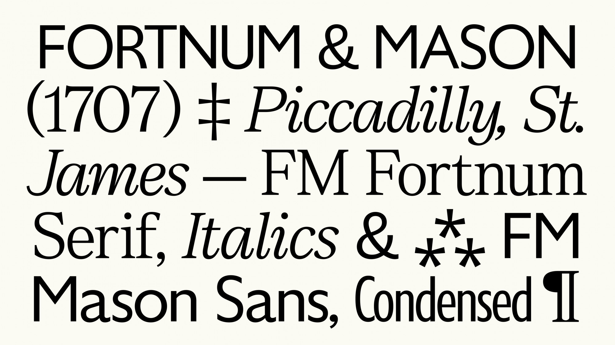
The posh Piccadilly department store Fortnum & Mason has been around for a long time—over 300 years, in fact! For some reason, in all that time, they’ve never had their own bespoke typeface, but for a lot of the recent past, they’d been leaning on Gill Sans for a lot of their wares. A great font, sure, but a little overused and definitely too pedestrian for a brand with Fortnum & Mason’s pedigree. At a certain point, it didn’t make sense for a store this old and world-renowned to not, well, speak for itself.

The London branch of bi-continental studio Otherway stepped in to help the store create a robust, expansive font family. After diving into the brand’s rich archives for inspiration, they returned with a collection of sans, serif, and condensed typefaces, each with three different weights. These thoughtful letterforms nail the balance between old-fashioned and modern, feeling uniquely inconspicuous and classically English. They’re even separated into two distinct families befitting the company’s original dual partnership: the more old-school, traditional font is Fortnum Serif, while a slightly wider range of sans typefaces include Mason Sans and Mason Condensed.
Get unlimited access to latest industry news, 27,000+ articles and case studies.
Have an account? Sign in


