THIS IS IT! DIELINE Awards 2026 Late Entry Deadline Ends Feb 28
Wowchi Mochi’s Vibrant Packaging Design Reflects The Brand’s Outgoing Personality
By
Published
Filed under

By
Published
Filed under
AG Design Agency has infused Wowchi’s packaging with a vibrant, bold, and lively design. The chunky, bold logo at the top of the pack, paired with a dynamic box color and energetic illustrations, makes any consumer stop and want to know more about the brand. It’s expressive, engaging, and, most importantly, reflective of the brand’s outgoing personality.
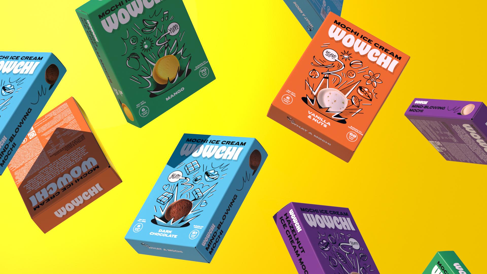
From naming to branding and packaging design we introduced a vibrant yet delicious ice cream mochi brand. The role of color, illustration, moving image and it’s digital presence formed an expressive brand that makes you go WOW! Let’s begin with an undeniable fact. WE LOVE MOCHI. And we also love going our own way. Because doing things differently can lead to something exceptional. Much like when you combine the iconic Japanese rice cake confection dough with the most delightful ice cream filling to produce a mochi that makes you go WOW!
Get unlimited access to latest industry news, 27,000+ articles and case studies.
Have an account? Sign in