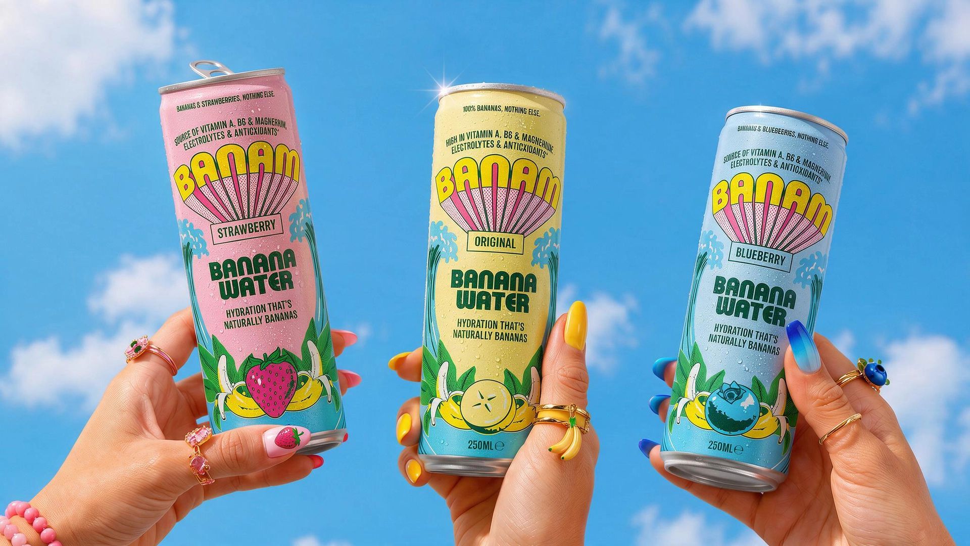
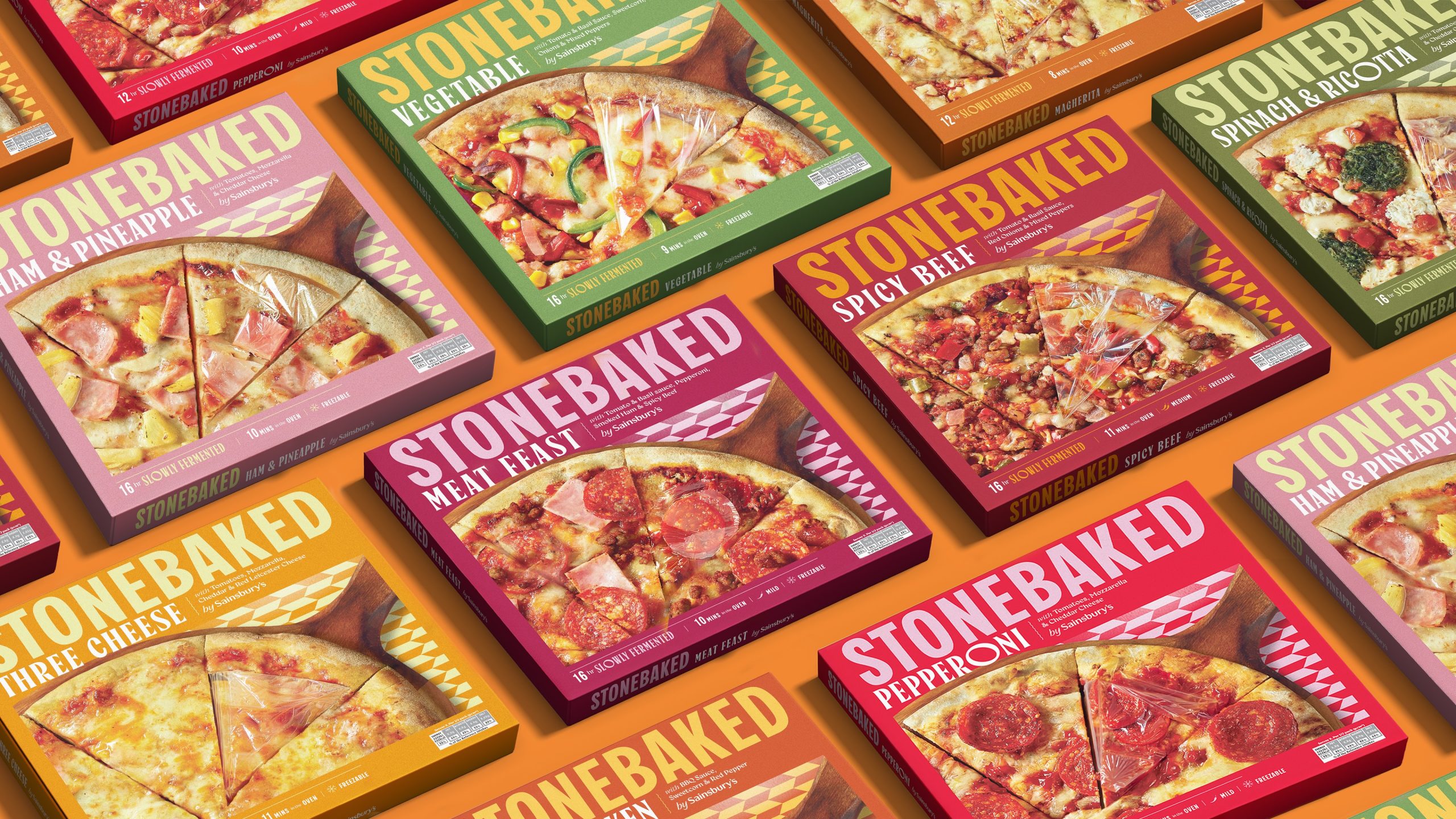
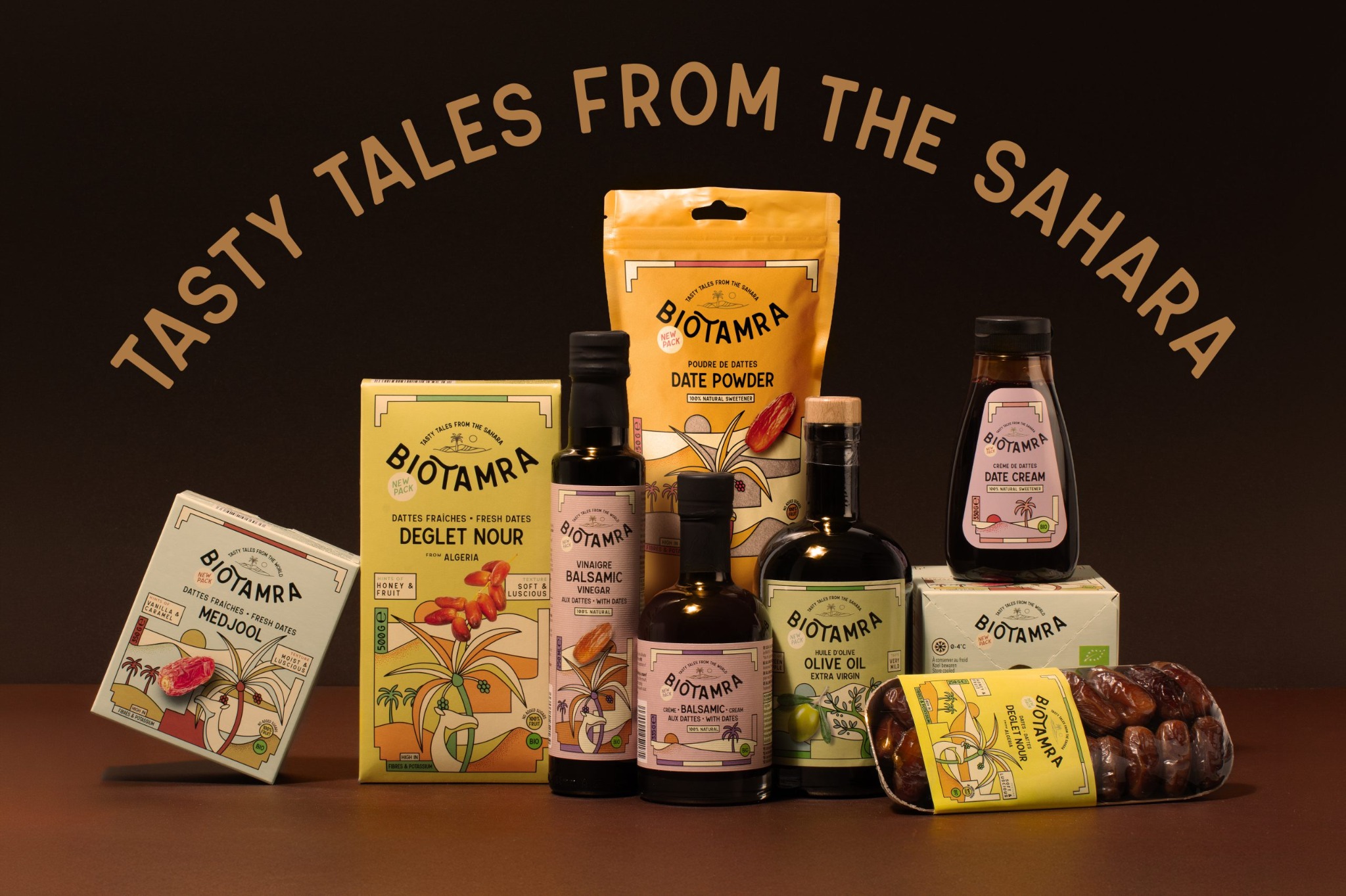
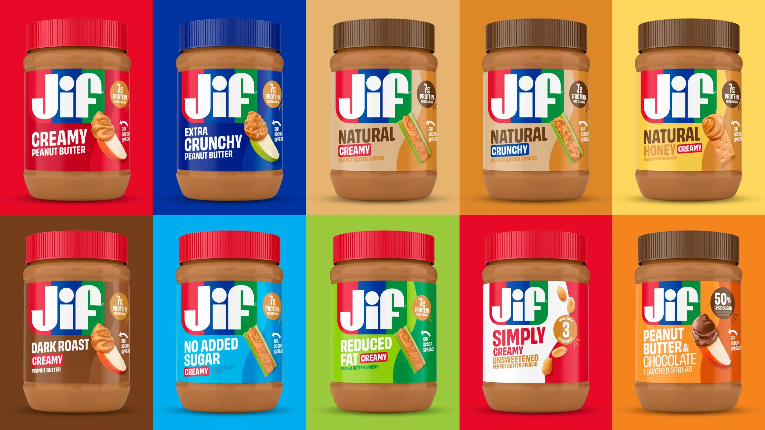
Designed by Brandia, The Positive Foods’ packaging system expresses a sweet attitude while being transparent about the ingredients used. The bright yellow packaging and the clean, simple typography and iconography system play into the balanced ingredients. Plus, the food imagery allows the brand to communicate the flavors and products without having to oversell through text on the pack.

The Positive Foods is a brand that seeks balance within our meals whilst keeping a diverse range of lifestyles in mind. We know that a bite can communicate a sweetness that goes beyond taste: a smile, a hug. TPF collaborators wanted to communicate a positive impact through food with products that were real and accessible. Taking this mission into account, a brand strategy was developed that elevates the values of balance and joy.