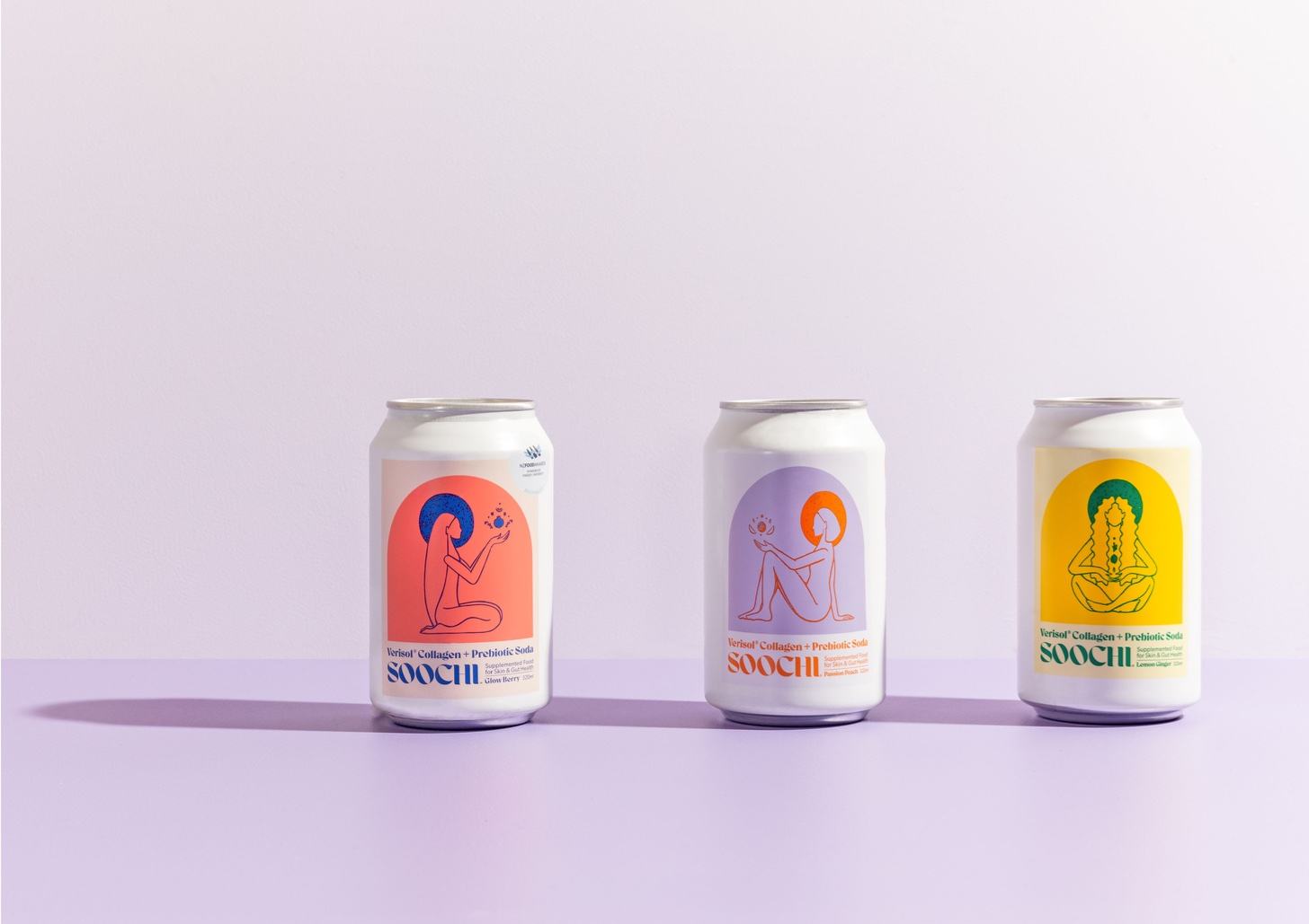
Soochi drinks merge the science of nature, taste and innovation to deliver on functional benefits for the skin, body and mind. With added collagen, vitamins and prebiotics, Soochi was created to fill a gap in the market for a refreshing, yet functional supplement drink that didn’t compromise on taste.
Soochi is a unique category of beverage – it sits on the shelf space between ‘food and beauty supplement’, so it posed an interesting brief as an entirely new product. Unlike other canned beverages (fizzy/soda pop drinks for example) it was important to create a packaging design that didn’t follow the typical norms of fruit drink packaging with overused fruit visuals, garish colour palettes, text heavy alcoholic mixer labels or experimental craft beer. Additionally, as a beauty product, it was also important that the design didn’t adhere to the minimalist cosmetic packaging trend and end up ‘lifeless’. As Soochi is its own ‘drink genre’ there were many possibilities to play with and the opportunity to create a very different packaging design. Ultimately, part of the inspiration came from the beauty of gallery display, the elegant, framed bold graphic acting as the draw, the information below is succinct and clearly describes the brand and product, like a painting in a gallery with a caption. For this reason, the bright graphic uses 2/3rds of the face of the can against the white background, so the customer can easily see the design on a busy shelf alongside over-elaborate competitors.
