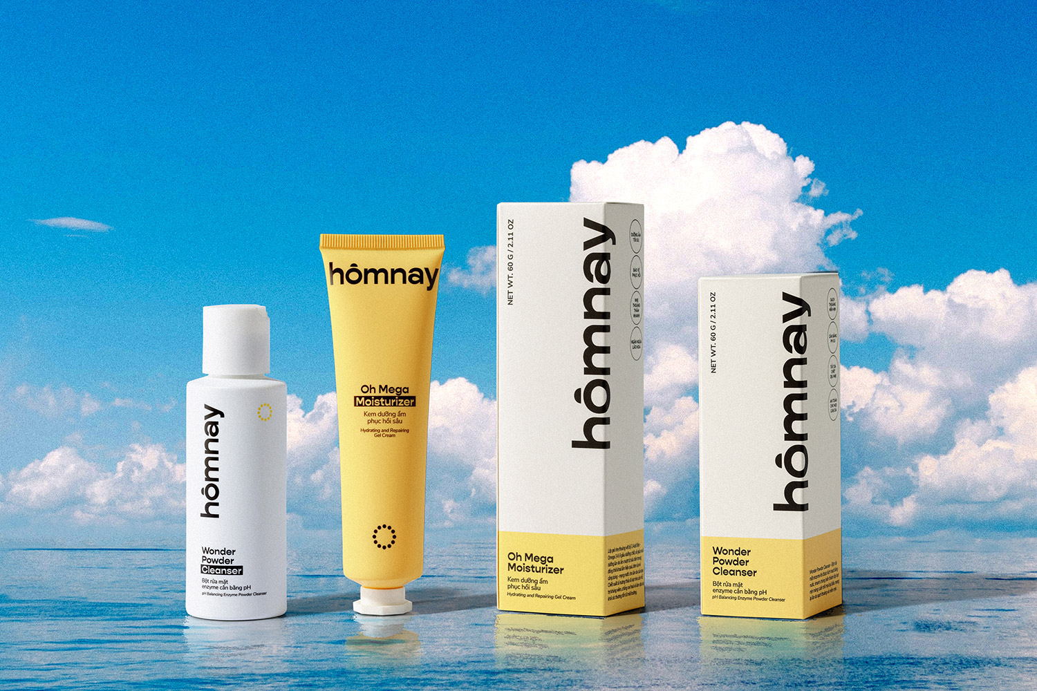
Xolve Branding’s packaging for homnay represents a streamlined approach to skincare, addressing the confusion consumers can face in a saturated market. The three-fold strategy—Simple Beauty, True Clean Beauty, and City Solutions—is visually communicated, simplifying product selection and adapting to urban lifestyles. The packaging design ensures a hassle-free experience, skincare benefits without irritation, and products tailored to dynamic urban routines. Xolve’s visual elements, including a clock-inspired logo and a warm color scheme, amplify homnay beauty’s authenticity and reliability, making it a testament to simplicity and a standout in the complex skincare sphere.
Challenges: Skincare decision-making Choosing skincare becomes a confusion amidst the surplus of options. Urban dwellers, juggling diverse lifestyles, face the uphill task of navigating through complex routines, ingredients, and their compatibility with varying skin types. The demand for a streamlined approach echoes loudly in a cluttered market, highlighting the need for reliable, simple solutions that resonate with busy, modern lives.


