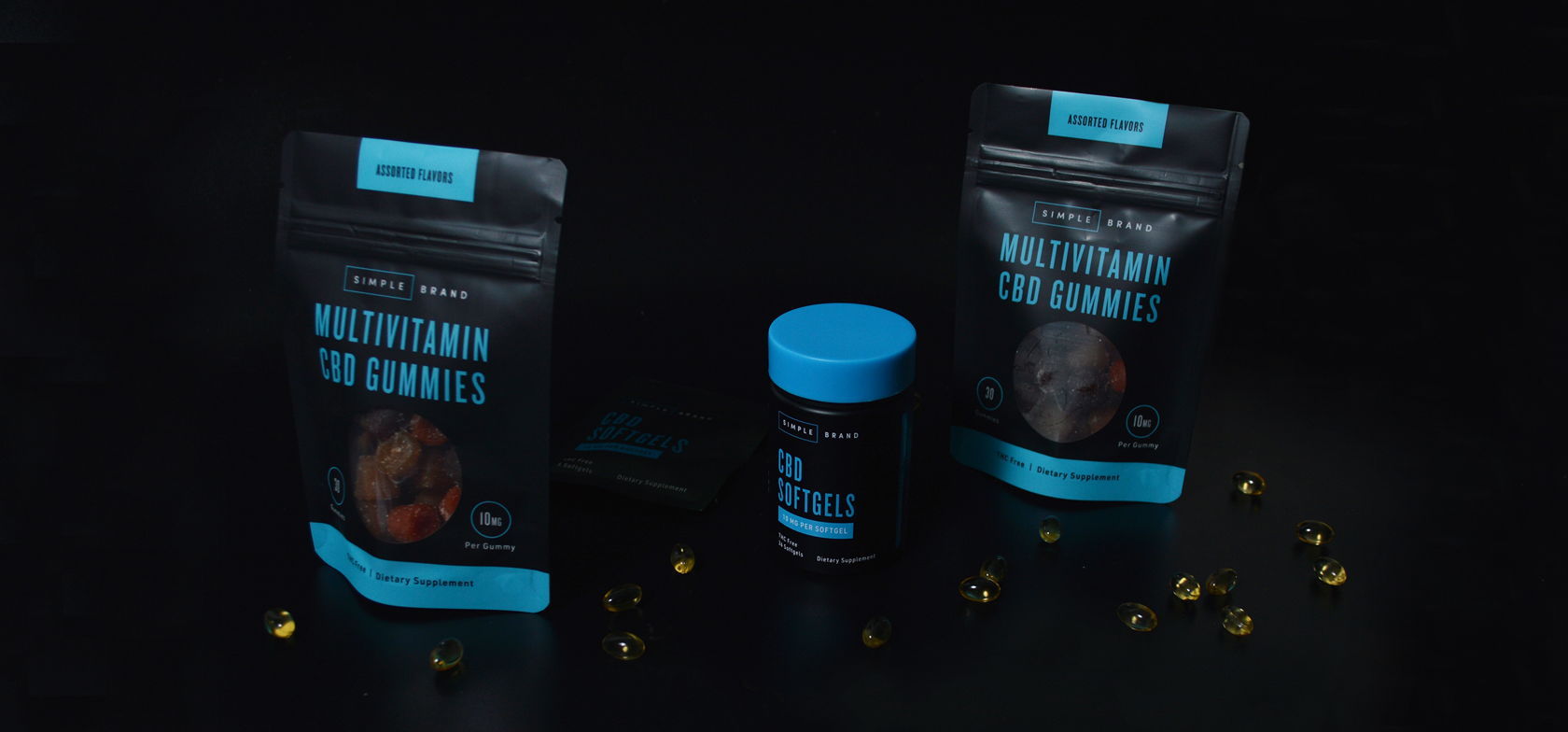
Simple Brand CBD Utilizes High Contrast Colors
By
Published
Filed under
By
Published
Filed under
Simple Brand CBD is true to it’s namesake. Keeping it’s packaging sleek by utilizing three colors and san-serif fonts, Simple Brand is a departure from funky CBD packaging. The straight-forward design would feel at home next to fitness supplements and protein powders.

Simple Brand is a CBD company based out of LA, who came to us looking to develop a sleek and organized branding and packaging system to roll out a series of new products. With a focus on clean communication and premium quality, this system uses high contrast colors and bold, contemporary typography for maximum impact and legibility.
Get unlimited access to latest industry news, 27,000+ articles and case studies.
Have an account? Sign in


