Student Re-Imagines Sephora Packaging Collection
By
Published
Filed under
By
Published
Filed under
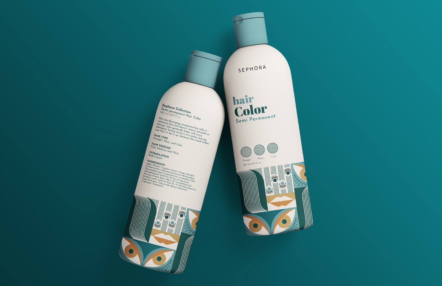
Sephora’s private label line just got a makeover. The new bottles utilize earth-tones, sage greens, and deep turqoises to give the label a more natural feel. The serif font chosen is subdued, and compliments the illustrations that utilize lines and geometric shapes. The overall design is adult, cohesive, and distinct — a challenge in the bloated beauty sector. The branding works across all of Sephora’s products, giving them an identity that is entirely them.
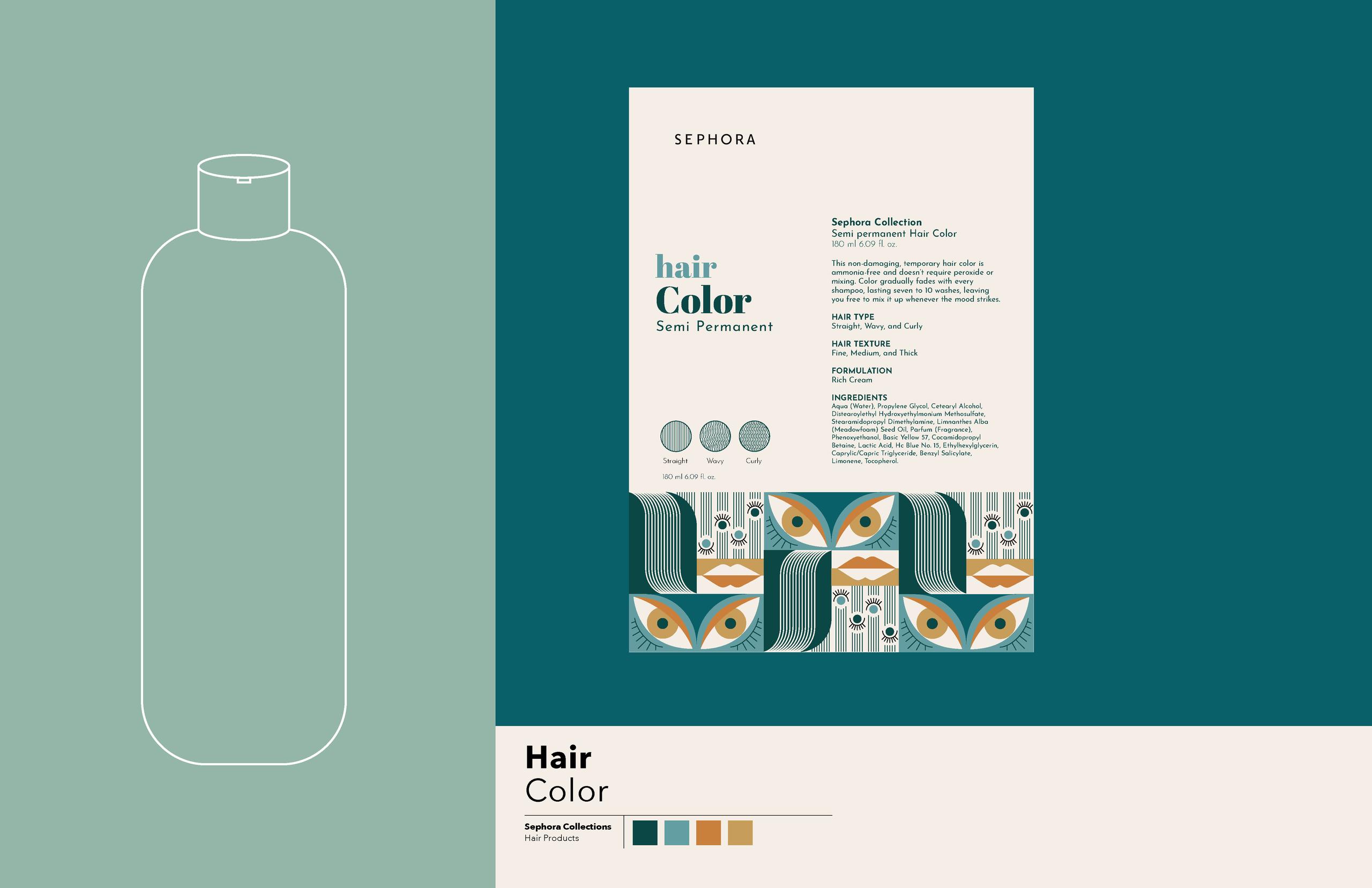
Sephora is a multinational chain of personal and beauty stores featuring around 300 brands including its private label.
Get unlimited access to latest industry news, 27,000+ articles and case studies.
Have an account? Sign in


