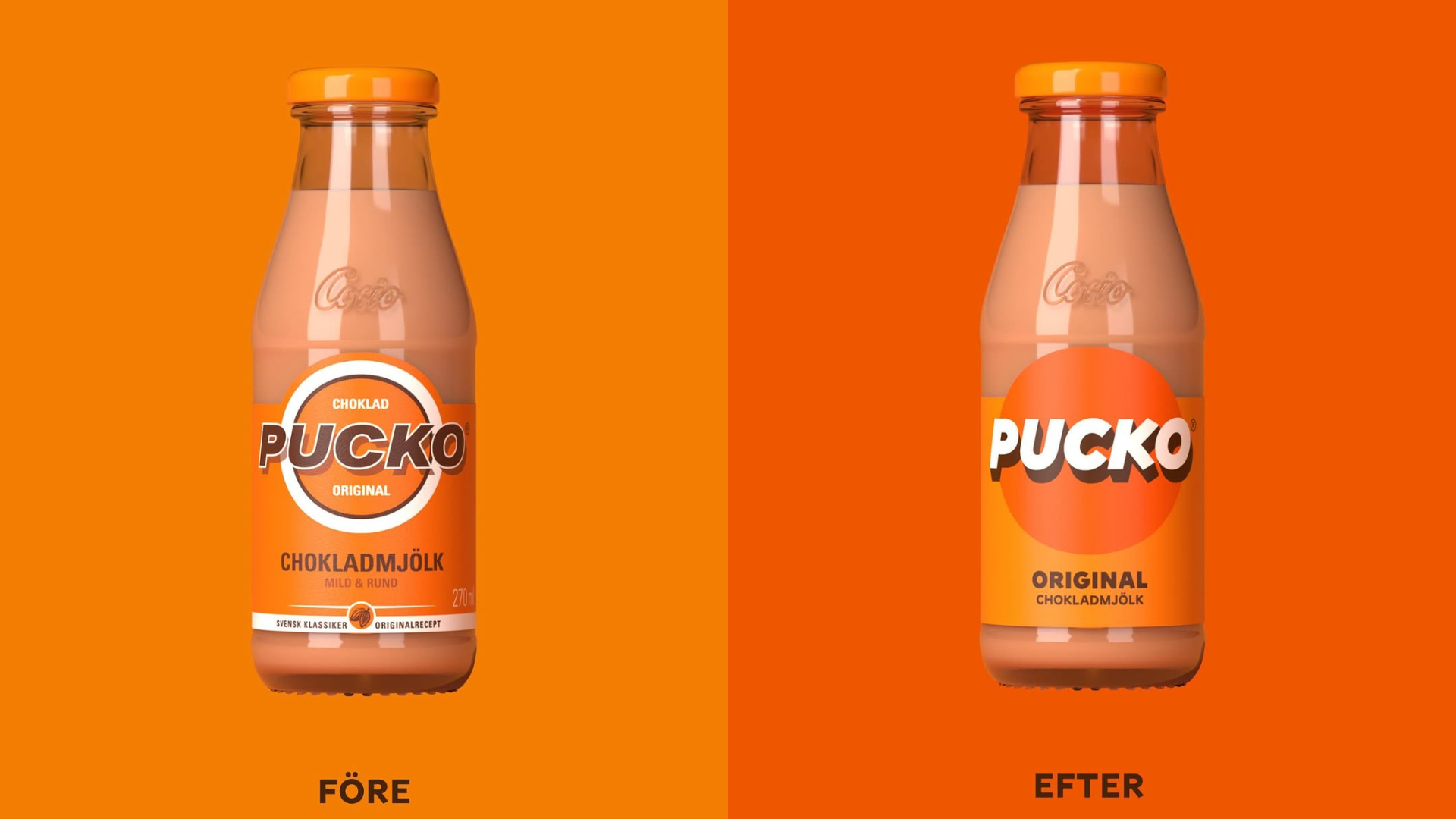
IW Agency strips Pucko back to its most recognizable assets and turns them up a bit. In the new design, the chunky, slanted wordmark sits inside a flat orange circle, instantly legible at arm’s length. Orange floods everything, creating a single-color system, refreshing for a dairy-based beverage. Compared to milk brands chasing softness or nostalgia, Pucko does the opposite.


