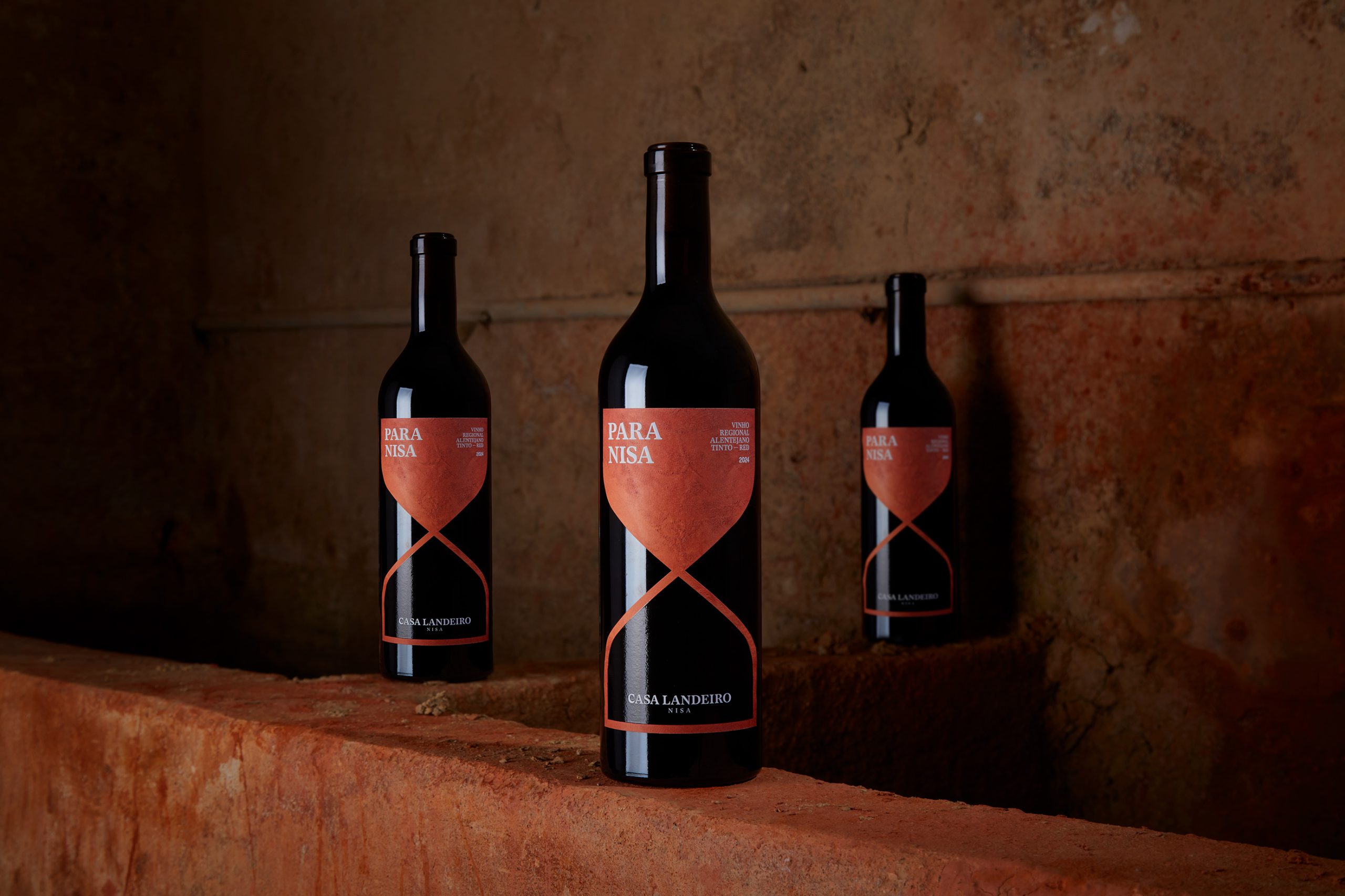
PARA NISA’s Label Explores the Relationshiop Between Time and Land
By
Published
Filed under
By
Published
Filed under
PARA NISA’s packaging by PEDRO VARETA STUDIO trades all ornament for symbolism, with its terracotta-hued hourglass. The typography is quietly authoritative, letting negative space do the work. In a category crowded with decorative flourish, PARA NISA opts for gravity and modern ritual.

Get unlimited access to latest industry news, 27,000+ articles and case studies.
Have an account? Sign in