Pavel Borisovsky of HSE DESIGN SCHOOL Moscow

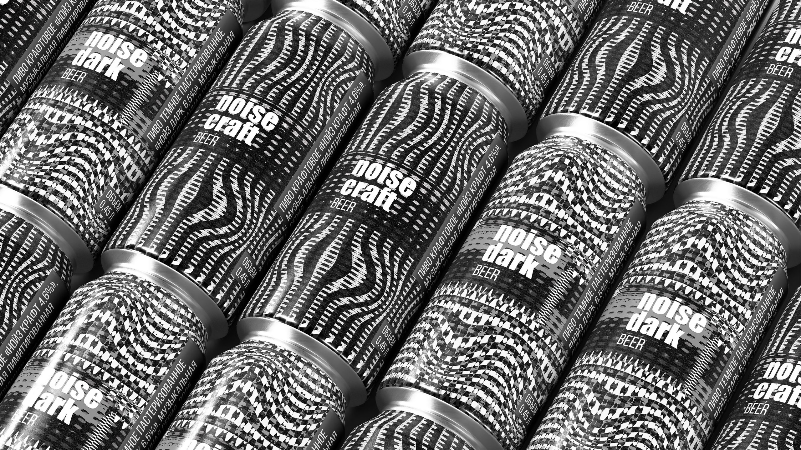
At the heart of my approach is the idea that packaging is not just a shell but a visual sound that a person sees before opening the can. I was inspired by the noise genre, experimental music where distortion, sound textures, and raw energy become an artistic language. Noise Beer is a line of dark and craft beers. Its visual identity is built around graphics that resemble noisy waves and sound distortions. I created patterns with optical effects, rhythmic textures, and strong contrasts of black and white. Each can becomes a visual impulse that recalls the scream of guitar pedals, the beat, and distorted frequencies.

For the packaging, I used a solution that enhances the perception of taste through visual form. Bold and expressive graphics combine with the minimalist shape of the can, while the sequence of patterns adds a sense of motion even in a static view. In the design of boxes and additional elements, I applied the same graphic language so the brand feels complete.
The main goal is for the packaging to speak as loudly as the music it visually reflects.