Nice Foods is Making Dairy Alternatives Look Even Cooler with a Trendy, Dynamic Redesign
By
Published
Filed under

By
Published
Filed under
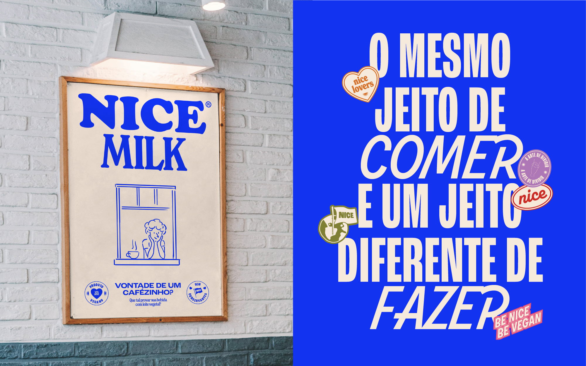
With the increasing bevy of exciting non-dairy options on the market, it’s probably never been a better time to be a vegan. FatFaceStudio makes the trend look all the more, well, nice with their fun retro design for Brazil’s Nice Foods.
Their design is both deceptively simple and more complex than it looks. The branding is consistent across the line’s products, which feature bubbly serif typography, a cute sun icon, and a variety of pleasantly poppy colors. But each package goes quietly crazy with its fonts, from the difference in sizes and weights for each word in the logo and flipping from serif to sans and back for the other text. The promo materials make it a bit more obvious, using italics and fun stickers to grab attention.
Get unlimited access to latest industry news, 27,000+ articles and case studies.
Have an account? Sign in