Johnny’s Market’s Packaging Captures The Indulgence Of Health Food
By
Published
Filed under
By
Published
Filed under
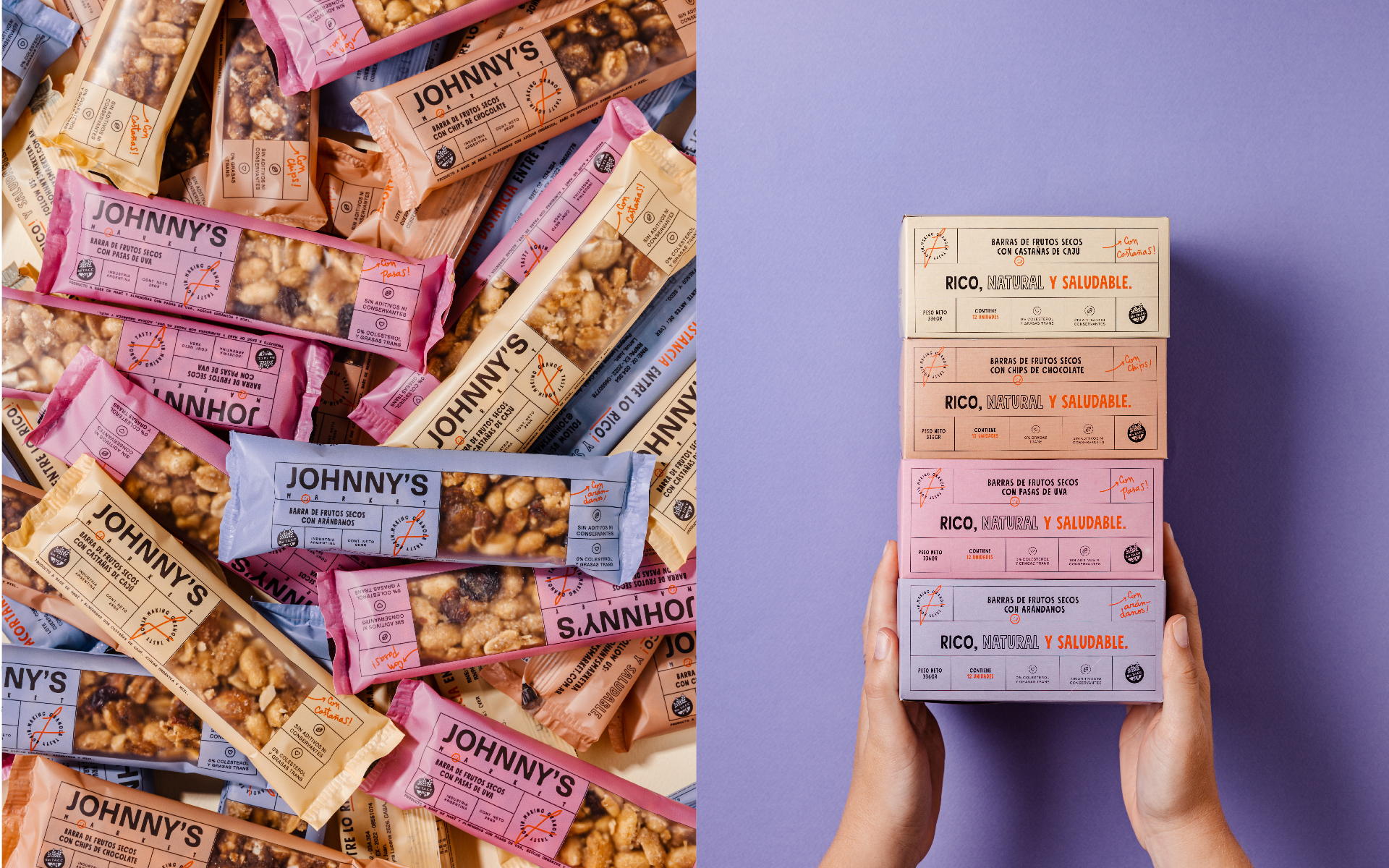
Bunker3022 helped Johnny’s Market differentiate its products through packaging that feels indulgent despite the products offering a healthier alternative. The upbeat packaging system is warm and lighthearted, while the sans serif structural typography captures the brand’s prominence.

Johnny’s Market is a family business. They started selling homemade granola and then amplified their portfolio to cereal bars. That was when they realized their identity didn’t reflect their brand personality and shoud look more professional and human. That´s when Bunker3022 appeared.
Get unlimited access to latest industry news, 27,000+ articles and case studies.
Have an account? Sign in