In Praise of Guy Fieri and Flavortown (or Why Brand Design Doesn’t Need To Be This Hard)
By
Published
Filed under
By
Published
Filed under
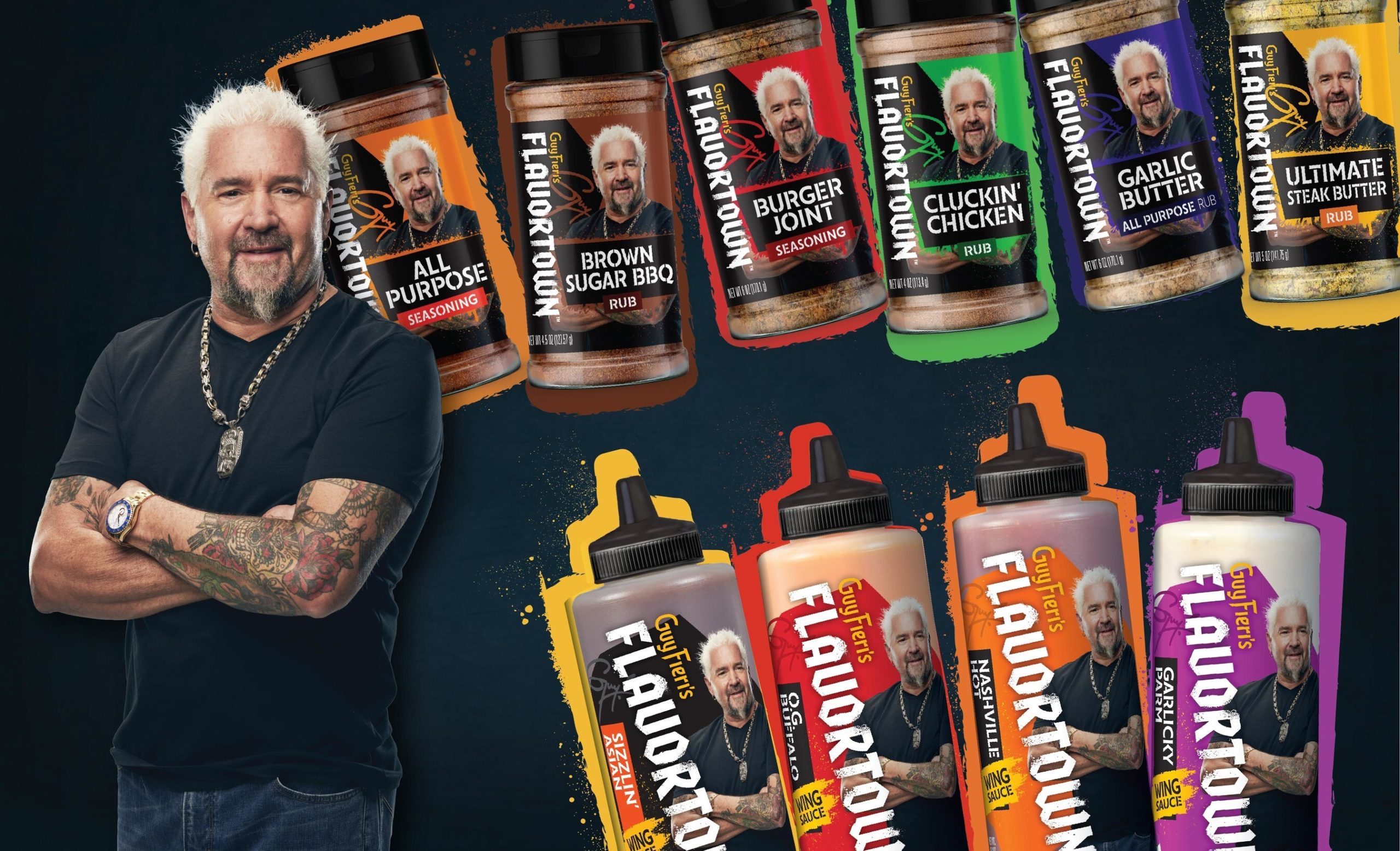
Maybe you clicked on this story because you saw the hero image of Guy Fieri and his Flavortown product line, and you assumed that one of us was going to take the piss out of the design and throw around some snarky language because, hey, yours truly has absolutely done that before.
That’s not what this piece is about. It is about good design—design that makes sense and accomplishes the brief’s goals.
For instance, if Guy Fieri approaches you about extending his line of sauces and spices, you’re not digging into what makes Guy tick or some forgotten footnote from his origin story that feels like a pretty gosh-darn good metaphor for why his Burger Joint Seasoning is red. Nope, you’re getting that trusted shit-eating grin, the trademark spikes, and Flavortown set in a type that doesn’t look all that different from an early-00s lower back tattoo.
Get unlimited access to latest industry news, 27,000+ articles and case studies.
Have an account? Sign in