If you take one glance at the smorgasbord of sports drinks and hydration products at the grocery store, you’re immediately inundated with plastic bottles that mostly look alike and aggressively promise the same thing: hydration and motivation.
However, a newly launched brand takes visual cues not from the sports industry, but from street style —a much-needed shake-up that the category has been thirsting for.

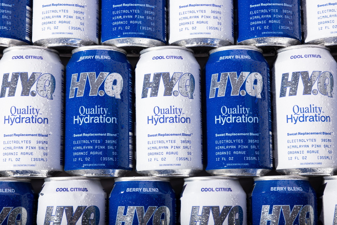
HY.Q‘s packaging, designed by Fred Hart and Kody Goodson, strips hydration down to its essentials in formula and form. There are no gradients, fruit illustrations, or cliched copy, just bold typography, clean layouts, and a smart use of aluminum that mirrors the product’s refreshing, utilitarian purpose.
“The sports drink category is filled with loud branding and design, from the OGs like Powerade and Gatorade to PRIME and Recover. We knew we wanted to challenge the category and not the consumer, so we leaned into fashion and lifestyle branding and design for inspiration,” notes Fred Hart, Design Strategist and Creative Director. “Intentionally contrasting typefaces that work in harmony, strong compositional juxtapositions, monochromatic color tones.”


The HY.Q wordmark, set in a custom twist on Futura Bold, is rendered in exposed aluminum across the body and side. The reflective finish creates a sleek contrast with the matte printed can, giving it a subtle energy that plays with light and condensation in a fridge, gym bag, or on a retail shelf.
“We were super excited about hydration in a can, for both environmental reasons as well as design reasons. The metallic substrate and reflectivity gave us a really unique asset to leverage in our packaging design,” mentions Hart. “The logo, on both the front and side, is always unfinished aluminum and silver, which creates an awesome contrast to the printed parts of the can, creating both allure, intrigue, and dynamism.”

While most hydration drinks lean into assaulting your eyeballs with sensory overload, often in the guise of neon hues, energetic lightning bolts, or futuristic gradients, HY.Q intentionally holds back without losing its boldness. The white and cobalt blue palette gives it a cool, composed feel, echoing the product’s “Quality Hydration” promise and standing out by not screaming for attention. It’s performance-driven, but it doesn’t beg you to be an athlete.
The tagline “Do something that makes you sweat” shifts the tone away from hardcore gym culture and into everyday movement, whether you’re walking your dog, dancing at a wedding, or, sure, doing stair sprints.


The team drew inspiration from everywhere but sports drinks. Instead, they gravitated to old packaging ephemera and performance apparel. “We were inspired by old Nikon packaging, New Balance Ads, Malbon gold, fashion brand Parca Gallery, and the utilitarian laundry instructions on the inside of clothing,” comments Hart.
Essentially, it’s quality over gimmicks. Every element hangs off that core message, with branding that’s confident but not aggressively so. There’s no mysticism about what’s inside the can, you get exactly what’s listed: 385mg of electrolytes and a design that treats hydration with the same attention to detail you’d expect from a great sneaker box or cycling jersey.
It’s new-age hydration. Function forward and beautifully built without being a try-hard.