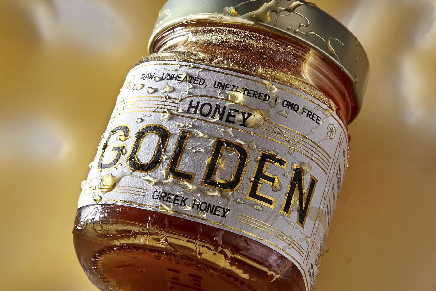
This honey packaging will leave you buzzing. Designed by Cursor Design Studio, the glass jar is exquisite, if we’re being honest. The gold foil creates a sense that the typography is dripping in the product within, and keeping the label a cream-based white with direct black typography allows the golden details to shine further. It’s all about simplicity with this honey, and it’s working.

Label design for a new premium honey from FOOD SURFING company: Greek Blossom and Chestnut Honey. We offered a solution based upon typography in order to surface one of the most classic products with a modern touch.