GLOWA Takes a Well Rounded Approach To Modern Skincare
By
Published
Filed under
By
Published
Filed under
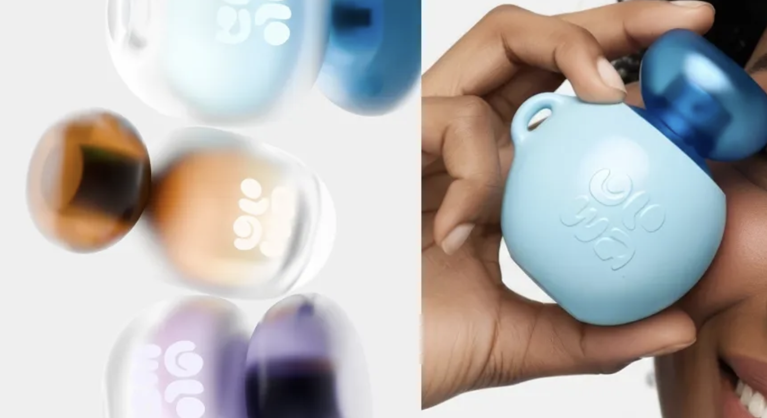
I will forever and always think rounded packaging within the beauty space is the most fun.
GLOWA’s packaging, designed by Creavora, pares skincare down to a tactile object, and the pebble-like form softens the category, while embossed lowercase typography favors touch over legibility theatrics.
Muted pastels and translucent jewel-toned caps suggest hydration and light without clinical cues. There are no literal illustrations, and in a market crowded with bottles and pumps, GLOWA distinguishes itself through intimacy, portability, and a quiet confidence.
Get unlimited access to latest industry news, 27,000+ articles and case studies.
Have an account? Sign in